What is a Customer Service Dashboard?
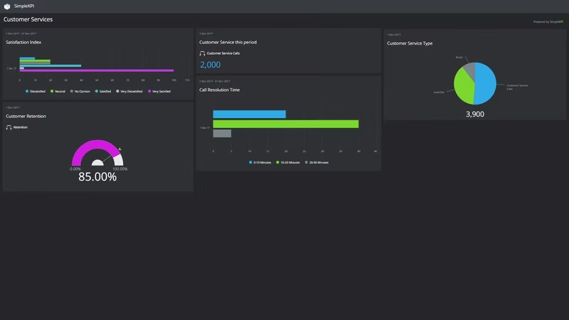
A customer service dashboard is a visual display that puts a support team's key numbers, such as complaints, resolution times, satisfaction scores and service costs, together on one screen. It shows how the department is performing against its service levels without anyone compiling a report first. Managers use it to run the desk day to day. Executives use it to check customers are being looked after at a cost the business can live with.
Overview
Customer service is part of nearly every business, and the evidence of how well it's going ends up scattered: complaints in the ticketing system, survey results in a spreadsheet, warranty claims sitting with the product team, costs with finance. Each number is accurate. None of them alone tells you whether customers are happy.
A dashboard puts them side by side. When the complaint percentage rises in the same month resolution times stretch, you're looking at a staffing or process problem, not a run of difficult customers. When satisfaction dips while overdue requests climb, the connection is on the screen instead of buried in an export.
Satisfaction scores deserve a note of their own. A satisfaction index gives you a simple scale for how interactions land, usually 1 to 5 or very satisfied to dissatisfied. It's a blunt instrument, but tracked the same way every month it becomes one of the most honest numbers a service team has. Ratings like these behave differently from counts and costs; this guide to qualitative KPIs covers how to track them without fooling yourself.
Who benefits from this dashboard?
- Customer service managers: complaints, resolution times and overdue requests in one view, so the day's priorities are set by evidence rather than by whoever shouted last.
- Support agents: a visible board means everyone knows what counts as good and where the backlog stands, without asking.
- Product and operations teams: warranty claims are an early warning. A climbing claim count usually says more about the product than about the desk handling it.
- Executives and owners: satisfaction and service desk costs on one screen answer the board's question: are customers happy, and what are we paying for it?
Dashboard Example Overview
The dashboard pictured here tracks seven KPIs, grouped around four questions:
- Are customers happy? Satisfied Customers and Positive feedback give the headline read on how interactions are landing.
- Where are things going wrong? Complaint Percentage shows how much of the workload turns sour, and Warranty Claims points at problems that start with the product rather than the service.
- How fast do we put it right? Complaint resolution time and Overdue Service Requests measure the gap between what was promised and what was delivered. These are the SLA numbers.
- What does it cost? Service Desk Costs keeps the whole operation honest. Better service at any price isn't a strategy.
Seven KPIs is a deliberately small set. Every one can be pulled from records a support team already keeps, and together they cover satisfaction, failure, speed and cost. That's the whole job of the department, on one screen.
Read Complaint Percentage next to Complaint resolution time. If both climb together, the desk is probably understaffed. If complaints rise while resolution time holds steady, look upstream at the product or at the promises being made during the sale.
Creating a Customer Service Dashboard in SimpleKPI
-
Step 1 Map your service journey
Write down where customers actually reach you, from first question through complaint to warranty claim, and pick the measure that matters at each point. New to dashboards generally? This comprehensive guide to KPI dashboards covers the groundwork.
-
Step 2 Add your customer service KPIs
Create each KPI in SimpleKPI with a target and an update frequency. Tags keep things tidy by team, product line or channel. Plans include unlimited KPIs, so a growing list costs nothing extra.
-
Step 3 Connect your data
Feed numbers in through spreadsheet imports, integrations or the API. Complaint and request counts tend to arrive daily, while survey results and costs land weekly or monthly. The dashboard updates as each does.
-
Step 4 Build views for different audiences
A live queue board for the desk, an SLA view for managers, a satisfaction and cost summary for the board. Same data, different framing.
-
Step 5 Share, review, adjust
Put the dashboard on a screen above the desk and bring it to one-on-ones. Scheduled KPI reports carry the numbers to people who'll never log in. As your history builds, Kip, the built-in AI, can suggest targets and flag indicative benchmarks (AI estimates, not peer data). And retire any KPI nobody acts on.
List of Customer Service KPIs
The table below covers every KPI on the example dashboard. Targets are general guidance, not benchmarks. Your own baseline beats any generic range.
| KPI Name | Typical Target | Description |
|---|---|---|
| Complaint Percentage | Trending down | The share of customer interactions that become complaints. A rising line here is the earliest warning this dashboard gives. |
| Complaint resolution time | Under 48 hours | The average time from a complaint being raised to it being resolved. Speed matters almost as much as the outcome. |
| Overdue Service Requests | Zero, or close to it | The number of open requests past their promised date. Each one is a commitment a customer is still waiting on. |
| Positive feedback | Trending up | The count of compliments, good reviews and positive survey comments. Track it so the desk hears about more than failures. |
| Satisfied Customers | 80% or higher | The percentage of surveyed customers who rate themselves satisfied. Keep the survey method consistent or the trend means nothing. |
| Warranty Claims | Set from your baseline | The number of warranty claims raised this period. Often a product problem showing up in the service queue first. |
| Service Desk Costs | Stable as volume grows | The full cost of running the service operation. Read it beside volume and satisfaction so savings don't quietly become complaints. |
Why Customer Service Dashboards Matter
Relying on satisfaction surveys alone isn't enough to judge a support operation. Surveys arrive late, attract the extremes and miss the customers who left without saying anything. A dashboard that puts satisfaction next to complaints, resolution times and overdue requests shows the machinery behind the score while there's still time to fix it.
Keeping customers happy and informed goes a long way toward keeping them as customers, and visible numbers change how a service desk behaves. When the overdue count is on the wall, nobody needs chasing, and the oldest requests stop hiding at the bottom of the queue. The team sees the promise slipping before the customer feels it.
Cost completes the picture. A desk can buy its way to happy customers, at least for a while, so Service Desk Costs sits beside the satisfaction numbers to keep that trade visible. Seven KPIs, one screen, and the whole department is legible at a glance. Few reports can claim as much.
Build this dashboard yourself with SimpleKPI's KPI dashboards, start from the call center KPI template, and pay one flat price for unlimited users and KPIs.