What is an IT Dashboard?
An IT dashboard is a visual display that brings a team's key operational KPIs, such as server uptime, incident resolution time, patch compliance and IT cost per user, together on one screen. It shows the health of systems and support against target in charts and gauges, so nobody has to pull a report to find out whether things are running. IT managers use it to run the day-to-day. Everyone above them uses it to check that reliable service is being delivered at a sensible cost.
Overview
IT generates more numbers than almost any other department, and they live in more places: uptime in the monitoring tool, tickets in the service desk, licenses in a spreadsheet, costs in finance. Each system reports on itself. None of them reports on the operation as a whole. A dashboard sits above the tooling and answers the plain questions: are systems available, are we fixing things quickly, is risk under control, and what does it all cost.
Most IT dashboards lean one of three ways:
- Availability boards track uptime, network downtime and failure rates. This is the wall-screen view that reassures a room in one glance.
- Service desk boards follow response and resolution times, the numbers your service levels are written against.
- Management boards add compliance and cost, which is what the CIO and finance actually ask about.
The example on this page combines all three, which suits an IT manager who answers for infrastructure, support and budget at the same time. For more on how the different flavors compare, this comprehensive guide to KPI dashboards walks through the main types.
Who benefits from this dashboard?
- IT managers: uptime, resolution times and cost per user in one view, which is most of what a weekly operations review needs.
- System administrators: MTBF, hardware failure rate and patch compliance show where the estate is aging before it fails during office hours.
- Service desk leads: response and resolution times against target, visible to the whole team rather than buried in the ticketing tool.
- CIOs and finance: license compliance and IT cost per user turn "what do we spend on IT" into a question with an answer.
Dashboard Example Overview
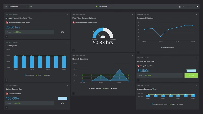
The dashboard pictured here is a dark-themed IT operations board built in SimpleKPI. It tracks thirteen KPIs, grouped around four questions:
- Are systems up? Server Uptime, Network Downtime, Mean Time Between Failures (MTBF) and Hardware Failure Rate cover availability now and the reliability trend behind it.
- How fast do we fix things? Average Response Time IT and Incident Resolution Time measure the service desk from first touch to closed ticket.
- Is risk under control? Backup Success Rate, Patch Compliance, Change Success Rate and Software License Compliance are the quiet numbers that prevent loud weeks.
- What does it cost? Resource Utilization, Inventory Turnover Ratio and IT Cost Per User show whether capacity, spares and budget are being used well.
None of this needs a data warehouse. Every figure can come from records the team already keeps: the monitoring tool, the ticket queue, the asset register and the monthly cost report.
Put Patch Compliance, Backup Success Rate and Change Success Rate on the same view. They rarely slip together by coincidence; when all three sag, the team is firefighting instead of maintaining, and it's time to look at workload rather than process.
Creating an IT Dashboard in SimpleKPI
-
Step 1 Map your IT services
List what you run and what you promise: the systems that must stay up, the response times you've agreed, the compliance rules you answer to. Pick the measure that proves each one. If a KPI doesn't trace back to a service or a promise, leave it off.
-
Step 2 Add your IT KPIs
Create each KPI in SimpleKPI with its target and frequency. Tags keep things organized by system, site or team. Calculated measures like IT Cost Per User are best built as KPI formulas, so the arithmetic happens once and stays consistent.
-
Step 3 Connect your data
Feed numbers in through spreadsheet imports, integrations or the API. Monitoring and ticket data tend to arrive daily; costs and license counts land monthly. The dashboard updates as each source does.
-
Step 4 Build views for different audiences
An availability board for the wall screen, a ticket view for the service desk, a cost and compliance summary for management. Same data, different framing, and nobody has to read past the numbers that concern them.
-
Step 5 Share, review, adjust
Put the board where the team works and let scheduled KPI reports carry the numbers to people who won't log in. Kip, the built-in AI, can suggest targets and flag indicative benchmarks (AI estimates, not peer data) as your history builds. Retire any KPI nobody acts on.
List of IT KPIs
The table below covers every KPI on the example dashboard. Targets are general guidance. Your own baseline, and your own service agreements, beat any generic range.
| KPI Name | Typical Target | Description |
|---|---|---|
| Server Uptime | 99.9% or higher | The percentage of time servers are available. The headline reliability figure, and the one everyone quotes back at you. |
| Incident Resolution Time | Set by severity tier | Average time from a ticket being logged to the fix. Track it per severity level; one blended average hides the failures that matter. |
| Mean Time Between Failures (MTBF) | Trending up | Average operating time between system failures. A rising figure means the estate is getting more dependable. |
| Backup Success Rate | 98-100% | The share of scheduled backups that complete. Only a test restore proves a backup, but this rate flags trouble early. |
| Resource Utilization | 60-80% | How much of your compute and storage capacity is in use. Too low wastes budget; too high leaves no headroom for a bad day. |
| Change Success Rate | 95% or higher | Changes implemented without causing an incident or a rollback, as a percentage. A falling rate usually means changes are being rushed. |
| Network Downtime | Trending toward zero | Total time the network is unavailable each period. Count it in minutes; your users certainly do. |
| Average Response Time IT | Under 2 hours | Average time from a ticket arriving to the first response. This is the number users judge the whole department on. |
| Inventory Turnover Ratio | Set from your baseline | How quickly hardware stock and spares are used and replaced. Idle stock is budget sitting on a shelf going out of date. |
| Patch Compliance | 95% or higher within the patch window | Systems patched on schedule, as a percentage of the estate. The cheapest security KPI you will ever track. |
| Hardware Failure Rate | Trending down | The frequency of hardware failures across the estate. A rising rate is usually aging kit asking for a refresh budget. |
| Software License Compliance | 100% | The percentage of installed software that is properly licensed. The only defensible target is full compliance. |
| IT Cost Per User | Set from your baseline | Total IT spend divided by the number of users supported. The figure that anchors every budget conversation. |
Why IT Dashboards Matter
IT has a visibility problem: the department mostly gets noticed when something breaks. A dashboard fixes half of that on its own. Uptime held, backups ran, patches landed. When the quiet work is on a screen, it stops being invisible, and the conversation about IT changes tone.
The deeper value is in the leading numbers. Uptime and downtime are lagging figures; by the time they disappoint, the cause is weeks old. Patch Compliance, Change Success Rate and Backup Success Rate are the early warnings. When they slip, incidents follow, so a manager watching all three can act while the problem is still cheap to fix.
Cost completes the picture. IT Cost Per User sitting beside uptime and resolution times turns the budget discussion from "IT costs too much" into "this is the service level, and this is what it costs." One screen, thirteen numbers, and a department that usually explains itself in jargon becomes legible to anyone who walks past. That's the point.
Build this dashboard yourself with SimpleKPI's KPI dashboards, and pay one flat price for unlimited users and KPIs.