Dashboard Charts and Graphsa guide to choosing the right visuals for your KPIs, metrics, and data
Displaying your metrics in charts and graphs can convey complex data sets into a single view, but choosing the right tool to visualize your KPIs can be confusing. Here's a quick guide to selecting the right visuals for your dashboard.
Benefit from a range of best practice charts and graphs
They say "a picture is worth a thousand words," and certainly when it comes to data, metrics, and KPIs nothing could be more apt. Without visual tools such as charts and graphs, we'd soon get lost in the swathes of numbers being presented to us. These tools simply take that data and put it into a concise and understandable format. But which charts should you use for plotting an increase in sales, or showing progress towards a goal?
This simple guide to the breadth of charts, graphs, gauges, and reports available in SimpleKPI will help you choose the most appropriate option for your needs.
Bar Chart
A bar chart is one of the most common types of chart. They are a good option for summarizing data that is subset by categories. Typically, these categories would be represented by a series of horizontal bars that sum the values. For example, a bar chart may be used to plot the time taken on certain sales activities such as calls and appointments, with time on the x-axis. This would show a comparative visualization of which activities were the most time intensive.
How to use dashboard bar charts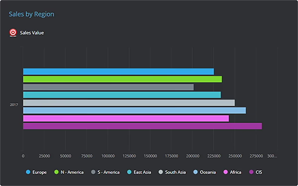
Column Chart
Column charts, also referred to as vertical bar charts, are used in most cases to show KPIs and metrics that need to be conveyed by value. Column charts are also good comparative charts when KPIs go into negative values. For example, budget variance, where it would be beneficial to see how each department is performing against its set budget, can show the columns going into negative values.
Using column charts on KPI dashboards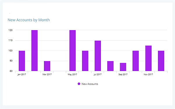
Single KPI View
Single KPI views can be used to emphasize the actual value of an individual data point, metric, or Key Performance Indicator between specific date points. This type of chart can also emphasize performance against a target and offers contextual information with an additional sparkline. For example, current revenue levels during a month against target as purely a total would be a good use of this chart.
Using Single KPI charts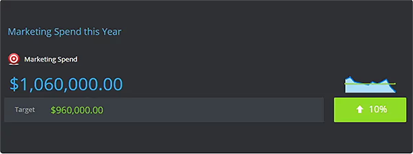
Line Graph
A line graph is a chart type used to display the values or measurements of continuous data over time. They are a good choice for tracking measurements over time such as stock or share prices or even temperatures in production processes. Line graphs nearly always have time or dates on the x-axis and comparative plots on the chart.
Using Line Graphs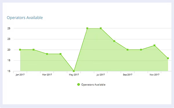
Multiple KPI Series
Occasionally it can be advantageous to compare loosely related metrics and KPIs on the same chart. A Multi KPI Series allows the comparative plotting of those KPIs, regardless of whether they share the same x or y axis, to expose the relationships based on trends. For example, measuring new customers alongside the number of marketing campaigns can offer insight into the success of these initiatives.
Using Multi KPI Series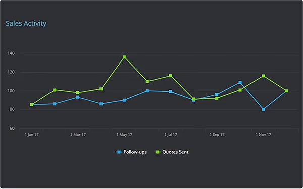
Single Column KPI
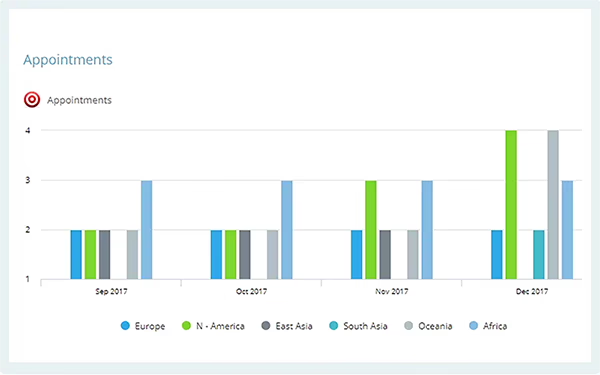
A single column KPI is a chart type that allows for a breakdown of the underlying data, metrics, or KPIs into individual bar columns or lines. This breakdown can be either by user or by group. For example, sales revenue could be visualized by region, by month, or by sales representative across all regions.
Trend Chart
A trend chart can be either a line, column, or bar chart used primarily to highlight when a value is either above or below a specified target. For example, a chart detailing the number of meetings against a target would display red bars when the number of meetings was below the set target, while values above target might appear blue. This enables users to quickly identify values that are underperforming.

Red, Amber, Green (RAG) Threshold Chart
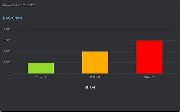
RAG threshold charts, like trend charts, can be a line, bar, or column chart, and allow for visual coloring to draw attention to values that are outside considered norms. The difference with a RAG chart is that these thresholds may be considered a range rather than a single value. For example, a production level may use percentages within set thresholds to indicate how close it is to achieving a 'green' performance level.
Pie Chart
A pie chart is a type of chart that displays various data points in a circular fashion. Each section of the chart is divided by its relationship to both the circumference and the other data points. Pie charts are often used to display the percentage of the whole for related or categorized values broken down by group, however their ability as a visualization tool is limited, as users can find the relationships between different segments difficult to judge. We recommend using only a couple of obviously differentiated values in pie charts.
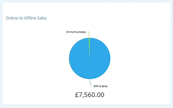
Pie Chart - Multiple KPIs
Multiple KPI pie charts offer the same abilities as the standard pie chart but with the additional feature of being able to choose specific, and often unrelated, KPIs in their structure. For example, with a multiple KPI chart you could combine several customer service KPIs to see the visual relationship between call type and the total value of all calls.
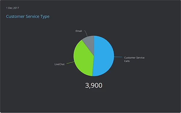
Gauge with a Target
Gauges with a target offer a single representation of a metric or KPI against a set target. As this type of chart only displays a single value, they are limited in their use for performance measurement, as progress towards the value is not detailed. Similar to both pie and single KPI charts, they can be used to emphasize a value such as the current customer retention percentage.
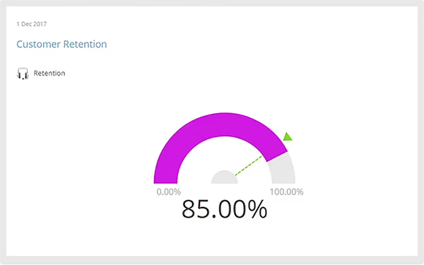
Gauge with a Goal
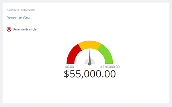
Gauges with goals are a great example of a gauge that offers additional benefits for monitoring progress. They can be used to set a target or goal for a future date and see if that goal is on track at this specific point in time. For example, if the annual sales target is set in January, you can use this gauge to automatically show performance based on sales to date.
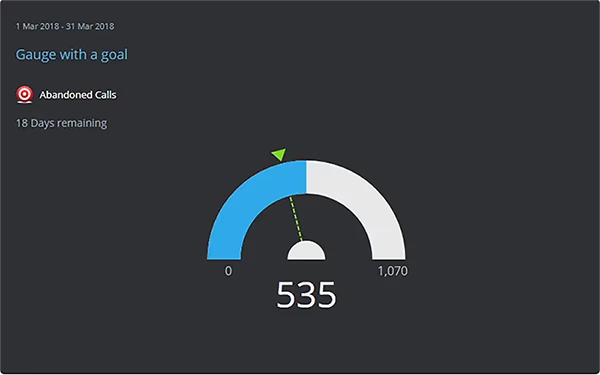
Gauge with a RAG Threshold
As with RAG bar charts, gauges with RAG abilities offer a further visual dimension for understanding a value in the context of its expected thresholds. Not unlike a car's gauge, these charts often offer a quick visual indication of whether a metric is currently operating within acceptable or unacceptable ranges, by placing the indicator in either (customizable) red, amber, or green sections.
Reports
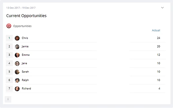
Reports and lists are a good example of a versatile dashboard view that can show detailed information related to overall KPI performance. Lists can be produced using a variety of filters, breakdowns, and groupings that allow you to produce, for example, league tables of sales performance, top performing KPIs, or worst performing KPIs, and they are extremely customizable. However, due to displaying data in tabular format, they can take up large amounts of dashboard real estate.
Stacked Bar Chart
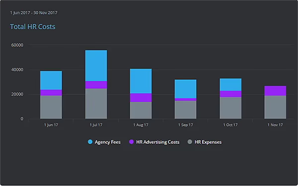
Stacked bar charts can help visualize the overall makeup of a total by category, or show data broken down into parts of a whole. Typically, the different sections within the bar are colored separately to represent their respective values towards the overall height of the bar. For example, total agency fees may be displayed to show agency fees, advertising costs, and expenses as parts of a bar.