Using Bar Charts on your KPI dashboards and reports
Getting the most from bar charts when comparing values, categories, and trends at a glance.

What are Bar Charts?
Bar charts are a great way to display and compare data, metrics, or Key Performance Indicators across categories. Bar charts use graphical bars running parallel to a horizontal axis to show values proportional to other bars in the chart. The x-axis and y-axis of these charts typically show time and groups, though other examples can include ranges.
Bar graphs are the most commonly used charts on KPI dashboards and reports.Their simple structure makes it far easier to quickly and efficiently compare values across groups or categories relative to other chart types.
The different types of bar charts
The term "bar chart" normally refers only to the horizontal version of the chart. However, the term is sometimes used as a catch-all for similar variations that also use bars to visualize data, including:
Stacked charts
Display a breakdown of values within the bars in a single column.

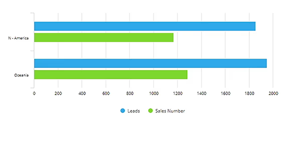
Grouped bar charts
Use a series of bars grouped together against other grouped bars.
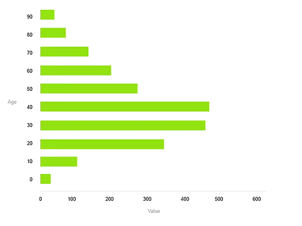
Histograms
Typically use ranges such as age, gender, or social groupings on either axis.
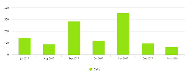
Column charts
Display bars running from the x-axis up to define the values.
Bar chart examples
Examples are the best way to see how bar charts are typically used in different scenarios. Here are a few examples detailing the most common uses of this chart type:
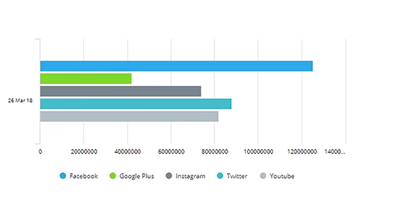
Simple value comparisons
Using a chart to show the difference between unique visitors across various social media channels. This simple example uses the x-axis to show the number of visitors in millions, and the y-axis to define the different channels.
Charting groups
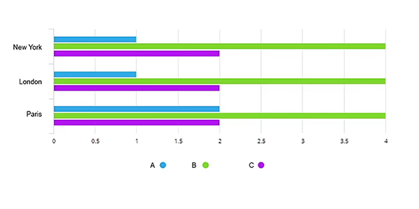
Comparisons between different groups' performance across the same categories can also be achieved with this chart. For example, you can see the difference in sales across different stores for the same products.
Charting over time
This chart offers an additional dimension to the groups' variation by displaying different value series for the same country by year, a good way to see more in-depth time comparisons without reverting to a different chart for each year.

Negative values
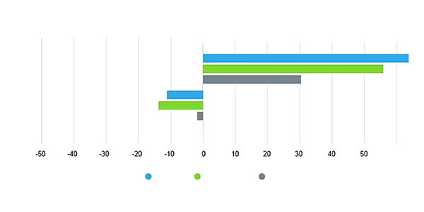
Negative values may be used in a bar chart, for example, certain data and values such as temperature variation or changes in profit between different product lines.
Best practice for using bar charts
All charts have situations where they're more suitable for getting the message across, visualizing the data better, or simply taking up less space.Here are a few guidelines for the effective use of charts on dashboardsto help you get the most from this chart type:
- Use the full axis to avoid distortions in representations.
- Use meaningful and direct labels, and avoid abbreviations.
- Explain the chart in the title. If more explanation is needed, consider using additional labeling or text boxes via links.
- Avoid using legends if you only have a single category.
- Use consistent color themes throughout the charts, especially when more than one category or group is being compared.
How to use bar charts in SimpleKPI
Setting up bar charts in other KPI software can be a confusing and time-consuming process. SimpleKPI keeps the steps as straightforward and simple as possible: first select the KPI, then the date range, and a bar chart can be added to a dashboard within a few clicks. Customize the chart by changing options such as colors, sizes, axis scales, and filters.
More on setting up and customizing bar charts can be found here.
Explore more dashboard chart types