Using Column Charts on dashboards and reports
Utilizing column charts to display and compare your KPIs, metrics, and data.
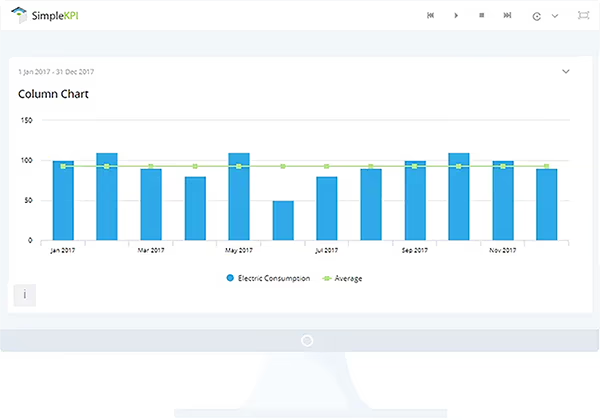
What are Column Charts?
A column chart is a graphic visualization of numeric data. Column charts display vertical bars along a horizontal axis. The vertical axis is used to state the value of the scale, generally with the lowest value at the bottom and the highest value at the top. The bars in the chart then follow the scale, running from the lowest value upwards from the baseline.
Column charts are one of the most commonly used charts for displaying data, as their simple format makes them easy to set up and quick for the audience to understand.
The different types of column charts
Column charts are normally used to display and compare items in a range, for example, when comparing meetings across different cities or countries. Column charts are simple graphical displays of data; however, there are variations of the column chart, such as:
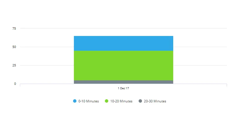
Stacked column charts
Display segments of the chart to represent values within a single column.
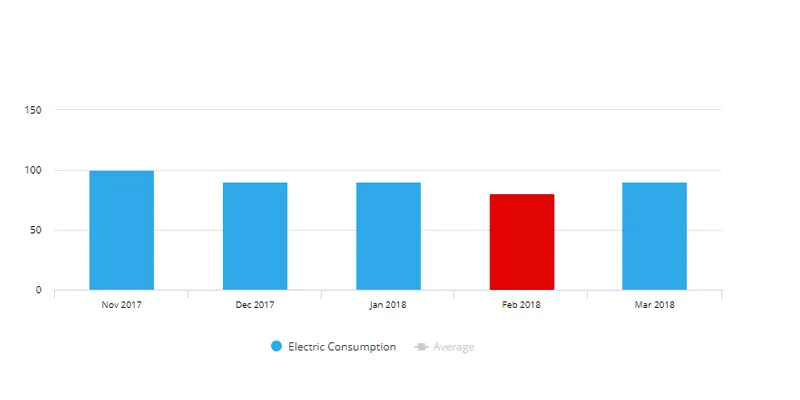
Trend columns
Show the past trend of a single KPI over time; colors are further used to show if the trend is over or above target.
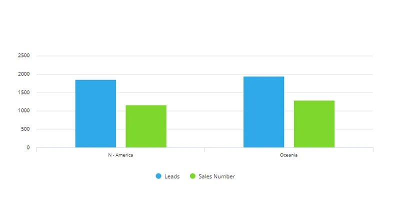
Grouped or clustered column charts
Visually group categories into clusters associated with a date or value range.
Column chart examples
Column charts can cover a multitude of data visualization scenarios. Here are a few working examples of these charts in action:
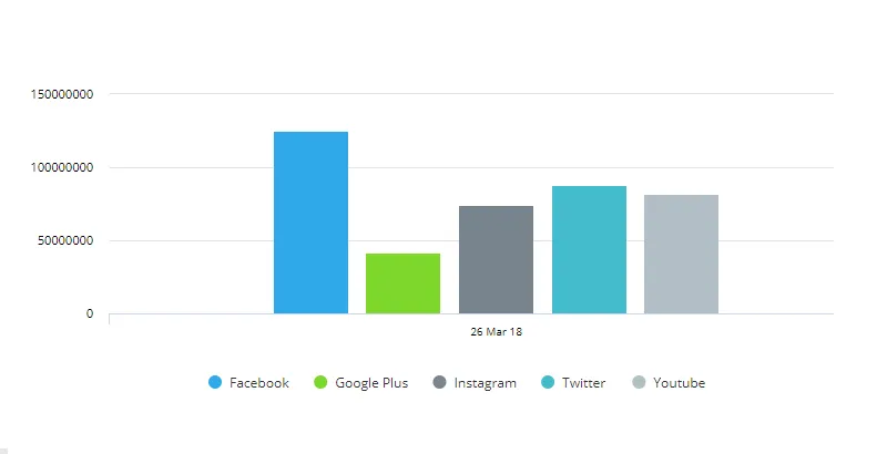
Single value comparisons
Simple values can be visualized to see direct comparisons of categories of the same sort. For example, a column graph could be used to show the difference in scale between social media channel engagement.
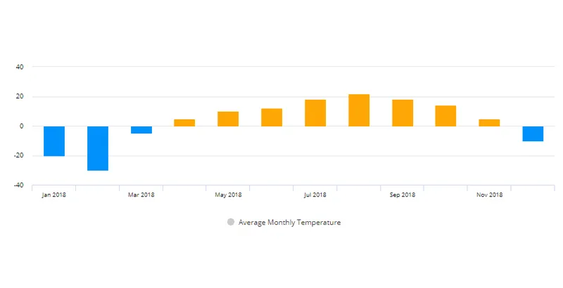
Displaying negative values
Column graphs aren't just limited to positive values; the y-axis can display a scale that includes negative values. This enables the column chart to be used, for example, when visualizing temperature differentials across calendar months for a city.
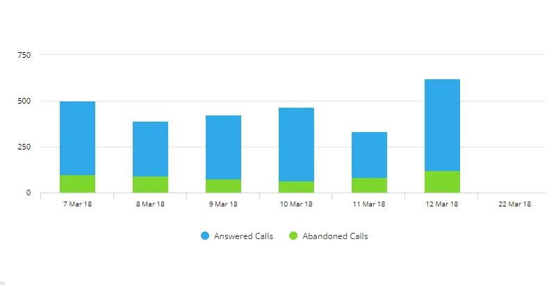
Grouped stacked column
A common variation that can be used to see both the overall value of a KPI, such as the number of total calls received, alongside a breakdown of what percentage and value of those calls were abandoned.
Column chart best practice
Column charts are extremely versatile and can be incredibly effective when visualizing data, metrics, and KPIs. But, like every chart type, it's useful to keep a few guidelines in mind that will help you get the most from your visualizations:
- Take full advantage of the y-axis to avoid distorting the relationship between bar values.
- Label series and titles clearly to guide the viewer, and avoid confusing or contradictory terminology.
- If a single series is being visualized, avoid unnecessary legends.
- Be consistent with colors across the chart, and avoid using more than one color for the same comparative bar in a series.
How to use column charts in SimpleKPI
Creating column charts in SimpleKPI is a straightforward and simple process. Once you've chosen the best column chart type for your visualization, simply select the KPI, determine the date range, and add the chart to one of your dashboards or reports. Customize the chart by changing options such as colors, sizes, axis scales, and filters.
More on setting up and customizing column charts can be found here.
Explore more dashboard chart types