Using Line Graphs to see trends in your KPIs
See how continuous data, from revenue to call volumes to stock levels, trends over time.
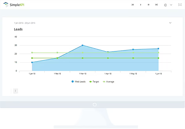
What are Line Graphs?
Line graphs are a simple form of data visualization used almost universally to show the relationship between data and time. They use simple graphic lines connected to data points running horizontally on a time-defined axis, with data values on the vertical axis. This form of graph allows for quickly understanding trends in values based on historical data.
For example, Key Performance Indicators (KPIs) such as revenue by month would display the value of the revenue along the vertical axis with the monthly intervals along the horizontal axis, connected with lines between the different values. This allows you to quickly see how revenue was performing in the context of previous monthly values, which is important for seeing the value in historical context. For example, revenue can fluctuate based on seasonal trends, such as increased sales for summer products, or reduce around periods of accounting deadlines as budgets run short.
Although rare, line graphs may also use other periodic values such as temperature, distance, speed, and dates. They are also a good way to compare the trend against previous periods to add further context, particularly when reviewing seasonal trends. A line graph showing two trend lines, with revenue data from the current and preceding years, offers a very simple way to compare performance against previous years.
Best practice for line graphs
As with all graph types, there are pros and cons to their use. To help you understand when to use this chart type, here's some best practice advice:
- Line graphs are predominantly used for data that changes over time, or more importantly, a visual representation of the historic trend of that data. Try to use this graph type for things that show variations over time, such as stock prices or sales by month.
- Consider using line charts for other periodic values, such as temperature, age, distance, and speed on the x-axis.
- Visualize only what you need. Keep the number of comparisons on a line chart to a simple few; it's easy to quickly overpower a line chart with too many data series.
- Keep comparisons relevant; all data series should be comparable to every other series on the graph.
- Try to tell a story with the data. If it's about revenue growth for a certain product against other categories, highlight the main point using a single color and use neutral colors, such as gray, for the others.
How to use Line Graphs in SimpleKPI
KPIs that need to be displayed to show the historical trend are typically visualized with line graphs. To add a line graph to your KPI dashboard, simply select "Line Graph" from the chart menu, then select the KPI along with the date range. Once a line graph has been generated, you can use options to show or hide targets and averages. Line graphs can also be customized by changing colors, sizes, and filters.
Explore more dashboard chart types