What is a SaaS Dashboard?
A SaaS dashboard is a visual display that brings the key metrics of a subscription software business, such as monthly recurring revenue, new accounts, acquisition cost and churn, together on one screen. It shows the whole customer journey in charts and gauges, from first visit through trial to paying account, so nobody has to piece the story together from six different tools. Founders use it to watch growth. Teams use it to see whether this month's work actually moved the numbers.
Overview
In a SaaS business, data generates at a fantastic pace, and it scatters as fast as it arrives. Signups sit in the product database, revenue in the billing system, traffic in analytics, spend in the ad platforms. A dashboard filters that volume into a usable format, and the connections become visible. A dip in conversions this month explains the soft MRR you would otherwise be puzzling over next quarter.
Most SaaS dashboards cover three jobs:
- Acquisition tracks visitors, trials and what they cost, so marketing spend has to answer for itself.
- Conversion follows prospects through signup and onboarding to paid, the stretch where subscription revenue is won or lost.
- Retention watches churn and lifetime value, because a subscription business keeps only what it renews.
The example on this page draws from all three, which suits an owner or operator who wants the whole funnel in one place. A useful side effect: it gives instant feedback on new features and pricing changes as they ship, because the effect shows up in conversion and churn within weeks.
Who benefits from this dashboard?
- Founders and owners: MRR, churn and unit economics in one view. That is the health of the business, and most investor updates start and end there.
- Marketing teams: Customer Conversion next to Cost to Acquire shows whether campaigns bring in buyers or just traffic.
- Product teams: churn is the bluntest feedback a product ever gets. Watching it move after each release beats guessing.
- Customer success: New Accounts and Churn frame the job: everything won this month, and everything at risk of quietly leaving.
Dashboard Example Overview
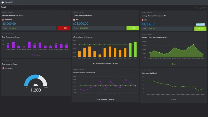
The dashboard pictured here is a light-themed SaaS board built in SimpleKPI. It tracks seven KPIs, grouped around three questions:
- Is revenue growing? New Revenue and Monthly Reoccurring Revenue (MRR) give the headline: what came in this period, and what the subscription base now produces every month.
- Is the funnel working? New Accounts and Customer Conversion show whether interest is turning into paying customers, and at what rate.
- Do the economics hold? Lifetime Value (LTV), Cost to Acquire (CAC) and Churn decide whether growth is worth having. When customers cost more than they return, more signups just speed up the problem.
Seven KPIs is a deliberately short list. SaaS throws off more data than almost any other business model, and the discipline is picking the numbers that tell the story of the customer journey rather than tracking everything that moves. There is a longer argument for this in our piece on why fewer KPIs work better. These seven cover it: money in, customers in, customers kept.
Keep Customer Conversion, CAC and Churn on the same view. When conversion climbs and churn climbs with it, you are buying customers the product cannot keep. Fix onboarding before raising the ad budget.
Creating a SaaS Dashboard in SimpleKPI
-
Step 1 Map the customer journey
Write down the path from first visit to renewal: visitor, trial, paid account, retained account. Pick one or two measures per stage and stop there. Seven good numbers beat thirty noisy ones.
-
Step 2 Add your SaaS KPIs
Create each KPI in SimpleKPI with a target and a frequency. Several of these are calculated from others; churn divides canceled accounts by the base, and LTV builds on revenue and retention. This guide to creating KPIs with formulas covers the pattern. Plans include unlimited KPIs, so the list can grow with the business.
-
Step 3 Connect your data
Feed numbers in through spreadsheet imports, integrations or the API. Signups and conversions tend to arrive daily or weekly, billing data monthly, and the dashboard updates as each lands.
-
Step 4 Build views for different audiences
A funnel view for marketing, a churn and retention view for customer success, an MRR summary for the board. Same data, different framing, and each audience skips the parts it never needed.
-
Step 5 Share, review, adjust
Put the dashboard on a screen, open it in weekly reviews, and let scheduled KPI reports carry the numbers to investors and advisors who will never log in. Kip, the built-in AI, can suggest targets and flag indicative benchmarks (AI estimates, not peer data) once your history builds. Retire any KPI nobody acts on.
List of SaaS KPIs
The table below covers every KPI on the example dashboard. Targets are general guidance. SaaS ranges swing widely with price point and market, so your own baseline beats any generic number.
| KPI Name | Typical Target | Description |
|---|---|---|
| New Revenue | Growing month over month | Revenue from new customers this period. The clearest read on whether acquisition is producing money, not just accounts. |
| Monthly Reoccurring Revenue (MRR) | Trending up | The predictable revenue the subscription base generates each month. The number the rest of the dashboard exists to explain. |
| New Accounts | Set against your growth plan | The number of new paid accounts added this period. Read next to New Revenue to see whether growth comes from more customers or bigger ones. |
| Lifetime Value (LTV) | 3x CAC or better | The total revenue an average customer generates before leaving. Retention moves it more than pricing does. |
| Cost to Acquire (CAC) | Recovered within 12 months | The total cost of obtaining a new account, including marketing spend and salaries. The ceiling on how fast you can afford to grow. |
| Customer Conversion | Set from your baseline | The percentage of visitors or trials converted into paid customers. Small movements here compound through everything downstream. |
| Churn | Trending down | The percentage of accounts that canceled this period. The single number that decides whether growth compounds or leaks away. |
Why SaaS Dashboards Matter
Subscription businesses die slowly, which is the dangerous part. Churn compounds quietly. CAC creeps up one campaign at a time. By the time either shows up in the bank balance, the cause is months old. Keeping LTV, CAC and Churn in daily view turns slow leaks into things you notice while they are still cheap to fix.
The other gain is a shared version of reality. Marketing, product and customer success each own one piece of the funnel, and without a common screen each team optimizes its own piece. Put conversion next to churn and the conversation shifts from whose number looks fine to where the journey actually breaks.
Having the numbers in one place also means you can monitor the impact of even small changes that help convert prospects into loyal customers. A tweaked onboarding email or a new pricing page shows up in the figures within weeks, not at the annual review. Money in, customers in, customers kept: seven numbers, checked in the time it takes to pour a coffee, and you know whether the machine is working.
Build this dashboard yourself with SimpleKPI's KPI dashboards, start from the SaaS KPI template, and pay one flat price for unlimited users and KPIs.