What is a Retail Dashboard?
A retail dashboard is a visual reporting tool that brings a store's key performance indicators together on one screen, covering sales, margins, pricing, and shopper behavior. It shows how the business is trading right now and how that compares with last week, last month, or the same period last year.
That is the whole job. Instead of digging through POS exports, supplier invoices, and a door counter nobody checks, you get charts and gauges that answer the questions that actually decide whether a shop survives: are we selling enough, at the right price, to people who come back?
Overview
Retail runs on thin margins. Rent and staff cost the same whether the shop is full or empty, online competitors undercut on price, and demand swings hard with the seasons. None of that is news to anyone who has stood behind a counter in January.
The KPIs worth tracking fall into two groups. Money measures tell you whether the trading model works: gross sales, cost of goods, retail price, and gross margin. Behavior measures tell you why: how long people spend in the store, how much lands in the average basket, and how many of them come back. A retail dashboard puts both groups side by side, which is the point. A jump in gross sales means very little if you gave away margin to get it, and a healthy margin on falling retention is a slow leak.
Watching these numbers weekly, on one screen, turns the usual end-of-quarter surprise into something you saw coming in week two.
Who benefits from this dashboard?
- Owners: watch gross margin against cost of goods to see whether the shop is making money, not just taking it.
- Store managers: basket spend and shopping time make a fair judge of layout changes, promotions, and staffing calls.
- Buyers and merchandisers: the pricing chain from cost of goods through to margin shows which lines still earn their shelf space and which no longer cover the effort.
- Area and operations managers: comparing the same KPIs across branches shows which store habits are worth copying.
Dashboard Example Overview
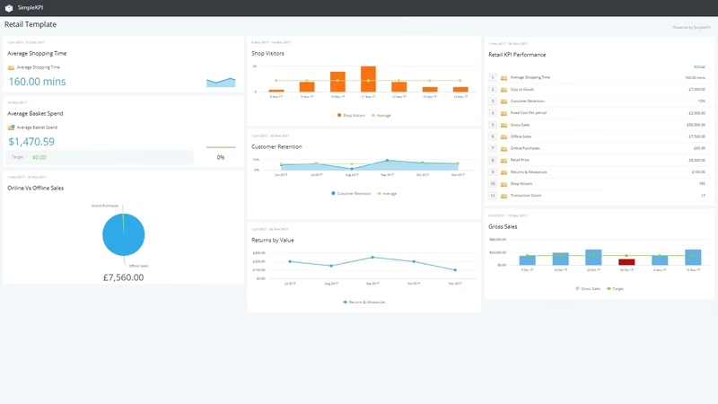
The dashboard pictured here tracks seven KPIs that between them cover the money side and the shopper side of a retail operation.
Three of them form the pricing chain: Cost of Goods, Retail Price, and Gross Margin. Together they show whether the markup you planned is the markup you are getting. Gross Sales sits alongside as the headline volume figure.
The remaining three describe the people walking through the door. Average Basket Spend shows what a typical transaction is worth. Average Shopping Time shows how long customers browse, worth watching whenever you change the layout or the window display. Customer Retention compares repeat buyers with first-timers, and it is the cheapest early warning a retailer gets, since keeping a customer costs less than winning a new one.
Each KPI appears as a chart or gauge with a target and a comparison against the previous period, so a glance tells you what moved and in which direction. No spreadsheet reconciliation required.
Creating a Retail Dashboard in SimpleKPI
-
Step 1 Map your retail journey
Start with the path a customer takes: they walk in, they browse, they buy or they leave, and they either come back or they do not. Pick the handful of KPIs that describe each stage. Seven is plenty to begin with.
-
Step 2 Add your retail KPIs to SimpleKPI
Create each KPI with its unit, frequency, and target. If you are not sure where a target should sit, Kip, the AI built into SimpleKPI, can suggest indicative benchmarks. Those are estimates rather than real peer data, but they give you a defensible starting point until your own history builds up.
-
Step 3 Connect your data
Feed in numbers from your point-of-sale or ecommerce exports using spreadsheet imports, integrations, or the API. Most retail data already exists somewhere in the checkout stack; the work is routing it, not creating it.
-
Step 4 Build views for different people
The owner wants margin. The Saturday team wants basket spend. Build a view for each audience rather than one dashboard that tries to please everyone. This guide to using charts and graphs on dashboards covers which chart type suits which KPI.
-
Step 5 Share, review, and improve
Put the dashboard on a screen in the back office, and send scheduled KPI reports to anyone who is not looking at it daily. Then revisit the KPI list each quarter and drop anything nobody has acted on.
Tag each KPI with its store or location when you create it. The first shop will not need the distinction, but the day you open a second one, every comparison report is already built.
List of Retail KPIs
These are the seven KPIs on the example dashboard, with typical targets offered as guidance rather than gospel. Sensible numbers vary a lot by sector, so treat your own baseline as the real benchmark.
| KPI Name | Typical Target | Description |
|---|---|---|
| Average Basket Spend | Trending up on your baseline | The average amount spent per transaction, calculated as gross sales divided by transaction count. The quickest growth lever that does not need more foot traffic. |
| Average Shopping Time | Set from your baseline | How long customers spend in the store during the period. Read it alongside basket spend: longer visits that do not lift spend suggest people cannot find what they want. |
| Cost of Goods | 50-70% of retail price | What you paid for the items you sold, before markup. Watch it as a share of sales so supplier price creep shows up early. |
| Customer Retention | 20-40% repeat customers | The number of repeat customers compared with first-time purchasers. Rising retention compounds; falling retention means the marketing budget is running to stand still. |
| Gross Margin | 30-50% of sales | Total sales minus the cost of goods, usually shown as a percentage of sales. The single best summary of whether the trading model works. |
| Gross Sales | Up on the same period last year | The total value of all sales before returns and allowances. Compare like-for-like periods, since seasonality makes month-on-month comparisons misleading. |
| Retail Price | Set from your pricing strategy | The cost of goods plus your markup. Tracking it as a KPI keeps discounting honest, because every markdown shows up as a gap between planned and achieved price. |
Why Retail Dashboards Matter
Most retailers already have the data these KPIs need. It sits in the point-of-sale system, the accounting package, and the ecommerce back end, and it mostly stays there. A dashboard makes that data cheap to look at, and a number you see every morning changes decisions in a way a quarterly report never will.
The payoff shows up in small corrections made early. A gross margin drifting down two points gets caught while it is still a supplier conversation rather than a year-end write-down. A dip in retention shows up before the sales figure follows. Seasonal patterns become plannable instead of surprising, which matters most in the run-up to the busiest quarter, when getting your KPIs ready for a strong year-end is the difference between riding the peak and reacting to it.
None of this needs a data team. SimpleKPI is $79 per month flat, or $67 per month billed annually, with unlimited users, dashboards, reports, and KPIs, and the AI included with no credits or metering. There is a 14-day free trial with no credit card, which is long enough to load a quarter of sales data and see whether the picture it paints is one you recognize.
Build this dashboard yourself with SimpleKPI's KPI dashboards, start from the retail KPI template, and pay one flat price for unlimited users and KPIs.