What is a Financial Dashboard?
A financial dashboard is a visual display that brings a company's key financial KPIs, such as revenue, profit margins, cash position and outstanding invoices, together on one screen. It condenses the numbers that normally sit in ledgers, spreadsheets and month-end packs into charts and gauges anyone can read at a glance. Finance teams use it to watch the position between reporting cycles. Owners and directors use it to answer the question that never goes away: are we in good shape?
Overview
Nearly every part of a business feeds into its financial results, but the evidence arrives scattered: sales in one system, costs in another, invoices in a third. A dashboard puts the pieces side by side, and the relationships become visible. When gross margin slips, you can see whether costs rose or pricing softened. When cash tightens, the overdue invoice count usually explains why.
Most financial dashboards concentrate on three things:
- Profitability: revenue against the costs it took to earn it, read through gross margin, net margin and EBIT.
- Liquidity: whether there is enough cash and working capital to run the day to day without strain.
- Collections: outstanding, overdue and disputed invoices, because profit on paper is not money in the bank.
The example on this page covers all three, plus a few efficiency measures, which suits a finance manager who wants the whole position in one place. It shows performance and liquidity in a single view, without waiting for reports or audits to surface a problem.
Who benefits from this dashboard?
- Finance managers: watch margins, cash and collections through the month, and catch problems while they are still cheap to fix. This template was built with teams new to financial KPI tracking in mind.
- Business owners and directors: revenue, EBIT and net assets in one view is usually all a board meeting needs to start the right conversation.
- Credit control: outstanding, overdue and disputed invoices on a shared screen give the collections effort a visible scoreboard.
- Department heads: revenue per employee and cost figures show what each area contributes to the result, not just what it spends.
Dashboard Example Overview
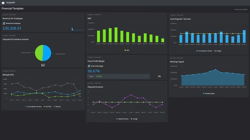
The dashboard pictured here tracks sixteen financial KPIs, grouped around four questions:
- Are we making money? Revenue, Cost Goods / Services, Gross Profit Margin, Margin, Net Profit Margin and EBIT trace the path from sales to earnings, so you can see at which step the money leaks.
- Can we cover our obligations? Daily Cash, Working Capital and Net Assets read the balance sheet in near real time rather than at quarter end.
- Is the money actually arriving? Order Entry, Outstanding invoice amount, Overdue Invoices and Disputed Invoices follow revenue from booked order to cleared payment.
- How efficiently are we running? Number of Employees, Revenue per employee and Financial Reporting Accuracy keep the operation itself honest.
None of this needs a data warehouse. Every figure comes from records the finance team already keeps, which is what makes it a realistic starting set rather than a wish list.
Put Daily Cash, Overdue Invoices and Outstanding invoice amount on the same view. Cash problems rarely announce themselves; they show up first as invoices quietly aging.
Creating a Financial Dashboard in SimpleKPI
-
Step 1 Decide what the business needs to see
Start with the questions that matter: are we profitable, can we pay our bills, is cash arriving on time? Pick one or two KPIs per question. The sixteen in this example are a sensible default if you would rather not begin from a blank page.
-
Step 2 Add your financial KPIs
Create each KPI in SimpleKPI with its target and frequency: Daily Cash daily, invoice measures weekly, margins monthly. Tags keep things organized by entity or department, and plans include unlimited KPIs, so nothing gets trimmed to fit.
-
Step 3 Connect your data
Feed numbers in through spreadsheet imports, integrations or the API. Most finance teams already live in spreadsheets; if yours is straining under the reporting load, this piece on why KPI spreadsheets break down explains what to move first.
-
Step 4 Build views for different audiences
A cash and collections view for the finance office, a margin summary for the board, a reporting accuracy tracker for the team itself. Same data, different framing. The seven golden rules for creating KPI dashboards will keep each view readable.
-
Step 5 Share, review, adjust
Bring the dashboard to the monthly review and let scheduled KPI reports carry the numbers to people who won't log in. Kip, the built-in AI, can suggest targets and flag indicative benchmarks (AI estimates, not peer data) as your history builds. Retire anything nobody acts on.
List of Financial KPIs
The table below covers every KPI on the example dashboard. Targets are general guidance; margins in particular vary so much by industry that your own baseline beats any generic range.
| KPI Name | Typical Target | Description |
|---|---|---|
| Cost Goods / Services | Stable or falling share of revenue | Inventory costs of goods or services sold. Watch it beside revenue, not on its own. |
| Daily Cash | Covers near-term outgoings | The cash position recorded each day. The earliest warning this dashboard gives you. |
| Disputed Invoices | Low single digits | The percentage of disputed invoices. A rising figure usually means a process problem, not difficult customers. |
| EBIT | Positive and trending up | Earnings before interest and taxes. The cleanest read on operating performance. |
| Financial Reporting Accuracy | Approaching 100% | The share of reports issued without error or correction. Confidence in every other number starts here. |
| Gross Profit Margin | Set against your industry norm | The difference between revenue and cost of goods before accounting for other costs. |
| Margin | Stable or rising | Profit as a percentage of revenue, tracked between formal accounts as a running health check. |
| Net Assets | Growing year on year | Total assets minus total liabilities. The slow-moving backdrop to the faster numbers above. |
| Net Profit Margin | Set from your baseline | The percentage comparing net profit after taxes to revenue. The figure the year is judged on. |
| Number of Employees | Set against plan | The headcount, mostly here as the denominator for the efficiency measures. |
| Order Entry | Consistent with the revenue plan | Orders recorded in the period. An early read on the revenue that follows. |
| Outstanding invoice amount | Set from your baseline | The total value invoiced but not yet paid. Money earned that the business cannot spend yet. |
| Overdue Invoices | Trending down | The number of invoices past their terms. The first place cash trouble becomes visible. |
| Revenue | On target or above | Income received from business activities. The headline the rest of the board exists to explain. |
| Revenue per employee | Trending up | Revenue divided by the total workforce. A rough but useful gauge of overall efficiency. |
| Working Capital | Positive | Current assets minus current liabilities. What the business actually has to work with day to day. |
Why Financial Dashboards Matter
Financial results are the ultimate lagging indicator. By the time the accounts confirm a bad quarter, the causes are months old and the options have narrowed. A dashboard shortens that delay to days. Overdue invoices climb, margin drifts, daily cash thins, and someone sees it while the fix is still routine.
There is a translation benefit too. Balance sheets speak accountant; charts speak everyone. Nearly every aspect of a business contributes to financial success, and when margin, cash and collections sit on a screen in plain view, department heads stop treating finance as a black box and start seeing how their numbers move the company's.
The finance team gets time back as well. The month-end pack still matters, but it stops being the only window into the business, and the ritual of assembling the same figures for every meeting quietly disappears. Sixteen numbers on one screen, and nobody is waiting for the audit to find out.
Build this dashboard yourself with SimpleKPI's KPI dashboards, start from the financial KPI template, and pay one flat price for unlimited users and KPIs.