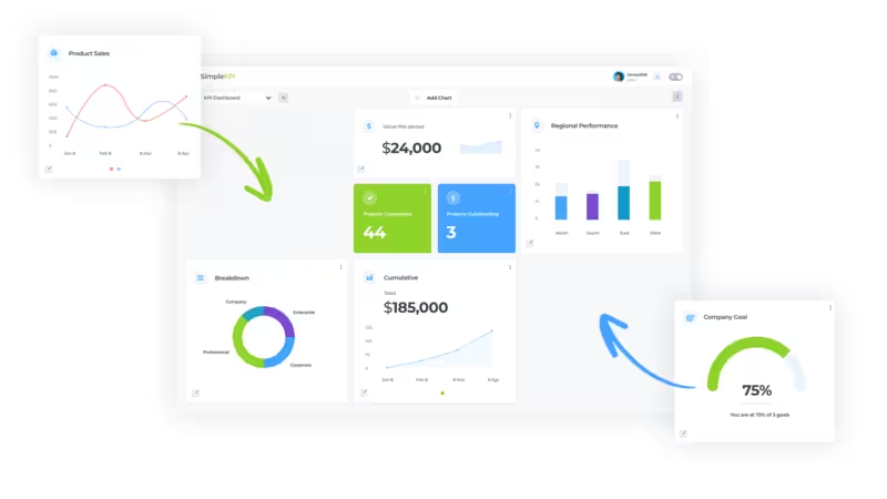
What is a KPI Dashboard?
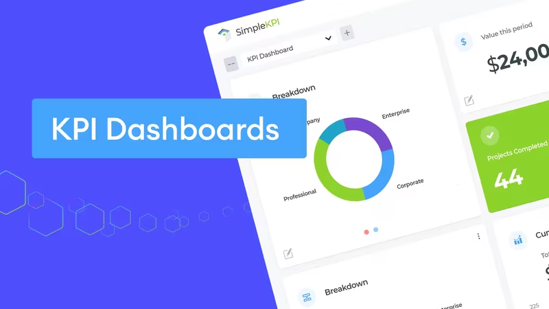
A KPI Dashboard uses charts and graphs to display Key Performance Indicators in a logical and straightforward format. This enables the analysis of large datasets to track a company's progress toward its goals more efficiently, while also providing users with a simple and effective tool to make data-driven decisions that improve a company's overall performance.
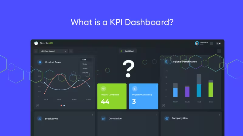
When implementing a KPI Strategy, a KPI Dashboard becomes an essential part of monitoring the performance of individuals, teams, and departments against their targets and goals. This leads to a transparent and manageable way in which to identify trends, opportunities, and threats to the overall strategy.
Also in this guide:
- What are the benefits of tracking KPIs on a Dashboard?
- The difference between a KPI Dashboard and a KPI Report
- Creating your first KPI Dashboard
- Choosing KPI Dashboard Software
- Different Dashboard Types
- How AI is Reshaping KPI Dashboards in 2026
- KPI Dashboard Examples
- 5 Common KPI Dashboard Mistakes to Avoid
- Finally, some practical Dashboard tips
- FAQ
- More References and Resources...
What are the benefits of tracking KPIs on a Dashboard?
Understanding where an organization stands, where it has been, and where it aims to go is crucial for its health. Monitoring performance offers a structured approach to monitor progress and set future goals.
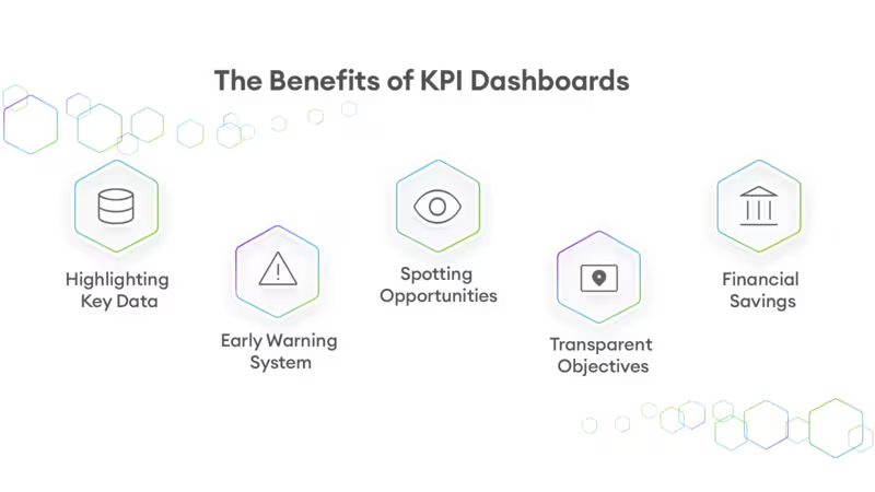
Tracking KPIs on a dedicated dashboard isn't just about making data look pretty—it fundamentally changes how quickly a team adopts a performance-driven culture. Based on our anonymized data from thousands of businesses setting up KPIs, teams that successfully create their first centralized dashboard are nearly 3 times more likely to establish long-term performance tracking habits compared to teams managing isolated metrics. Using a centralized dashboard provides numerous advantages across the company, such as:
- Highlighting Key Data: Enables managers and individuals to make informed decisions by focusing on the most relevant data.
- Early Warning System: Identifies potential problems early, with analytical tools to diagnose causes and take corrective action swiftly.
- Spotting Opportunities: Uncovers potential business opportunities, allowing companies to capitalize on them faster than competitors.
- Transparent Objectives: Creates a clear framework for everyone to understand and work towards the company's goals.
- Financial Savings: Monitors cost metrics against projects, aiding in accurate future cost estimations and financial savings.
Read More on the benefits of tracking KPIs.
What is the difference between a KPI Dashboard and a KPI Report?
KPI Dashboards and KPI Reports serve distinct yet complementary roles in performance management. KPI Dashboards are interactive tools that provide a real-time, visual snapshot of key performance indicators, allowing users to monitor metrics at a glance.
KPI Dashboards are characterized by their ability to display live data, update automatically, and offer interactivity, such as drilling down into specific data points and filtering information. Dashboards are visually focused, using charts, graphs, and gauges to make complex data easy to understand quickly. They are ideal for real-time monitoring, supporting day-to-day decision-making, and facilitating team collaboration with up-to-date visual data.
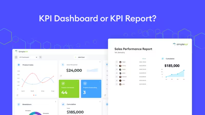
In contrast, KPI Reports are detailed documents that compile and analyze performance data over specific periods, offering a comprehensive review of past performance in a more static format. These reports focus on historical data, providing in-depth analysis, narrative explanations, and recommendations. They are usually presented as static documents, such as PDFs or printed materials, and include extensive data, charts, tables, and text for thorough performance reviews.
KPI Reports are used for periodic performance assessments, strategic planning, and detailed stakeholder reporting, providing valuable insights and context for long-term decision-making. By understanding the distinction between these tools, organizations can effectively leverage both to ensure comprehensive performance management and informed decision-making.
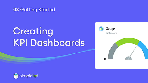
Creating your first KPI Dashboard
A KPI Dashboard should present all your KPIs and Metrics for a specific objective in a concise and visually informative manner.
When adding KPI graphs to a dashboard, it’s easy to get carried away. With so much data available from an ever-expanding array of sources, how do you avoid creating counterproductive dashboards and overwhelming your audience with information overload?
Well, here are 8 simple steps to get you going:
- Choose the KPIs and Metrics to Track:
Identify the most critical KPIs and metrics that align with your business objectives. These should directly reflect the performance indicators vital to your project, department, or overall company goals. A great resource to see what similar companies are tracking is this KPI Generator tool. - Consult with Stakeholders:
Before you build anything, speak to the people who will use the dashboard (executives, managers, and frontline teams). Ask what decisions they need to make each week, what “good” looks like, and how often the data needs to update—this step prevents building a dashboard that looks impressive but doesn’t get used. - Sketch Your Dashboard Layout:
Create a quick low‑fidelity mock-up (paper, whiteboard, or a simple grid) showing where each KPI will sit and what visual format it will use. This makes it easier to spot clutter early and ensures the layout tells a clear story at a glance. - Select Your Data Sources:
Determine where your data will come from. This could include internal databases, CRM systems, spreadsheets, or external data sources. Ensure these sources are reliable and updated regularly to maintain data accuracy. - Understand the Intended Audience:
Know who will be using the dashboard. Whether it's executives, department managers, or team members, understanding their needs and preferences will help tailor the dashboard to provide the most relevant and actionable insights. For more insights on how to implement a KPI culture, click here. - Build Your Dashboard with Meaningful and Straightforward Graphs:
Design your dashboard using clear, concise, and easy-to-understand graphs and charts. Avoid clutter and focus on visualizations that best represent your data, making it easier for users to interpret and act upon the information. - Run a Feedback Session (Then Iterate):
Share a first version with a small group of stakeholders and ask: What’s unclear? What’s missing? What would you act on immediately? Dashboards are naturally iterative—small improvements after real feedback usually make the difference between a dashboard people admire and one they rely on. - Deploy and Embed It into Your Workflow:
Once your dashboard is ready, share it with the intended audience. Ensure it's easily accessible, whether through email, a shared link, or integrated into your existing tools. Then make it part of your routine (weekly reviews, leadership meetings, team standups) so it drives real decisions instead of sitting unused.
Creating a KPI Dashboard: Step by step video guide
Choosing KPI Dashboard Software
Selecting the right KPI dashboard software is essential for obtaining accurate and actionable insights. Specialized KPI software can streamline this process, offering features and functionalities that general tools might lack.
When choosing the right software, focus on three main questions:
What Do You Need to Track?
KPI dashboards come in various forms, from simple free versions to those following strict methodologies like the Balanced Scorecard, or as part of comprehensive Business Intelligence (BI) solutions.
Understanding your tracking needs and software usage is vital. For instance, if you're tracking a few high-level KPIs, a basic dashboard may be sufficient. However, if you require numerous data integrations feeding thousands of metrics for hundreds of users, an advanced BI solution with a dashboard might be more appropriate.
What Features Does Your Business Require?
Comparing features can be challenging. Most tools offer basic features such as integrations, full-screen modes, and various graphs. However, additional analytics tools, KPI reports, and options for manual data entry can be beneficial as your performance tracking needs expand.
What’s the budget?
Most KPI dashboard software is delivered online with annual and monthly subscription plans. While this model offers cost savings on hosting, hassle-free maintenance, and automatic feature updates, the expenses can add up.
Some providers offer all-inclusive pricing, while others may charge extra for additional users, data storage, and the number of KPIs and dashboards.
Researching feature matrices and cost structures can significantly impact your annual performance budget.
Here are some notable providers of KPI Dashboard Software:
Looking for the best KPI Dashboard options? Discover the top dedicated providers to consider in 2026.
For a more comprehensive look at generic KPI Software providers, check out this 14 KPI Software guide and review for 2026
Different Dashboard Types
KPI dashboards cover three main aspects of business performance tracking, each serving a specific purpose: strategic, operational, and analytical.
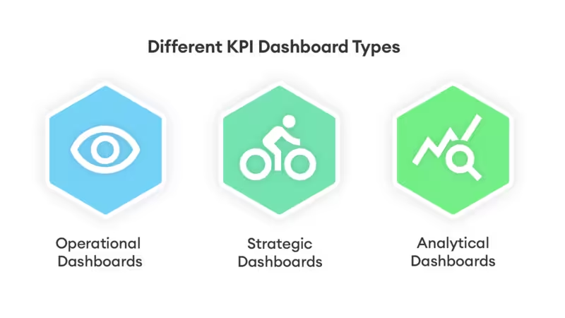
- Strategic dashboards are predominantly used to view the business in its entirety. They contain high-level financial and process-based KPIs. These dashboards are a great way to see the company’s current state and growth. Strategic decisions are made using these dashboards, highlighting opportunities and weaknesses to key individuals.
- Operational Dashboards deliver real-time data to managers and employees, crucial for making informed decisions on daily operations. These dashboards consolidate large amounts of information into easily understandable visuals, making them essential in industries like construction and manufacturing, and departments like sales and marketing.
- Analytical Dashboards allow for in-depth investigation of data anomalies, often referred to as KPI reports. They help determine the root causes of fluctuations and compare performance trends using historical data, offering a comprehensive analysis tool for further insights.
| Dashboard Type | Primary Purpose | Best Suited For | Update Frequency |
|---|---|---|---|
| Strategic | High-level view of company health, growth, and long-term goal tracking. Focuses on broad financial and process-based KPIs. | Executives, Founders, and C-Suite Leadership. |
|
| Operational | Day-to-day monitoring of active processes, identifying bottlenecks, and keeping teams aligned on immediate targets. | Department Managers, Team Leads, and Frontline Staff. |
|
| Analytical | Deep-dive investigation of data anomalies, historical trends, and root-cause analysis to support strategic shifts. | Data Analysts, Business Intelligence Teams, and Strategists. |
|
More indepth information on the different dashboard types and how to use them can be found here
How AI is Reshaping KPI Dashboards in 2026
The days of static, manually updated charts are rapidly fading. In 2026, the most effective KPI dashboards are moving from purely descriptive (showing what happened) to predictive (showing what will happen). AI-driven features now allow dashboards to automatically detect anomalies—such as a sudden spike in churn or a drop in server performance—and alert teams in real-time without anyone needing to check the screen.
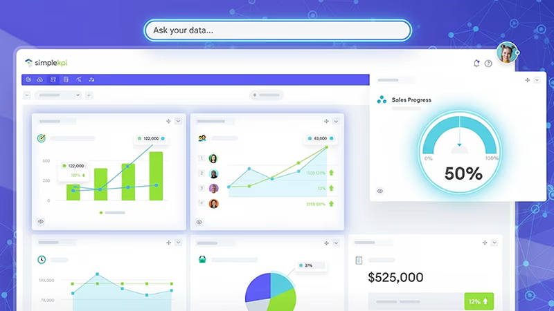
This shift is backed by major industry forecasts: industry research predicts that over 80% of CX organizations will abandon native mobile apps to automate data analysis. For dashboard users, this means you can now ask natural language questions like "Why did revenue drop yesterday?" and receive an instant visual answer, rather than digging through filters and spreadsheets to find the root cause.
Real-World KPI Dashboard Examples
Different industries and departments use dashboards in very specific ways — from fast-paced sales environments to production-focused manufacturing floors. The right dashboard reflects the unique goals and metrics of the team using it.
We've compiled 50+ industry-specific KPI dashboard examples covering Sales, Marketing, Manufacturing, SaaS, HR, Finance, and more — each with the key metrics you should be tracking.
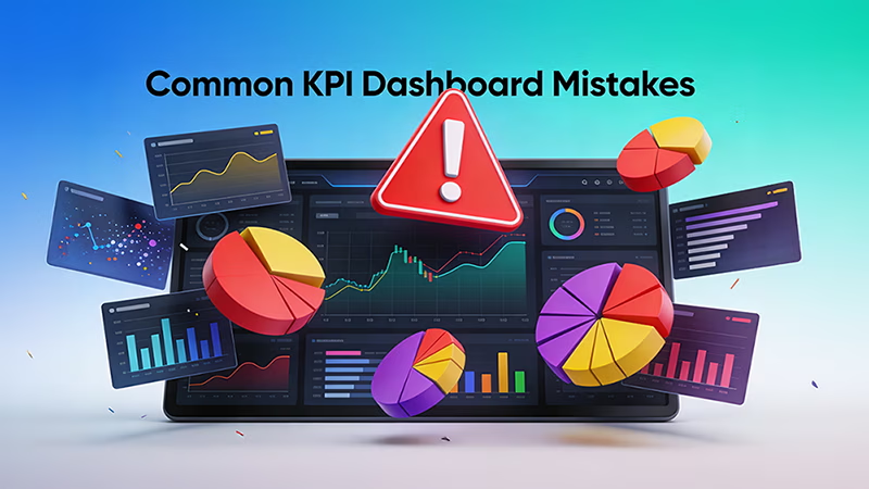
5 Common KPI Dashboard Mistakes to Avoid
Even with the best intentions and accurate data, dashboards can fail if they aren't designed with the end-user in mind. Based on thousands of implementations, here are the most common pitfalls that prevent teams from getting actionable value from their KPI dashboards.
- Information Overload: Cramming 20+ charts onto a single screen defeats the purpose of a dashboard. If everything is highlighted as important, nothing is. Stick to a maximum of 5 to 10 core KPIs to keep the focus sharp.
- Lack of Context or Targets: Displaying that revenue is $50,000 means nothing without context. Is that good or bad? Always include comparative data (e.g., vs. previous month) and clear target lines so users instantly know if they are on track.
- Creating "One-Size-Fits-All" Dashboards: A CEO needs a high-level strategic overview, while a marketing manager needs granular daily campaign data. Forcing both audiences to use the exact same dashboard results in a tool that serves neither effectively.
- Using the Wrong Visualizations: Using a pie chart to show a trend over time, or relying on 3D charts that distort data proportions, causes immediate confusion. Always match the chart type to the data's story (e.g., line charts for trends, bar charts for comparisons).
- Focusing on Vanity Metrics: Highlighting metrics that look good on paper (like total page views or social media followers) but don't tie directly to business objectives leads to a false sense of success and poor strategic decision-making.
Finally, some practical Dashboard tips
Here are some tips and best practices that will help you make the most of your dashboards:
KPIs need owners
When KPIs have owners, you get good performance. Without owners, it’s unclear who should interpret the data, communicate the results and initiate any actions that are needed.
Divide your dashboards by function
Group your KPIs and create individual dashboards focused on a specific audience. Strategic Dashboards visualize growth and the organization’s goals. Operational Dashboards for day-to-day operations such as those for Sales teams. Analytics dashboards for investigation and trend analysis. Avoid trying to create a single dashboard to cater to all these functions. Splitting them out will provide the audience with a single purpose to focus on.
Keep it simple
Less is more when it comes to Dashboard design. Aim for a single screen with no more than nine views. Limit the number of colors and use consistently sized graphs. With each graph, ask yourself, is it necessary to show all the historical data if the audience only needs Real-time data?
Use Vanity Metrics Sparingly
Actionable KPIs, such as the number of users completing a particular stage of a signup process, provide information for you to make decisions that can improve performance. Vanity metrics, on the other hand, like the number of website visitors, are helpful but are prone to fluctuations, manipulation and don’t tell the real story. Are these visitors genuinely interested in purchasing your product or service?
Avoid gimmicky widgets
With so many dashboard providers competing for a unique selling proposition, new and unique widgets appear almost daily. For example, the ‘latest time in London,’ an image rotator, or a ‘latest tweet’ provide little to no real actionable information – they just add to the clutter.
Timely Reviews and adjustments win
As with any business tool, regular reviews and maintenance are needed to keep them performing at their best. Having KPI owners contribute to regular ‘optimization’ reviews will reduce information overload and further improve performance.
Set your dashboards free
There is no point in creating beautiful dashboards when they are limited to a single person or hidden behind numerous logins. The information contained needs to be communicated to all shareholders involved in the process. Consider sharing dashboards freely, both internally and externally, and provide a feedback mechanism.
Combine metrics to create actionable KPIs
Consolidating metrics into a single actionable KPI will provide direction for practical actions. For example, dividing the number of signups to a service by the number who completed a specific stage will give you the information to help change areas of the process that are under-performing.
Clean and accurate data
Rubbish in rubbish out. If data is inaccurate, then it does not matter how beautifully designed your dashboard is; it just won’t have the right fuel to perform. As much as is reasonably possible, try to test data for reliability and accuracy.
Measuring something is better than measuring nothing at all
Implementing an organization-wide set of Dashboards can be a daunting prospect. Start small; even a single graph might provide a welcome insight - and let’s face it, without any measuring, would remain undiscovered.
A KPI Dashboard uses charts and graphs to display Key Performance Indicators in a logical and straightforward format. This enables the analysis of large datasets to track a company's progress toward its goals more efficiently, while also providing users with a simple and effective tool to make data-driven decisions that improve a company's overall performance.
KPI Dashboards and KPI Reports serve distinct yet complementary roles in performance management. KPI Dashboards are interactive tools that provide a real-time, visual snapshot of key performance indicators, allowing users to monitor metrics at a glance. KPI Dashboards are characterized by their ability to display live data, update automatically, and offer interactivity, such as drilling down into specific data points and filtering information.
The optimal number of KPIs on a dashboard typically ranges between 5 to 10, ensuring a balance between comprehensiveness and clarity. This range allows for effective monitoring of critical metrics without overwhelming users with too much information, making it easier to focus on the most important performance indicators that align with strategic goals.
A KPI dashboard is a visual tool that displays key performance indicators (KPIs) to provide a quick overview of an organization's performance, typically focusing on real-time data and short-term metrics. In contrast, a balanced scorecard is a strategic management framework that not only includes KPIs but also aligns them with the organization's long-term objectives across four perspectives: financial, customer, internal processes, and learning and growth.
KPI dashboards, while powerful, have several disadvantages including the potential for information overload if not properly managed, the risk of focusing too much on easily measurable metrics rather than strategic goals, and the dependency on accurate data input, which can skew insights if the data is flawed. Additionally, setting up and maintaining these dashboards can be resource-intensive, requiring significant time and expertise to ensure they align with business objectives and provide relevant, actionable insights.
More References and Resources...
Harvard Business Review: The Predictive Power of KPIs
For a deeper understanding of how modern organizations shift from backward-looking metrics to predictive performance indicators, read Harvard Business Review's guide on exploiting the predictive power of KPIs. This resource explains how to map metrics to future financial performance rather than just acting as a "school report" for past actions.
The KPI Institute
For expert insights and global benchmarks on Key Performance Indicators, visit The KPI Institute's KPI Dashboard resources. This renowned organization offers comprehensive guidance on KPI development, implementation, and best practices to help you fortify your performance measurement strategies.
Stacey Barr
For professional expertise on performance measurement and tracking Key Performance Indicators on Dashboards, visit Stacey Barr. Her PuMP® methodology provides valuable resources and insights to help organizations develop effective KPIs and improve their performance management practices.
From SimpleKPI...
- What are Key Performance Indicators? — A complete guide to understanding and implementing KPIs.
- The SimpleKPI Library — Access over 200+ industry-specific KPIs and templates to use immediately.
- Free AI KPI Generator — Instantly discover the best metrics for your specific industry and goals.
- Top 14 KPI Software Platforms for 2026 — Read our updated review to find the right dashboard tool for your team.
- Metrics vs. Measures — A definitive guide to understanding the difference between the two.
- 5 Examples of KPI Bad Practice — Learn what to avoid when setting up your performance tracking.

by Stuart Kinsey
Stuart Kinsey writes on Key Performance Indicators, Dashboards, Marketing, and Business Strategy. He is a co-founder of SimpleKPI and has worked in creative and analytical services for over 25 years. He believes embracing KPIs and visualizing performance is essential for any organization to thrive and grow.