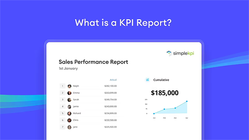
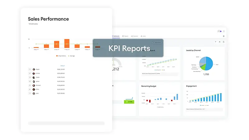
What is a KPI Report?
A KPI Report is a performance management tool for visualizing Key Performance Indicators (KPIs). They typically display this data using charts, graphs, and tabular formats, enabling businesses to track progress against specific targets, objectives, or goals.
These reports serve as an essential resource for gaining insights and providing a mechanism for making informed, data-driven decisions.
By regularly reviewing KPI reports, you can quickly spot progress, trends, and opportunities. This provides a transparent and structured format for ensuring that everyone remains aligned with the company’s goals.
What are KPI Reports used for?
Nearly every business, from coffee shops to global fashion brands, generates far more data than is absolutely necessary, tracking everything from website visitor numbers to the auto-generated microdata in manufacturing processes.
While some of this data is crucial for business operations, much of it lacks real business value.
KPI Reports help to summarize, filter, and make practical sense of this overwhelming data, making it more manageable and useful.
These reports are essential not just for structured performance monitoring and improvement processes, but for tracking company objectives with real data.
Getting Started with KPI Reporting
Whether you’re just starting a KPI management program or are an experienced KPI manager ready to track and visualize performance, there’s always something new to learn. And, from new tactics to basic strategies, with a little polish, you can make your KPI reporting a more purposeful and powerful tool.
This guide contains actionable tips and tactics for developing KPI reports that not only look good, but also effectively captivate your audience and influence better business decisions.
In this article...
- What are KPIs and Metrics?
- How do KRAs fit into KPI Reports?
- How AI & Automation are Changing KPI Reports in 2026
- What is the difference between KPI Dashboards and KPI Reports?
- Different KPI Report Types
- Creating a KPI Report
- How to Create a KPI Report in SimpleKPI
- Distributing a KPI Report
- KPI Reporting Examples
- 3 Common KPI Reporting Mistakes to Avoid
- KPI Reporting Best Practice
- FAQ
- More Resources
What are KPIs and Metrics?
To understand the fundamentals of KPI reporting, it's essential to understand what KPIs are and what makes them different from regular data points and metrics.
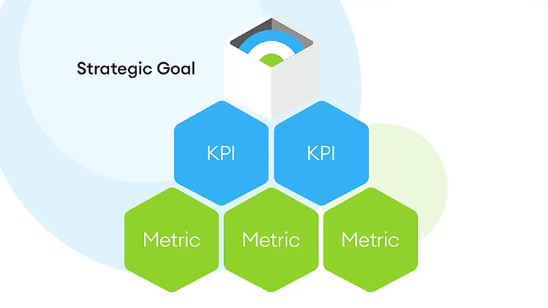
What is a KPI?
A Key Performance Indicator (KPI) is a metric aligned to a 'Key' business objective. It tracks how effectively an organization performs against that objective, including associated targets or goals.
Companies use KPIs to bring about performance improvements that drive growth. For example, if your objective for the next six months is to increase leads by 50%, simple KPI criteria might look like this:
- Objective: To Increase leads by 50%.
- Measurement: A combined total leads KPI - calculated by taking all leads from all channels.
- Activities: Increasing the number of lead generation channels.
- Responsibility: Who will be responsible for making sure these activities are completed.
- Time frame for success: 6 months.
- Reviewed and communicated: At the end of each month.
KPIs help you stay focused on the overall business objective by providing a structured and timely way to track progress, without getting distracted by too many or irrelevant measurements.
And what about Metrics?
Metrics, on the other hand, are measures or numerical values. In the example above, the individual leads generated from different channels are individually classified as metrics. Metrics are not just limited to individual measures; they can be calculated from a series of metrics.
Are Metrics important?
Metrics can be as important to an organization as KPIs. They offer a way to measure the health of business activities. For example, a metric that measures the defects in a production line can quickly alert the company when a problem occurs. The same metric can also be used to analyze the performance of different production lines over time.
How do KRAs fit into KPI Reports?
Firstly, KRAs (Key Result Areas) are often confused with KPIs, as they share common ground. However, KRAs are aligned with the big picture, like a company goal or a desired outcome such as improving team communication. They are generally qualitative or descriptive, and often they can be seen as the overall objective or purpose of a KPI Report.
Meanwhile, Key Performance Indicators (KPIs) are the actual measurements that will demonstrate whether you have, or have not, met the objective set out in the KRA.
For example, a KRA whose purpose is to increase production quality may have KPIs such as defect rate or First Pass Yield.
It is quite common to see KRAs set as the purpose of an individual report, with the KPIs supporting it by showing, through measurable data, how we are performing towards that objective.
How AI & Automation are Changing KPI Reports in 2026
For decades, KPI reports were purely historical—static documents telling you what happened last month. In 2026, the standard has fundamentally shifted. According to MIT Sloan Management Review, organizations are increasingly adopting "smart KPIs" powered by AI that don't just describe the past, but actively predict future outcomes.

This integration of generative AI means that modern reporting software can now automatically write executive summaries, spot data anomalies (like a sudden drop in marketing conversions), and suggest corrective actions before the report is even opened by stakeholders. Furthermore, automation has eliminated the "Friday afternoon scramble"—teams can now schedule reports to be automatically compiled and distributed via email or Slack at exact intervals.
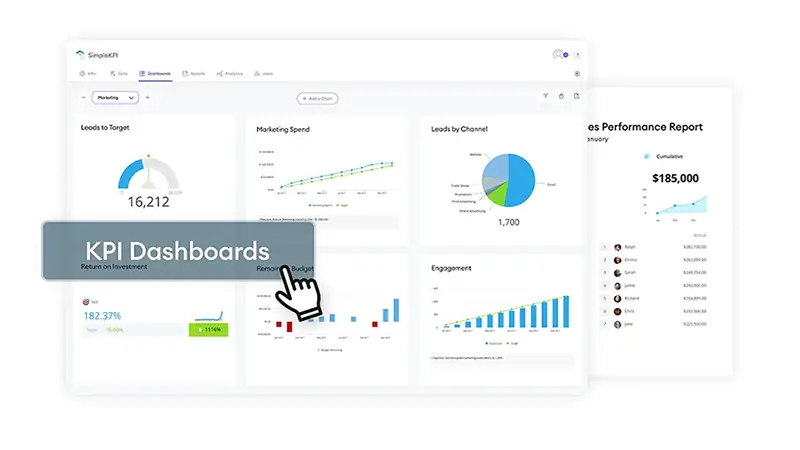
What is the difference between a KPI Dashboard and a KPI Report?
A KPI Dashboard is primarily a visualization tool. It employs a blend of graphs and charts to provide real-time performance of KPIs and Metrics that can be viewed at a glance.
A KPI Report focuses on an analytical interpretation of the underlying measures, using trend graphs and tabular formats to support the decision-making process.
The confusion
Reports and dashboards are often confused. They both share similar functions and advantages when it comes to visualizing KPIs. Understanding how each is applied in a business environment will help distinguish the variances.
The KPI Dashboard
Dashboards are better suited for operational or day-to-day performance monitoring than reports. By nature, they are designed to be understood at a glance. For example, a sales team may create a sales dashboard that is accessible to the entire team, allowing members to dip in and out to check their performance-often displayed in a league table format-against others. These metrics could include the number of wins, calls, or leads.
The KPI Report
In contrast, the KPI Report is usually where the analysis takes place. What makes up those KPI numbers? Why are there fluctuations in the data points? What caused this to happen? These questions are addressed by digging into the historical data.
Reports are also delivered at specific points for review, such as monthly sales meetings - where they would provide tabular data, offer historical context with trends, and interpretations of the metrics.
| Feature | KPI Dashboard | KPI Report |
|---|---|---|
| Primary Purpose | Real-time monitoring of live performance at a glance. | In-depth analysis and narrative review of performance over a period. |
| Data Type | Live, continuously updated data. | Historical data compiled over a fixed timeframe (weekly, monthly, quarterly). |
| Format |
|
|
| Best Suited For | Day-to-day decisions; team leads, managers, and operational staff. | Strategic reviews, board meetings, and stakeholder presentations. |
| Update Frequency |
|
|
| Interactivity | High — users can filter, drill down, and explore data dynamically. | Low — static snapshot; readers cannot interact with the data. |
| Audience | Frontline teams, department managers, and daily decision-makers. | Executives, board members, investors, and external stakeholders. |
| SimpleKPI Feature | Explore Dashboard Examples | Explore KPI Reporting |
Which should I choose?
There is no hard and fast rule for this. Use whichever comes more naturally to you. Generally, we see reports for analysis and Dashboards for day-to-day monitoring. However, both can be interactive and offer almost the same functionality—and there is no reason you can't employ both in your performance monitoring. After all, measuring something is better than measuring nothing at all.
Different KPI Report Types
As you've probably gathered by now, there are different types of KPI Reports, not just categorized by which business department but by their purpose.

The three types of KPI reports are analytical-based, operational, and strategic.
- Analytical Reports provide details behind the KPIs and can be used across all areas of the business. They are designed to answer questions arising from peaks and troughs in the KPI data. A static version of this report typically shows historical values, while interactive reports allow users to investigate the data by dynamically breaking down the individual metrics.
- Operational Reports are all about keeping a close watch on the day-to-day activities within a company.
- Strategic Reports aim to provide a clear and meaningful picture of a business's health and direction. These reports show the owners and shareholders how the company is performing against goals and objectives.
Creating a KPI Report
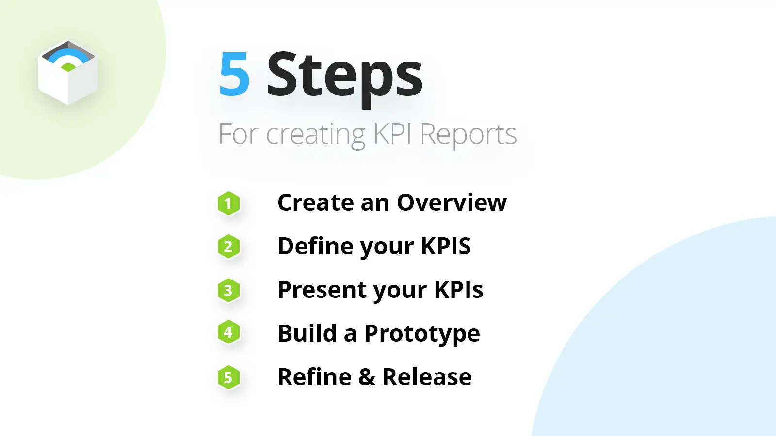
5 simple steps for creating effective KPI Reports.
1. Define Your Audience & Frequency
Before dragging a single chart onto a canvas, decide who this report is for. An executive board needs a monthly high-level summary of financial health, while a sales team needs a weekly (or daily) breakdown of pipeline activity. Matching the report's depth to the audience's attention span is step one.
2. Select Key Metrics (Less is More)
Resist the urge to include every available data point. Select 5-7 "North Star" metrics that directly align with the reader's goals. If you are reporting to marketing, focus on CAC and Conversion Rate; if to finance, focus on MRR and Burn Rate. Use our KPI Generator if you are unsure which metrics fit best.
3. Choose the Right Visualizations
Data storytelling matters. Don't use a table when a trend line would instantly show growth. Use bar charts for comparisons, line charts for trends over time, and simple "big number" widgets for hitting targets. Avoid complex 3D charts or clutter that forces the reader to do mental math.
4. Add Context & Analysis
A report without context is just a spreadsheet. Always compare current performance against past performance (e.g., "up 12% vs last month") or against a target (e.g., "85% of goal"). Add a short written summary explaining why the numbers moved—this adds the value that automation alone cannot provide.
5. Automate Distribution
The biggest friction point in reporting is manual compilation. set up your KPI software to automatically email the report PDF or send a Slack summary at the same time every week. Consistency builds trust, and automation ensures the report arrives even when you are busy.
Keep design simple
When designing a KPI report, consider these four essential tips to make them easy to understand, look great and fulfill their purpose:
- Highlight Key Information: Use a single highlight color to draw attention to important data points or trends. For example, stick to highlighting positive performance in green and negative trends in red.
- Avoid color overload: Go for clean designs, lots of white space and a limited number of consistent colors. (Sticking to brand colors works well)
- Consider Color Blindness: Ensure your color choices are accessible to those with color vision weaknesses. This can be done by testing your reports against accessibility guidelines.
- Don’t Chart everything: Sometimes, it’s far better to break reports up rather than try to track lots of objectives on a single report.
Watch: How to Create a KPI Report in SimpleKPI
How to Create a KPI Report: Step-by-step video guide
See how easy it is to build a clear, actionable KPI report in SimpleKPI. This quick 3-minute walkthrough covers everything from selecting your metrics to sharing results with your team.
Distributing a KPI Report
Distributing KPI reports is just as important as creating them. Getting the right insights to the right people ensures your hard work translates into real results.

Even the most insightful report or dashboard is only valuable if it reaches its intended audience. Sharing KPI reports boosts communication, motivation, and productivity across teams. Project management is a great example-distributing reports keeps stakeholders and staff informed about progress and outcomes, helping everyone understand the impact of their actions.
Reports can be distributed as static documents, often shared via email or in meetings, though these may quickly become outdated due to manual collation. Live reports, on the other hand, are delivered through dashboards or web-based formats, making them accessible anytime and always up to date.
Leveraging live reporting not only provides decision-makers with reliable, real-time data but also reduces manual effort and the risk of errors. Ultimately, the most effective KPI strategies combine smart data collection, clear visualization, and seamless distribution.
KPI Reporting Examples
We've gathered practical KPI Report examples across different domains like operations, manufacturing, and marketing. These examples offer valuable insights into measuring success and making informed decisions.
The Operational Sales Reports
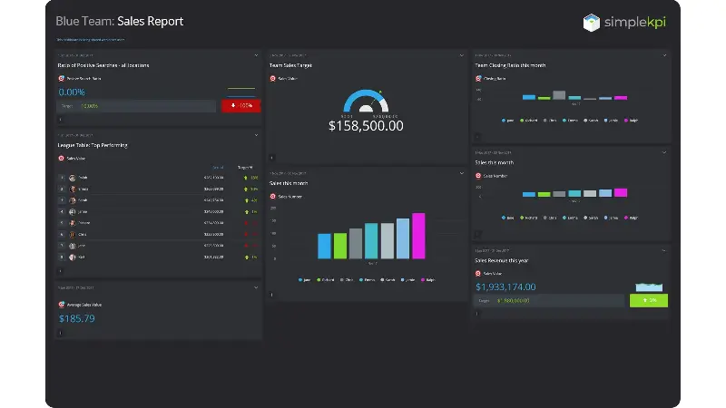
Preview this Operational Sales Report Example.
Good sales leadership understands that reporting is critical for determining whether you're on course to hit monthly or weekly targets. Which of your sales teams is producing the most wins? And which are the big closers? Sales efficiency is often tracked by presenting real-time sales information in league tables to show how each member is performing.
Strategic Organizational Reports
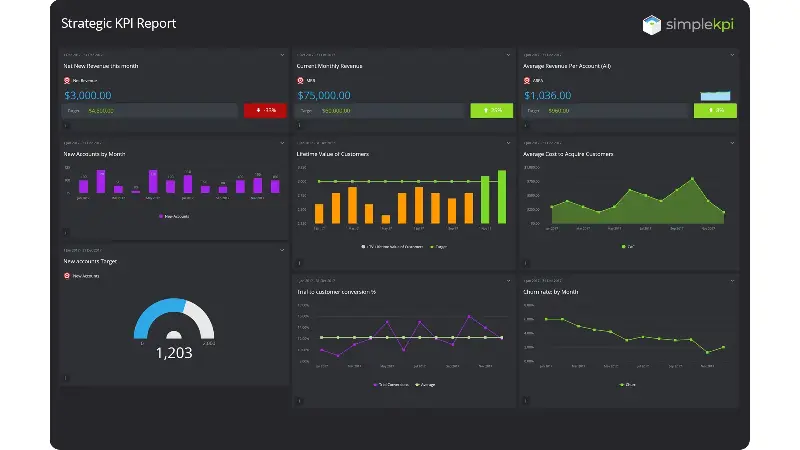
Preview this Strategic SaaS Report Example.
Organizations often set annual business objectives, such as increasing growth by 20%, reducing overheads, or increasing market share. A report showing how the company is performing against the objectives galvanizes the whole company to direct its efforts toward those goals.
Manufacturing Operational Reports
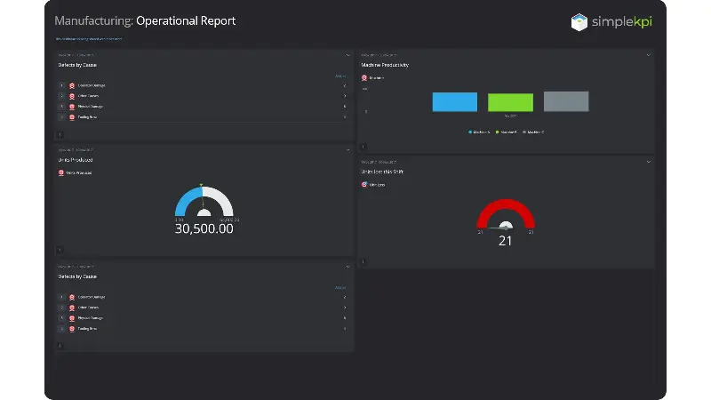
Preview this Manufacturing Operational Report.
Accurate and timely manufacturing reports are vital in maximizing productivity. Managers are provided the information they need to make decisions that keep production lines running, such as machine productivity, the units produced or even lost, and the cause.
Marketing Strategic Reports
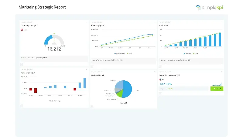
Preview this Marketing Strategic Report example.
A strategically focused marketing report can determine whether all your hard work is paying off. Are we growing market share? Are we reducing marketing spend and increasing customers? Are we increasing the number of leads, and what is our ROI? Or is a change or shift in strategy required?
These reports are also an excellent way to identify potential opportunities, such as a hike in conversion rates for a specific lead generation channel that may be worth allocating more budget.
3 Common KPI Reporting Mistakes to Avoid
Even with the best software, KPI reports can fail to drive action if they fall into common traps. Avoid these three mistakes:
- Creating "Data Dumps": Sending a 50-page PDF filled with hundreds of metrics guarantees your stakeholders won't read it. A report should be a curated summary, not a database export.
- Failing to Provide Context: Displaying that revenue was "$100,000" means nothing. Was the target $80,000 or $150,000? Always pair raw numbers with comparative data (e.g., vs last month) and visual targets.
- Reporting Without Recommendations: The biggest mistake is presenting the data and stopping there. A good KPI report should always include a short "Next Steps" or "Insights" summary detailing what action needs to be taken based on the numbers.
KPI Reporting Best Practice
Reporting brings about change. The very nature of reports challenges ingrained business processes and drives performance. But how do we avoid getting tied up in the complexity? How do we generate meaningful insights? And how do you get the most out of your reporting? Here are six best practice tips to avoid pitfalls.
- Set clear objectives. Create a clear brief for the report and stick to it. If it's a focused strategic report, keep it that way. Don't be tempted to 'bolt on' other metrics or KPIs just because it's convenient; build a separate report instead.
-
Keep it simple, really.
Don't fall into the trap of having the data dictate what to measure. An almost infinite number of KPIs or Metrics could be tracked. The secret is to focus on what is 'Key.' Restrict your initial report to a small number of KPIs and measure only what matters.
Based on our analysis of over 50,000 automated reports sent through SimpleKPI, reports containing fewer than 7 KPIs have a 40% higher open and read rate by stakeholders than those containing 10+. - Embrace technology and the cloud. It's time to ditch the spreadsheet and take your reporting to the next level. Cloud-based solutions designed for KPI Reporting are now more accessible than ever. They are a highly secure and cost-effective way to build and distribute your reports.
- Ensure data consistency. To demonstrate integrity in your reports, data accuracy and data is crucial. Nothing will ensure the short shelf life of a report than one that is misleading and relying on data that is out of date. Spend time testing various data-sets for their accuracy before committing to them.
- Coordinate with colleagues. Creating reports in isolation to the people who will use them is a recipe for disaster. Invite colleagues whose very responsibilities will be determined by the report to provide input on what needs measuring, when and how this will improve their processes.
-
Review regularly.
Businesses change, as do objectives and goals. What's important to track today might be obsolete tomorrow. Keeping regular maintenance and review points in the diary will help to keep your reports accurate, relevant, and beneficial to your business.
In most organizations, it’s the IT department who are responsible for creating and generating KPI and Analytics reports to support the business. You can find an interesting article here at Tech republic offering 8 Best practices for helping IT get the right information to the right people.
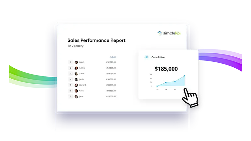
A KPI Report is a performance management tool for visualizing Key Performance Indicators (KPIs). They typically display this data using charts, graphs, and tabular formats, enabling businesses to track progress against specific targets, objectives, or goals. These reports serve as an essential resource for gaining insights and providing a mechanism for making informed, data-driven decisions.
A KPI Dashboard is primarily a visualization tool. It employs a blend of graphs and charts to provide real-time performance of KPIs and Metrics that can be viewed at a glance. A KPI Report focuses on an analytical interpretation of the underlying measures, using trend graphs and tabular formats to support the decision-making process.
A KPI checklist is a series of suggested points or steps to undertake when creating and subsequently evaluating your KPIs. Using a checklist ensures consistency in your approach to creating KPIs
KPI Reporting Software is designed to automate the collection of data, to visualize metrics, and then share the findings with colleagues or stakeholders. Unlike spreadsheets or manual processes which can introduce human error, the software is designed to eliminate or reduce this known problem and focus on insights and trend analysis, which in turn saves time and improves accuracy.
Monitoring KPIs involves first setting business goals or objectives and then tracking the relevant data (either manually or automatically) to monitor the KPIs against targets. This type of monitoring is normally continuous and focuses on key areas such as finance or operations.
A KPI performance summary is a more high-level overview of objectives and the progress to fulfilling those objectives. Normally a summary will highlight progress, trends, and outcomes without going into the raw data or metrics.
More References and Resources...
Industry Research & References
Harvard Business Review: The Predictive Power of KPIs
Exploiting the Predictive Power of KPIs. Learn why forward-thinking organizations are moving away from treating reports as "school report cards" for past performance.
MIT Sloan Management Review
The Future of Strategic Measurement: Enhancing KPIs With AI. A deep dive into how machine learning is automating KPI reporting and improving data accuracy.
Gartner: AI in Customer Service
91% of customer service leaders are under pressure to implement AI. Understand the macro trends driving the adoption of AI-powered automation and insights in business reporting.
From the SimpleKPI Blog...
Learn more about setting up and measuring your KPIs via helpful articles from our team:

by Stuart Kinsey
Stuart Kinsey writes on Key Performance Indicators, Dashboards, Marketing, and Business Strategy. He is a co-founder of SimpleKPI and has worked in creative and analytical services for over 25 years. He believes embracing KPIs and visualizing performance is essential for any organization to thrive and grow.