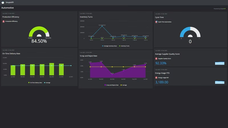
What is an Automotive Dashboard?
An automotive dashboard is a visual display that brings a plant's key performance indicators, such as production efficiency, cycle time, on-time delivery and scrap rates, together on one screen. It shows how the operation is running against target in charts and gauges, so anyone can see where things stand without waiting for the month-end pack. Plant managers use it to run the floor day to day. Directors use it to check that output, quality and cost are all moving in the right direction.
Overview
An automotive operation produces numbers all day long, but they scatter: production counts in one system, delivery performance in dispatch records, supplier defects in a quality log, energy usage in a utility bill nobody reads until it hurts. A dashboard puts them side by side, and the connections become visible. When supplier quality slips, scrap follows. When cycle time drifts, on-time delivery sags a few weeks later.
Most automotive dashboards fall into three broad types:
- Production dashboards track throughput: efficiency, cycle time, output by line or shift.
- Quality dashboards watch scrap, rework and supplier performance, usually against targets that get tighter every year.
- Delivery and cost dashboards cover the promises made to customers and what keeping them costs: on-time delivery, inventory turns, energy.
The example on this page mixes all three, which suits an operations lead who wants the whole plant legible in one place. If you'd like a broader menu of measures to choose from, this guide to 21 production KPIs covers the wider field.
Who benefits from this dashboard?
- Plant managers: efficiency, delivery and scrap in one view, so problems surface at the morning meeting instead of the month-end review.
- Production supervisors: cycle time and efficiency by line or shift show exactly where the day is being won or lost.
- Quality managers: Scrap and Reject Rate beside Supplier Quality Score separates process problems from inbound-parts problems.
- Directors and owners: delivery, inventory turns and energy usage tell the cost story a board meeting actually needs.
Dashboard Example Overview
The dashboard pictured here is a dark-themed automotive board built in SimpleKPI. It tracks seven KPIs, grouped around four questions:
- Are we producing efficiently? Production Efficiency and Cycle Time give the headline read on how well the line converts time and material into finished units.
- Are we keeping our promises? On-Time Delivery Rate measures the plant the way customers measure it, and in this industry they measure it constantly.
- Is quality holding? Scrap and Reject Rate shows what the process wastes. Supplier Quality Score shows what arrives already wrong.
- What is it costing us? Inventory Turns and Energy Usage cover the two costs that swell quietly while everyone watches output.
Seven KPIs is a deliberate number. A page crowded with charts is hard to read and easy to ignore, and the trends that matter get lost in the noise. Every chart here can be customized, and you can add your own KPIs to complement the ones provided.
Read Scrap and Reject Rate next to Supplier Quality Score. If scrap climbs while supplier scores hold steady, the problem is in your process, not your inbound parts.
Creating an Automotive Dashboard in SimpleKPI
-
Step 1 Map your production flow
Walk the route an order takes from raw material to dispatch and pick the measure that matters at each stage. If you're not sure where to start, these seven automotive KPIs for staying competitive are a sensible short list.
-
Step 2 Add your automotive KPIs
Create each KPI in SimpleKPI with its target and frequency. Tags keep things organized by line, shift or site. Plans include unlimited KPIs, so the list can grow with the plant.
-
Step 3 Connect your data
Feed numbers in through spreadsheet imports, integrations or the API. Production counts tend to arrive by shift, supplier scores weekly and energy monthly, and the dashboard updates as each lands.
-
Step 4 Build views for different audiences
A line-side board for the floor, a quality view for engineers, a delivery and cost summary for the monthly review. Same data, shaped for whoever is reading it.
-
Step 5 Share, review, adjust
Put the dashboard on a screen above the line, bring it to the morning meeting, and let scheduled KPI reports carry the numbers to people who won't log in. Kip, the built-in AI, can suggest targets and flag indicative benchmarks (AI estimates, not peer data) as your history builds. Retire anything nobody acts on.
List of Automotive KPIs
Every KPI on the example dashboard, with a workable starting target. Treat the targets as guidance; your own baseline beats a generic range.
| KPI Name | Typical Target | Description |
|---|---|---|
| Production Efficiency | 85% or above | Actual output as a share of what the line could produce at standard rate. The headline figure for how well the plant runs. |
| Inventory Turns | 6-12 per year | How many times inventory sells through in a year. Low turns mean cash sitting on shelves as parts and finished stock. |
| Cycle Time | Trending down | The time to complete one unit from start to finish. Watch the trend rather than the absolute number, which depends on what you build. |
| On-Time Delivery Rate | 95% or above | The share of orders delivered on the promised date. The number your customers judge you by. |
| Scrap and Reject Rate | Under 2% | Material and units lost to defects as a share of production. Every point here is margin spent making things twice. |
| Supplier Quality Score | Set from your baseline | A rating of inbound parts quality, however you score it. Falling scores show up later as scrap, rework and line stops. |
| Energy Usage | Trending down per unit | Energy consumed, best tracked per unit produced. Rising usage against flat output points at idling equipment or process drift. |
Why Automotive Dashboards Matter
Margins in automotive are thin, and the costs that erode them are quiet. Scrap creeps up a fraction at a time. Energy bills rise while output stays flat. Inventory builds because it always does. None of these announce themselves, and each is easy to miss in a monthly spreadsheet. On a dashboard, plotted as trends, they're hard to ignore.
The deeper value is in the connection between leading and lagging numbers. On-time delivery is a lagging measure; by the time it disappoints a customer, the cause is weeks old. A dashboard that shows supplier quality, cycle time and efficiency alongside delivery lets a plant manager act on the early signals while there's still time to protect the promise.
Visible numbers also change behavior on the floor. When the line can see its own efficiency and scrap figures in real time, the conversation shifts from whose fault last month was to what to fix this shift. One screen, seven numbers, and the state of the plant is obvious to anyone who looks up. That's the point.
Build this dashboard yourself with SimpleKPI's KPI dashboards, and pay one flat price for unlimited users and KPIs.