What is a Manufacturing Dashboard?
A manufacturing dashboard is a performance and efficiency tool that tracks the productivity of a production process, bringing KPIs such as production rate, units created and defects together on one screen. Production volumes and capacity are typically monitored daily for machinery, production lines or entire factories, then visualized on charts and gauges that update as the data arrives. Production managers watch it to keep lines running at their best. For executives, it is the quickest check that capacity, cost and output are staying in proportion.
Overview
Manufacturing depends on a long list of factors: operator expertise, capacity, staffing levels, volumes, planning, contingency. Each has to work as part of the whole, yet the numbers that describe them usually live in separate systems. A dashboard puts them side by side, and the side-by-side view is where the useful information hides. The number of operators relative to production volume, for instance, becomes a staffing and efficiency figure that helps with forward planning.
Trend analysis earns its keep here too. Seasonal or historically slow production periods show up clearly, which helps with maintenance scheduling, volume pricing and marketing. Merging defect counts with their causes, including customer complaints and returns, pinpoints problems in production or product design that would otherwise be pure guesswork.
Who benefits from this dashboard?
- Plant and production managers: watch line efficiency and output against plan, and get alerted when volumes drift outside set thresholds.
- Operators: real-time feedback on the operating levels of machinery, right there on the floor display.
- Senior executives: detailed production information that feeds directly into forecasting and capacity planning.
- Quality and process engineers: Defects by Cause says where to look first, so investigations start with evidence instead of hunches.
Dashboard Example Overview
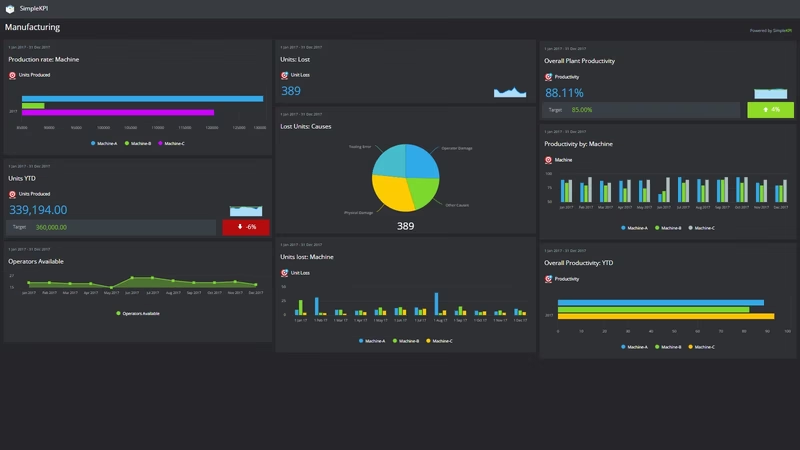
The dashboard pictured here tracks seven KPIs across a production operation, grouped around four questions:
- How much are we making? Production Rate and Units created give the headline output figures, hour by hour and period by period.
- What are we losing? Units Lost counts what never made it to finished stock, and Defects by Cause breaks the failures down so the biggest problem is obvious.
- How well are we running? Machine / Plant Productivity and Operator Productivity separate the performance of the equipment from the performance of the people. The fixes for each are completely different, which is why they deserve separate charts.
- How do our sites compare? Productivity by location puts every plant on the same scale, so the strongest site becomes a reference point rather than a rumor.
Seven numbers is a deliberately short list. Each one can be counted from records a plant already keeps, and together they cover the operation from raw output to root cause.
Chart Units Lost next to Defects by Cause. When losses rise but no single cause rises with them, the problem usually sits in handling or changeovers, not the line itself.
Creating a Manufacturing Dashboard in SimpleKPI
-
Step 1 Map your production process
Walk the process from raw material to dispatch and note where output, loss and delay actually happen. Pick one measure at each point. If you want a longer menu to choose from, this guide to 21 production KPIs covers the common ones.
-
Step 2 Add your manufacturing KPIs
Create each KPI in SimpleKPI with a target and an entry frequency. Tags keep everything organized by line, shift or site. Plans include unlimited KPIs, so a second production line never turns into a pricing conversation.
-
Step 3 Connect your data
Bring data in by spreadsheet import, integration or the API. Shift totals tend to arrive daily and cost figures monthly; the dashboard updates as each lands.
-
Step 4 Build views for different audiences
A floor display for operators, a line-by-line view for production managers, a capacity summary for the board. Nobody has to sit through numbers that aren't theirs.
-
Step 5 Share, review, adjust
Put the dashboard on a screen above the line, bring it to production meetings, and let scheduled KPI reports carry the numbers to people who won't log in. Once some history builds, Kip, the built-in AI, can suggest targets and indicative benchmarks (AI estimates, not peer data) as a starting point. Drop any KPI that never changes a decision.
List of Manufacturing KPIs
The table below covers every KPI on the example dashboard. Targets here are general guidance rather than benchmarks; your own baseline is the number to beat.
| KPI Name | Typical Target | Description |
|---|---|---|
| Production Rate | Set against planned capacity | Units produced per hour or per shift. The pulse of the operation, and the first number to move when something goes wrong upstream. |
| Units created | On plan or above | Total finished units this period. Read next to Production Rate to see whether a good hour turned into a good week. |
| Units Lost | Trending down | Units scrapped, damaged or otherwise lost between raw material and finished stock. Every one is paid-for material with no revenue attached. |
| Machine / Plant Productivity | Set from your baseline | Output relative to available machine or plant capacity. A falling figure against steady demand usually points at maintenance or changeover time. |
| Operator Productivity | Consistent shift to shift | Output per operator or per labor hour. Big swings between shifts are a staffing or training signal worth investigating. |
| Productivity by location | Narrowing gap between sites | The same productivity measures compared across plants. The aim is not to rank sites but to find what the best one does differently. |
| Defects by Cause | No single dominant cause | Defect counts broken down by root cause. The breakdown matters more than the total, because it tells you which fix pays back first. |
Why Manufacturing Dashboards Matter
A production report tells you what happened. A screen above the line tells you what is happening, and that difference changes behavior. A slow hour gets noticed in the hour, not at the end of the month, and small corrections stay small.
The deeper value is in what leads what. Monthly output is a lagging number; by the time it disappoints, the causes are weeks old. Production Rate, Units Lost and Defects by Cause move early enough to act on, so a manager watching them beside the monthly totals can step in while the month can still be saved. The same logic reaches beyond the plant walls, which is why many teams track a few supply chain KPIs alongside their production set.
Comparison does quiet work too. When Productivity by location sits beside the plant-level numbers, the question shifts from which site won to what the winning site is doing differently, and that is a far more useful argument to have. Seven KPIs will not answer every question a plant faces, but they will show you where to ask the next one. That is what a dashboard is for.
Build this dashboard yourself with SimpleKPI's KPI dashboards, start from the manufacturing KPI template, and pay one flat price for unlimited users and KPIs.