What is a Supply Chain Dashboard?
A supply chain dashboard is a visual display that brings the key measures of a supply chain, such as inventory, order fulfillment, delivery performance and cash flow, together on one screen. It shows each KPI against target in charts, gauges and tables, so anyone can see where the operation stands without chasing reports. Supply chain managers use it to run the week. Executives check that stock, service and cash are moving the right way.
Overview
Supply chain data is scattered by nature. Stock levels sit in the warehouse system, orders in the ERP, delivery confirmations with the carrier, receivables in accounting. A dashboard consolidates every stage of the chain into one view, and the connections show. When inventory turnover slows, the cash-to-cash cycle stretches a few weeks later.
Most supply chain dashboards concentrate on one of three areas:
- Service dashboards track the promises made to customers: fill rate, on-time delivery, perfect orders.
- Inventory dashboards watch stock, from turnover and velocity to the value sitting on shelves.
- Working capital dashboards follow the money through cost of goods, receivables and the cash-to-cash cycle.
The example on this page combines all three: the full chain, order to cash, on one screen.
Who benefits from this dashboard?
- Supply chain managers: the whole operation in one view, with problems visible while they're still cheap to fix.
- Procurement teams: cost of goods and inventory figures show whether buying decisions are paying off or quietly building a stockpile.
- Logistics and warehouse teams: throughput, fulfillment cycle times and on-time delivery counts measure the work they do every day.
- Finance and executives: cash-to-cash cycle time, DSO and receivables put operational performance in the language a board reads.
Dashboard Example Overview
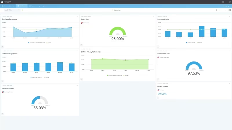
The dashboard pictured here is a light-themed supply chain board built in SimpleKPI. It tracks twenty KPIs, grouped around four questions:
- Are we keeping our delivery promises? Fill Rate, Service Rate, On-Time Delivery Performance and Perfect Order Rate give the headline service figures, fed by the raw counts of complete, on-time and perfect orders.
- How fast do orders move? Time from order to delivery covers what the customer feels, while fulfillment cycle time and total throughput measure the pipe itself.
- Is stock working or sitting? Inventory Turnover, Inventory Velocity and Average Inventory Value show whether the warehouse is a flow or a museum, with Cost of Goods Sold keeping the picture priced.
- Where is the cash? Cash-to-Cash Cycle Time, Days Sales Outstanding, accounts receivable and Average Daily Sales track the money financing everything above.
When a fill rate drifts, the raw counts behind it show whether the cause is more orders or fewer completes, and KPI analytics will show when the drift started. Every number comes from records an operations team already keeps.
Read Fill Rate, On-Time Delivery Performance and Perfect Order Rate as a set. Orders can ship complete but late, or on time but short, and each pattern points at a different fix.
Creating a Supply Chain Dashboard in SimpleKPI
-
Step 1 Map your chain end to end
Write down the stages an order passes through, from purchase order to paid invoice, and pick the measure that matters at each one. If the list gets long, start with these KPIs for modern supply chain challenges and grow from there.
-
Step 2 Add your supply chain KPIs
Create each KPI in SimpleKPI with its target and frequency. Tags keep things organized by site, supplier or product line. Plans include unlimited KPIs, so raw counts go in alongside the ratios they feed.
-
Step 3 Connect your data
Feed numbers in through spreadsheet imports, integrations or the API. Warehouse and delivery figures tend to arrive daily, financials monthly, and the dashboard updates as each lands.
-
Step 4 Build views for different audiences
A service board for the warehouse wall, an inventory view for procurement, a cash summary for finance. Same data, different framing, and nobody wades through numbers that aren't theirs.
-
Step 5 Share, review, adjust
Put the dashboard on a screen, bring it to the weekly ops review, and let scheduled KPI reports carry the numbers to people who won't log in. Kip, the built-in AI, can suggest targets and flag indicative benchmarks (AI estimates, not peer data) as your history builds. Retire anything nobody acts on.
List of Supply Chain KPIs
The table below covers every KPI on the example dashboard, named as they appear on the board. Targets are general guidance; your baseline beats any generic range.
| KPI Name | Typical Target | Description |
|---|---|---|
| Cash-to-Cash Cycle Time | Trending down | Days between paying suppliers and collecting from customers. The best single summary of how hard working capital works. |
| Service Rate | 95% or higher | The share of customer demand met as promised. Your chain from the customer's side of the counter. |
| Inventory Turnover | Set from your baseline | How many times stock sells through in a period. Too sector-dependent for a universal target; watch your trend. |
| Inventory Velocity | Trending up | How quickly stock moves from receipt to sale. Slowing velocity warns that turnover will follow. |
| Fill Rate | 95-98% | The percentage of order lines shipped complete first time. The gap to 100% is backorders and apologies. |
| On-Time Delivery Performance | 95% or higher | The share of deliveries arriving when promised. Late deliveries cost trust faster than short ones. |
| Perfect Order Rate | Trending up | Orders delivered complete, on time, undamaged and correctly documented. The strictest service measure here. |
| Days Sales Outstanding (DSO) Rate | Under 45 days | Average days to collect payment after a sale. Every extra day is stock financed from your own pocket. |
| Time from order to delivery | Trending down | Elapsed time from order placed to goods received. The lead time your customer actually experiences. |
| Order Fullfillment Cycle Time | Trending down | The internal slice of lead time, order to dispatch. Where process fixes show up first. |
| Cost of Goods Sold (COGS) | Set against budget | Direct cost of goods sold in the period; read next to sales to keep margins honest. |
| Average Inventory Value | Stable against sales | Stock value on hand, averaged over the period. Rising value on flat sales is capital asleep on shelves. |
| Total Throughtput | Set against capacity | Units moved through the operation in a period; context for the cycle times. |
| Number of Complete Orders | Rising with order volume | Orders shipped with every line filled. The numerator behind fill and service rates. |
| Total Orders SC | Set against forecast | All orders received in the period. The demand baseline the board divides by. |
| Number of on-time deliveries | Tracking total deliveries | Deliveries arriving on or before the promised date; feeds On-Time Delivery Performance. |
| Total Deliveries SC | Set against forecast | All deliveries made in the period; pairs with the on-time count. |
| Number of perfect orders | Growing with volume | Orders with nothing wrong at all: complete, punctual, undamaged, correctly billed. |
| Accounts Outstanding Recievable | Trending down | Money owed by customers at period end. Goods already shipped but not yet paid for. |
| Average Daily Sales | Stable or growing | Sales averaged per day; used with receivables for DSO and as a quick read on demand. |
Why Supply Chain Dashboards Matter
Supply chains fail quietly at first. Stock creeps up, a supplier slips a day, receivables stretch, and every system reports that its own corner is fine. By the time the failure is loud, a missed order or a cash squeeze, the cause is weeks old. A dashboard that puts service, stock and cash on one screen shortens the gap between cause and notice. Most of the damage lives in that gap.
It also settles arguments. When the numbers sit in separate systems, meetings get spent reconciling versions of the truth. One shared board means the conversation starts at "what do we do about it" instead of "whose figure is right".
On-time delivery can look excellent while inventory quietly doubles to make it possible. Cash-to-Cash Cycle Time next to Service Rate keeps both promises, to the customer and to the balance sheet, in the same frame. Twenty numbers, one screen, and the whole chain is legible at a glance.
Build this dashboard yourself with SimpleKPI's KPI dashboards, and pay one flat price for unlimited users and KPIs.