What is an Education Dashboard?
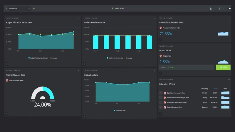
An education dashboard is a visual display that brings a school's key performance indicators, such as enrollment, graduation rate, test scores and teacher-student ratio, together on one screen. It shows each measure against target in charts and gauges, so anyone can see where the institution stands without pulling exports from three different systems. Principals use it to run the school term by term. Administrators and district officials use it to compare performance and put resources where they're needed.
Overview
Schools generate plenty of data, but it rarely sits in one place. Enrollment lives in the student information system, test scores in the assessment platform, budgets in finance software, and parental engagement in a spreadsheet someone updates when they remember. A dashboard collects those numbers into a single view, and the connections start to show. When satisfaction dips in one term, retention usually wobbles the following year.
Most education dashboards fall into three broad types:
- Outcome dashboards track graduation rates, test scores and dropout rates. These are the numbers boards and inspectors ask about first.
- Operational dashboards cover teacher-student ratios, budget per student and professional development hours, the resourcing side of the institution.
- Engagement dashboards watch satisfaction, parental involvement and digital learning adoption. Softer measures, but they tend to move before the hard ones do.
The example on this page mixes all three, which suits a principal or administrator who wants the whole institution on one screen.
Who benefits from this dashboard?
- Administrators and school leaders: enrollment, budget per student and retention in one view. That's most of what a board meeting needs.
- Principals and department heads: test scores and staffing ratios by department show where support is needed while the academic year can still be adjusted.
- District officials: the same measures across several schools, on the same definitions, so comparisons actually mean something.
- Teachers: visible class and cohort trends beat end-of-year surprises, and professional development hours stop being a guess.
Dashboard Example Overview
The dashboard pictured here is a dark-themed education board built in SimpleKPI. It tracks twelve KPIs, grouped around four questions:
- Are students coming and staying? Student Enrollment Rate, Retention Rate and Dropout Rate cover the flow of students in, through and out of the institution.
- Are they succeeding? Graduation Rate and Average Test Scores give the headline academic results.
- Are we resourcing them properly? Teacher-Student Ratio, Budget Allocation per Student and Professional Development Hours show whether staffing, money and training keep pace with student numbers.
- Is the wider experience working? Student Satisfaction Score, Parental Involvement Index, Digital Learning Adoption Rate and Physical Education Minutes per Week track the parts of school life that don't show up in test scores until later.
Nothing here needs a data team. Every measure can be counted from records a school already keeps: enrollment registers, assessment results, timetables and budget lines. A few, like satisfaction and parental involvement, are qualitative measures turned into scores. If that feels awkward, this guide to qualitative KPIs covers how to score them honestly.
Put Student Satisfaction Score, Retention Rate and Dropout Rate on the same view. Satisfaction usually moves first, which gives you a term's warning before the other two follow.
Creating an Education Dashboard in SimpleKPI
-
Step 1 Decide what matters this year
Write down the questions your board, district or inspectors will actually ask, then pick the measure that answers each one. Twelve KPIs is plenty. If the list keeps growing, this case for tracking fewer KPIs is worth ten minutes.
-
Step 2 Add your education KPIs
Create each KPI in SimpleKPI with a target and a frequency. Tags keep things organized by campus, department or year group. Every plan includes unlimited KPIs, so nothing forces the list shorter than it should be.
-
Step 3 Connect your data
Feed numbers in through spreadsheet imports, integrations or the API. Test results might land three times a year while enrollment updates weekly. Mixed frequencies are fine; the dashboard refreshes as each number arrives.
-
Step 4 Build views for different audiences
A results summary for the board, an operational view for the leadership team, a department view for faculty heads. Same data, different framing, and nobody wades through numbers that aren't theirs.
-
Step 5 Share, review, adjust
Bring the dashboard to leadership meetings, and let scheduled KPI reports carry the numbers to board members and district contacts who'll never log in. Kip, the built-in AI, can suggest targets and indicative benchmarks (AI estimates, not peer data) as your history builds. Retire any KPI nobody acts on.
List of Education KPIs
The table below covers every KPI on the example dashboard. Targets are general guidance. Sensible values differ between an elementary school and a university, so treat your own baseline as the real benchmark.
| KPI Name | Typical Target | Description |
|---|---|---|
| Student Enrollment Rate | Stable or growing | The percentage of available places filled each academic year. Tracks growth and flags a declining intake early. |
| Dropout Rate | Trending down | The percentage of students who leave before completing their program. The most expensive number on this board. |
| Graduation Rate | Improving year over year | The percentage of students who complete their program. The headline measure of academic success. |
| Average Test Scores | At or above prior year | Mean performance across subjects and cohorts. Break it down by department to see where support is needed. |
| Teacher-Student Ratio | Set from your baseline | Average students per teacher. A rough proxy for how much individual attention each student can get. |
| Retention Rate | Stable or improving | How many students return from one academic year to the next, as a percentage. Reads best next to satisfaction. |
| Budget Allocation per Student | In line with plan | Financial resources allocated per student. Keeps spending tied to student numbers rather than habit. |
| Parental Involvement Index | Trending up | A scored measure of parental participation in school activities. Slow to collect, quick to pay back. |
| Digital Learning Adoption Rate | Growing term over term | The share of students and teachers actively using digital learning tools. Measure use, not licenses bought. |
| Student Satisfaction Score | Trending up | Survey-based measure of the student experience. An early warning light for retention and dropout. |
| Professional Development Hours | On plan for the year | Time teachers spend on training. Consistency across the staff matters more than the total. |
| Physical Education Minutes per Week | At or above your policy minimum | Weekly PE time per student. A well-being measure, and a compliance one in many districts. |
Why Education Dashboards Matter
Education runs on lagging indicators. Graduation rates and test scores arrive once a year, long after the decisions that shaped them. A dashboard can't speed the results up, but it can surround them with leading measures: satisfaction, involvement, ratios, adoption. Those move monthly or each term, while there's still time in the year to respond.
It also settles arguments. When enrollment, budget per student and staffing ratios sit on the same screen, resource conversations start from shared numbers instead of competing anecdotes. That's a quieter benefit than any chart, and often a bigger one.
Visible numbers change behavior in schools the same way they do everywhere else. When the leadership team reviews the same twelve KPIs every month, data collection stops being a chore performed for inspectors and becomes part of how the school runs. One screen, twelve numbers, and the year is legible while there's still time to change it.
Build this dashboard yourself with SimpleKPI's KPI dashboards, and pay one flat price for unlimited users and KPIs.