What is a Public Sector Dashboard?
A public sector dashboard is a visual display that brings a government organization's key performance indicators, such as budget spend, cost per service, citizen satisfaction and project delivery, together on one screen. It shows performance against target in charts and gauges, so a department head or council member can see where things stand without waiting for the quarterly pack. Officials use it to run services day to day. Elected members use it to check that public money is producing public value.
Overview
Public money comes with an audience. Every service gets judged twice: on whether it worked, and on what it cost. The catch: those numbers live in different systems. Finance in the ledger, complaints in a case tool, project status in the program office's spreadsheets. A dashboard puts them side by side, where the connections show.
Most public sector dashboards lean one of three ways:
- Service performance boards track delivery: turnaround times, complaint response, cost per service.
- Financial stewardship boards follow the money, from total budget through infrastructure spend to revenue per capita.
- Project delivery boards watch whether initiatives land on time and on budget.
This example mixes all three: one honest view rather than three flattering ones.
Who benefits from this dashboard?
- Elected officials: budget, satisfaction and project delivery in one view. Most of what a scrutiny committee asks.
- Department heads: turnaround times, complaint response and cost per service for the services they run, in time to act.
- Finance teams: infrastructure spend against budget and revenue per capita, without assembling a month-end pack by hand.
- Communications teams: a clear record of what the authority has delivered, ready to share with citizens.
Dashboard Example Overview
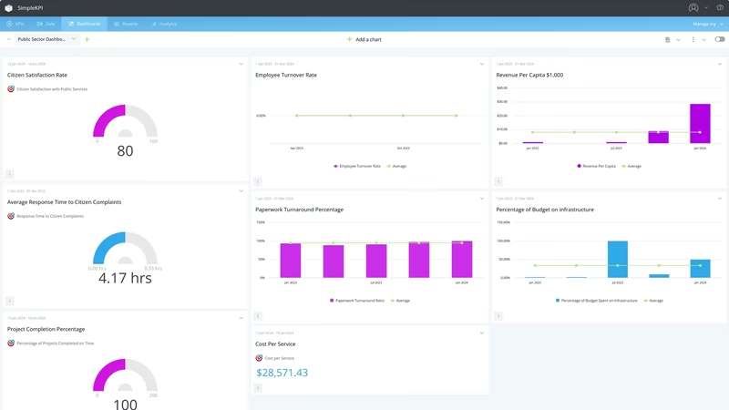
The dashboard pictured is a light-themed board built in SimpleKPI, eight charts and gauges tracking nine headline KPIs. They group around five questions:
- Are services running efficiently? Turnaround Times for Getting Paperwork Approved, Cost per Service and Response Time to Citizen Complaints cover the everyday machinery citizens touch.
- Where is the money going? Percentage of Budget Spent on Infrastructure and Revenue per Capita put spending in proportion to the budget and population.
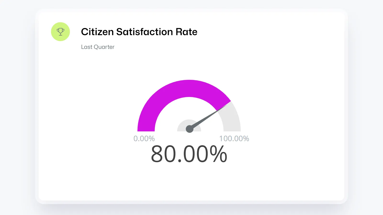
- Do citizens feel served? Citizen Satisfaction with Public Services, taken from survey returns, is the closest thing an authority has to a headline result.
- Are projects landing? Percentage of Projects Completed on Time and Percentage of Projects Completed within Budget keep the capital program honest.
- Is the workforce stable? Employee Turnover Rate, because staffing problems become service problems, later.
Behind those nine sit the raw totals that feed them: paperwork submitted and approved, citizens surveyed and satisfied, complaints received and answered on time. Each headline figure is a ratio built from these counts. This guide to creating KPIs with formulas shows how to set them up.
Read Citizen Satisfaction next to Response Time to Citizen Complaints. Satisfaction usually follows responsiveness with a lag, so a slipping response time is the early warning, not the survey.
Creating a Public Sector Dashboard in SimpleKPI
-
Step 1 Map your services
List the services the authority delivers and the outcome each one owes the public, then pick the measure that shows whether it's arriving. A short list watched weekly beats a wall of numbers nobody reads.
-
Step 2 Add your public sector KPIs
Create each KPI in SimpleKPI with its target and frequency. Tags keep things organized by directorate, department or ward. Plans include unlimited KPIs, so raw counts and ratios can all live in one place.
-
Step 3 Connect your data
Feed numbers in through spreadsheet imports, integrations or the API. Complaint and paperwork counts tend to arrive weekly, finance monthly, surveys quarterly. The dashboard updates as each lands.
-
Step 4 Build views for different audiences
A summary view for committee meetings, an operational view for each department, a public screen for the foyer. Same data, different framing. For a skeptical chamber, this piece on telling a story with KPIs is worth ten minutes.
-
Step 5 Share, review, adjust
Bring the dashboard to service reviews and let scheduled KPI reports carry the numbers to members who won't log in. Kip, the built-in AI, can suggest targets and flag indicative benchmarks (AI estimates, not peer data) as history builds. Retire any KPI that never changes a decision.
List of Public Sector KPIs
Every KPI on the example dashboard, nine headline measures first, then the raw totals that feed them. Targets are general guidance; your baseline beats any generic range.
| KPI Name | Typical Target | Description |
|---|---|---|
| Turnaround Times for Getting Paperwork Approved | Trending down | Average time from submission to sign-off. The friction citizens remember longest. |
| Percentage of Budget Spent on Infrastructure | Set from your capital plan | Infrastructure spend as a share of total budget. |
| Citizen Satisfaction with Public Services | Trending up | Satisfied citizens as a share of those surveyed. The figure most likely to be quoted back at you. |
| Employee Turnover Rate | 10-15% or lower | Leavers as a share of the workforce; resurfaces later as slower services. |
| Cost per Service | Stable or falling | Total cost of provision divided by services delivered. The core efficiency figure. |
| Revenue per Capita | Set from your baseline | Total revenue divided by population; keeps year-on-year comparisons fair. |
| Response Time to Citizen Complaints | 90%+ within target | The share of complaints answered inside the published target time. |
| Percentage of Projects Completed on Time | 80-90% | On-time completions as a share of all projects. Late projects attract outsized attention. |
| Percentage of Projects Completed within Budget | 80-90% | Projects closing at or under approved budget. Read beside the on-time figure. |
| Total number of paperwork approved | Keeping pace with submissions | Approvals completed in the period; the throughput half of turnaround. |
| Total number of paperwork submitted | Set from your baseline | Applications received; the demand that sets the workload. |
| Total amount spent on infrastructure | Within the capital budget | Actual infrastructure spend; numerator for the budget percentage. |
| Budget PS | Set annually | Total budget for the period; the denominator behind the money KPIs. |
| Total number of satisfied citizens | Trending up | Survey respondents reporting satisfaction. |
| The total number of citizens surveyed | Large enough to trust | Sample size. Small samples make the satisfaction gauge twitchy. |
| Total number of employees who left | Trending down | Leavers in the period; feeds the turnover rate. |
| Total cost of providing service | Set from your baseline | Full delivery cost, staff and overheads included. |
| Total number of services provided | Steady or rising | Services delivered; denominator for cost per service. |
| Total revenue PS | On budget | Revenue collected from taxes, fees and charges. |
| Total population | Updated yearly | Population served; denominator for per-capita figures. |
| Total number of complaints responded to within the target time | Close to the total received | Complaints answered inside the target window. |
| Total number of complaints received | Trending down | Every complaint logged. A falling count is a result in itself. |
| Total number of projects completed on time | Set from your delivery plan | On-time completions, counted rather than calculated. |
| Total Number of Projects PS | Matches your project register | The portfolio count; denominator for the on-time percentage. |
| Total number of projects completed within budget PS | Set from your delivery plan | Projects closed at or under their approved budget. |
| Total number of projects PS | Matches your project register | The project count behind the within-budget percentage. |
Why Public Sector Dashboards Matter
Trust is the currency here. Citizens rarely see the work behind their services; they see outcomes, and they hear about failures. A dashboard is a clear, concise way to show a constituency how initiatives, projects and budgets are performing, and visible numbers do more for confidence than any press release.
There's operational value in the early warnings too. Satisfaction and turnover are lagging numbers; by the time they disappoint, the cause is months old. The counts underneath move first: backlogs grow, complaint response slips, a project misses a milestone. Showing raw totals beside headline ratios lets managers act while acting is still cheap.
And the budget stays in the picture. Pairing Cost per Service with the satisfaction and delivery figures keeps efficiency honest; cheaper services citizens dislike are not a saving. One screen, nine headline numbers, and the whole authority is legible at a glance. That legibility is the point.
Build this dashboard yourself with SimpleKPI's KPI dashboards, and pay one flat price for unlimited users and KPIs.