What is a Non-Profit Dashboard?
A non-profit dashboard is a visual display that brings an organization's key measures, such as donations, donor retention, volunteer numbers and program spending, together on one screen. It shows performance against target in charts and gauges, so staff, trustees and funders can see where things stand without waiting for the annual report. Directors use it to run the organization week to week. Boards and donors use it to check that money is going where it was promised.
Overview
A non-profit answers to more people than most businesses do. Donors want to know their gifts made a difference, volunteers want their hours to count, funders want evidence, and the board wants all of it summarized by Thursday. But the numbers live in different places: donations in the fundraising platform, volunteers in a spreadsheet, expenses in the accounts. A dashboard puts them side by side, and the connections become visible. When volunteer satisfaction slips, retention follows a few months later. When web visitors fall, new donors fall soon after.
Most non-profit dashboards concentrate on three areas:
- Funding covers donations, donor retention and conversion: the money coming in, and how reliably it repeats.
- People means volunteers: recruitment, satisfaction and retention, which set your capacity to deliver anything at all.
- Stewardship is the spending side: program, fundraising and admin costs, plus the efficiency ratios funders judge you on.
The example on this page covers all three.
Who benefits from this dashboard?
- Executive directors: donations, volunteers and spending in one view, so the leadership meeting starts from shared numbers instead of competing anecdotes.
- Fundraising managers: watch conversion, new donors and fundraising efficiency together, and catch a fading campaign while there is still time to adjust it.
- Volunteer coordinators: retention and satisfaction figures show whether people feel useful. Satisfaction is a soft measure, but it can be tracked properly; this guide to qualitative KPIs covers how.
- Boards and funders: program efficiency and overhead at a glance. Sharing the dashboard shows the organization is accountable and transparent, and that builds trust faster than any brochure.
Dashboard Example Overview
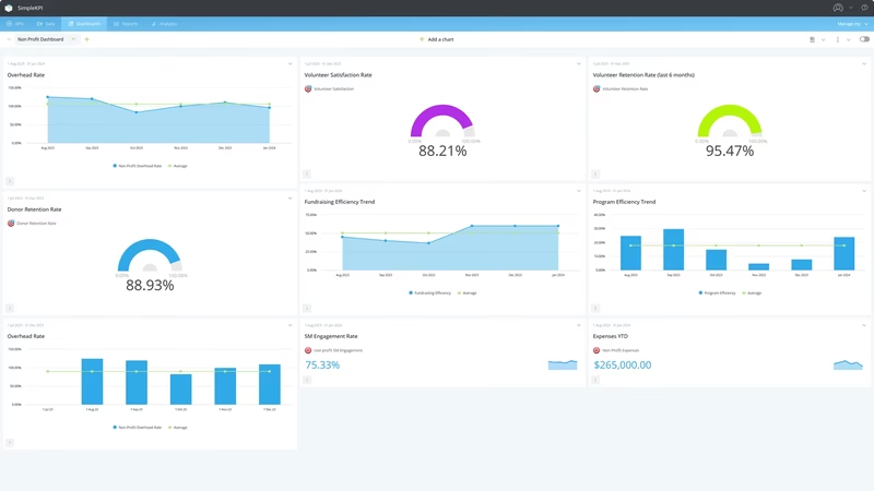
The dashboard pictured here is a light-themed non-profit board built in SimpleKPI. It tracks twenty-one KPIs, grouped around three questions:
- Are donors staying and growing? Donor Retention Rate and Donation Conversion Rate give the headline reads, while New Donors this Month, Donors at month beginning, Number of Donations, Non-Profit Web Visitors and SM Engagement show the funnel that feeds them.
- Can we keep our volunteers? Volunteer Retention Rate and Volunteer Satisfaction sit on top of the underlying counts: Volunteers at Month Start, Volunteers at Month End, New Volunteers, Satisfied Volunteers and Total Number of Volunteers.
- Is the money going where it should? Program Efficiency, Fundraising Efficiency and Overhead Rate are built from Expenses, Program Expenses, Fundraising Expenses and Admin Expenses. These are the ratios grant applications ask about.
These headline ratios are calculated automatically from the counts and totals beneath them, so nobody spends the first week of the month rebuilding formulas in a spreadsheet.
Put Donor Retention Rate and New Donors this Month side by side. Growth that relies entirely on new donors while retention slides is a treadmill, and an expensive one.
Creating a Non-Profit Dashboard in SimpleKPI
-
Step 1 Map what your mission depends on
Write down the questions your board and funders keep asking, then pick the measure that answers each one. Most non-profits land on some mix of donors, volunteers and spending ratios. For a starting point, this guide to essential non-profit KPIs covers the core set.
-
Step 2 Add your non-profit KPIs
Create each KPI in SimpleKPI with its target and frequency. Tags keep things organized by program, campaign or region. Plans include unlimited KPIs, so a small team can track all twenty-one from this example without watching the bill.
-
Step 3 Connect your data
Feed numbers in through spreadsheet imports, integrations or the API. Donation figures tend to arrive monthly from the fundraising platform, volunteer counts from whoever runs the schedule, and expenses from the accounts. The dashboard updates as each lands.
-
Step 4 Build views for different audiences
A stewardship view for trustees, a funnel view for the fundraising team, a headline summary for the annual report. Same data, different framing.
-
Step 5 Share, review, adjust
Put the dashboard on an office screen, bring it to board meetings, and let scheduled KPI reports carry the numbers to trustees who won't log in. Kip, the built-in AI, can suggest targets and flag indicative benchmarks (AI estimates, not peer data) as your history builds. Retire any KPI nobody acts on.
List of Non-Profit KPIs
The table below covers every KPI on the example dashboard. Targets are general guidance, and sector norms vary widely by cause and size. Your own baseline beats any generic range.
| KPI Name | Typical Target | Description |
|---|---|---|
| Donor Retention Rate | 40-60% | The share of last period's donors who gave again. Relationship health in one number. |
| Donation Conversion Rate | 1-3% of visitors | Donations divided by web visitors. Shows whether interest online turns into gifts. |
| Volunteer Retention Rate | 60-80% | Volunteers still active at month end as a share of those at the start. |
| Volunteer Satisfaction | 80% or higher | Satisfied volunteers as a share of those surveyed. Falls before departures do. |
| Program Expenses | In line with budget | Spending on the programs themselves. The number donors most want to see. |
| Program Efficiency | 65-80% | Program spending as a share of total spending. How much of each dollar reaches the mission. |
| Fundraising Efficiency | Under 20 cents per dollar | What it costs to raise each dollar. High figures point at channels, not the cause. |
| Overhead Rate | Under 30% | Admin and fundraising costs as a share of total spend. Funders read it first. |
| New Donors this Month | Trending up | First-time donors this month. The top of the funding funnel. |
| Donors at month beginning | Stable or growing | Active donors at the start of the month. The denominator for retention. |
| Number of Donations | Growing month on month | Gifts received this period, whatever the size. Volume makes forecasting steadier. |
| Non-Profit Web Visitors | Trending up | Visitors to the website. The audience your conversion rate works on. |
| Volunteers at Month Start | Stable or growing | Active volunteers at the start of the month. One half of the retention sum. |
| Volunteers at Month End | At or above month start | Active volunteers at the close. Read against the start to spot quiet attrition. |
| New Volunteers | Enough to cover departures | Volunteers recruited this month. Steady inflow keeps programs staffed. |
| Satisfied Volunteers | Rising with headcount | The number reporting satisfaction in surveys. Feeds the satisfaction percentage. |
| Total Number of Volunteers | Set from your capacity | Everyone actively volunteering. More is only better if coordination keeps up. |
| Expenses | Within budget | Total spending across the organization. The base for every ratio above. |
| Fundraising Expenses | Set from your fundraising plan | Costs of campaigns, events and appeals. Feeds efficiency and overhead. |
| Admin Expenses | 10-15% of total | Back-office costs. Necessary, but worth watching as a share of the whole. |
| SM Engagement | Trending up | Social likes, shares and comments. A leading indicator for web visitors and new donors. |
Why Non-Profit Dashboards Matter
The non-profit sector is highly competitive when it comes to funding. Many organizations chase the same pool of donations and grants, and the ones that can show their numbers clearly stand out. A dashboard makes that evidence a by-product of normal work rather than a scramble before each application deadline.
The deeper value is early warning. Donations are a lagging number; by the time they disappoint, the cause is months old. Web visitors, social engagement, new donor counts and volunteer satisfaction all move first. A dashboard that shows them beside the money gives a director time to act while acting still helps.
And there is trust. Donors, volunteers and funders all give something on the strength of a promise. Showing them the numbers, including the imperfect ones, is how that promise gets kept in public. One screen, twenty-one numbers, and the health of the whole organization is legible at a glance. That's the point.
Build this dashboard yourself with SimpleKPI's KPI dashboards, and pay one flat price for unlimited users and KPIs.