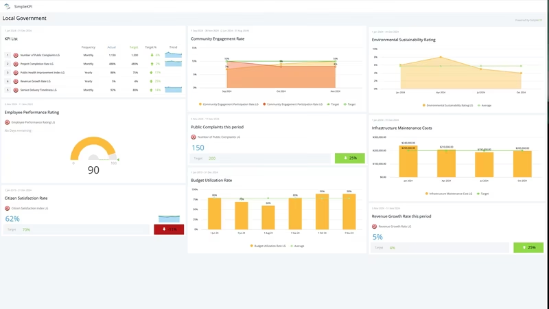
What is a Local Government Dashboard?
A local government dashboard is a visual display that brings a council's or city's key performance indicators, such as budget utilization, citizen satisfaction and service delivery timeliness, together on one screen. It shows how each service is performing against target in charts and gauges, so managers, staff and elected members can see where things stand without waiting for the quarterly report. Department heads use it to run services day to day. Executives and councilors use it to check that public money is turning into public value.
Overview
Local government measures a lot, but the numbers scatter: spend sits in the finance system, service requests in a CRM, works orders in an asset register, satisfaction in an annual survey. Efficient governance relies on clear insight, and clear insight is hard when every answer lives in a different export. A dashboard puts the essentials in one view, from budget through service delivery to how residents feel about the result.
Most local government dashboards fall into three broad types:
- Service dashboards track delivery: response times, timeliness, complaints. These are the operational boards department heads check daily.
- Financial and project dashboards follow budget utilization and project completion, the numbers finance committees and auditors care about.
- Community dashboards cover satisfaction and engagement, and often end up published, because transparency is part of the job.
The example on this page mixes all three, which suits a city manager who wants the whole operation on one screen.
Who benefits from this dashboard?
- City managers and chief executives: budget, services and satisfaction in one view. That covers most of what a leadership meeting needs.
- Department heads: public works, waste services and community teams each get their own numbers next to the targets they carry.
- Elected officials: project status and budget position before a council meeting, without commissioning a report for each question.
- Communications and engagement teams: complaints, engagement and satisfaction figures show whether the message is landing and where the friction is.
Dashboard Example Overview
The dashboard pictured here tracks ten KPIs for a local government, grouped around four questions:
- Are we spending well? Budget Utilization Rate shows how much of the plan is actually being used, and Public Project Completion Rate shows whether the money is turning into finished work.
- Are residents getting what they need? Service Delivery Timeliness, Response Time to Public Requests and Number of Public Complaints cover the day-to-day experience of dealing with the council.
- How do residents feel about it? Citizen Satisfaction Index and Community Engagement Level measure sentiment and participation. Both are qualitative at heart; this guide to qualitative KPIs covers how to score them consistently.
- Is the machine holding up? Employee Performance Rating, Infrastructure Maintenance Score and Waste Management Efficiency track the workforce and assets everything else depends on.
None of this requires new data collection. Finance already tracks spend, the service desk already logs requests, and the surveys already run. The dashboard's job is to put those existing numbers where people will actually look at them.
Keep Number of Public Complaints, Response Time to Public Requests and Citizen Satisfaction Index on the same view. Complaints and response times move first; satisfaction usually follows a survey cycle later. Fixing the first two is how you move the third.
Creating a Local Government Dashboard in SimpleKPI
-
Step 1 Map your services to measures
List the services residents actually touch (waste collection, planning, permits, road repairs) and pick one or two measures for each. Work down from strategic priorities to daily numbers; this guide to the KPI pyramid shows how the layers connect.
-
Step 2 Add your KPIs
Create each KPI in SimpleKPI with its target and reporting frequency. Tags keep things organized by department, ward or service area. Plans include unlimited KPIs, so a large authority doesn't have to trim the list to fit a license.
-
Step 3 Connect your data
Feed numbers in through spreadsheet imports, integrations or the API. Service request data tends to arrive daily, finance monthly, survey results quarterly or annually. The dashboard updates as each lands.
-
Step 4 Build views for each audience
An operational board for department heads, a budget and project summary for the council chamber, and a plain-language view you could publish. Same data, three framings.
-
Step 5 Share, review, adjust
Put the operational view on a screen in the office, and let scheduled KPI reports carry the monthly numbers to councilors and committee members who will never log in. Kip, the built-in AI, can suggest targets and indicative benchmarks (AI estimates, not peer data) as your history builds. Retire anything nobody acts on.
List of Local Government KPIs
The table covers every KPI on the example dashboard. Targets are general guidance; your service standards and your own baseline come first.
| KPI Name | Typical Target | Description |
|---|---|---|
| Budget Utilization Rate | 95-100% of planned spend | The percentage of allocated budget actually used. Persistent underspend is a planning problem; overspend is a control problem. |
| Citizen Satisfaction Index | Trending up year over year | Overall satisfaction from resident surveys. Survey method changes the number, so compare against your own history, not other cities. |
| Service Delivery Timeliness | 90%+ within standard | The share of services completed inside the published time frame. The clearest single read on operational performance. |
| Employee Performance Rating | Set from your baseline | The average performance rating across the workforce. Read it alongside workload; a falling score often signals strain before absence figures do. |
| Number of Public Complaints | Trending down | Complaints logged per period. Categorize them; the pattern matters more than the total. |
| Public Project Completion Rate | On schedule, trending up | The share of public projects delivered against plan. The number auditors and elected members reach for first. |
| Community Engagement Level | Trending up | Participation in surveys, consultations and public events. Low engagement makes every satisfaction number less reliable. |
| Response Time to Public Requests | Within your published standard | Average time to respond to resident requests and inquiries. Residents judge the whole council by this number. |
| Infrastructure Maintenance Score | Stable or improving | A composite of asset condition and maintenance completion. Deferred maintenance stays invisible until it suddenly isn't. |
| Waste Management Efficiency | Set from your baseline | Collection and recycling performance against plan. One of the few services every resident experiences weekly. |
Why Local Government Dashboards Matter
Public money comes with public accountability. When budget utilization, project completion and complaint numbers sit on one visible screen, the monthly scramble to assemble a committee pack gets shorter, and the answers stop depending on who compiled the spreadsheet. That alone repays the setup time.
The deeper value is in timing. Citizen satisfaction is a lagging number; by the time a survey dips, the cause is months old. Response times, complaint counts and maintenance scores lead. A dashboard that shows them beside satisfaction lets a manager act while the trend can still be turned.
There's also a trust dividend. A council that watches its own numbers, and can publish them plainly, builds the kind of transparency residents notice. Tracking these essentials helps a local government direct resources where they matter, improve service delivery, and meet the needs of the community it answers to. That's the whole point of the exercise.
Build this dashboard yourself with SimpleKPI's KPI dashboards, and pay one flat price for unlimited users and KPIs.