
We live in a world surrounded by statistics. Infographics, charts and graphs invade nearly every facet of our daily lives. From the number of fruit and veg we need to consume every day - normally accompanied with the obligatory chart detailing the increasing trend of obesity. Politicians pouring out an endless drove of graphs and stats to counter each other's arguments, to comparing the performance of sporting legends past and present to attain their greatness.
They are powerfully persuasive and influential tools, but how did we get here?
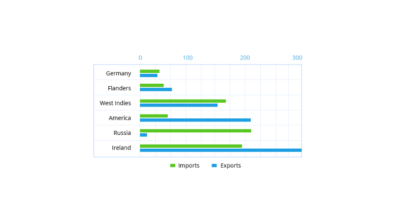
The history of the humble bar chart (and later the line, area and pie graph) owes its existence to an ingeniously simple import / export visualization created by William Playfair. He knew that understanding the relationship between goods in and out by country with data alone was problematic for most people. He devised a simple visual that clearly showed the relationships to other countries in terms of size and volume of trade, the bar chart was born. His simple approach to presenting import and exports hasn't significantly changed in over 300 years.
Today, we have dozens of recognized chart and graph types. However, the use of charts that take complex data sets and provide meaningful insights has intensified dramatically. This, in part is down to the huge amounts of accessible data and the emergence of channels such as Television, the internet and social media to distribute this information.
What are business or KPI dashboards?
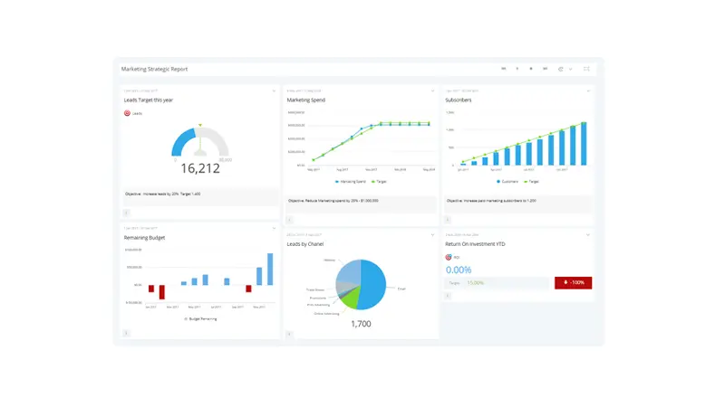
A business dashboard, sometimes referred to as a KPI Dashboard, is a data management and information communication tool - specifically designed to tracks measures, metrics and Key Performance Indicators (KPI). They contain a variety of visualization aids such as, graphs and charts to display data in a simple and easy to understand format.
Where did Dashboards come from?
Although we can't pin a medal definitively on the inventor of the data dashboard, it's safe to assume that its creation was more of a progression with its roots embedded firmly in the 70's. Notably, from a study into decision support systems and later the early forms of Executive Management Systems (EISs). However, without data handling techniques, adequate data warehousing, reliable infrastructure the idea did not gain traction until the 90s, when more robust data handling systems were available.
As data generation became more automated and subsequent data volumes swelled extensively, the need for a more manageable approach to business data accelerated the data dashboard evolution.
Coupled with concepts such as Key Performance Indicators (KPI) and Balanced Scorecards which mainly relied on visualizing data in a single report, the data dashboard finally became widely accepted as the performance reporting tool it is today.
How dashboards and charts help businesses monitor performance
Such advances in data collection, storage, network speeds and social media have all contributed to the rapidly increasing volume and complexity of data now available to even the smallest of businesses.
Proliferation of technologies, once the preserve of corporate giants has given way to low cost, cloud-based models that enable businesses to monitor performance far more accurately.
The ability for a company to now use real-time graphs and charts that clearly display how key aspects of their business is performing - has gone from a convenient 'nice to have' to a 'must have', those benefits include:
- Sharing performance with colleagues and clients, then instantly communicating without having to wait for end of month meetings and reports.
- Bringing all the data into one place, saves a whole lot of time collating reports.
- Speedy analysis using graphs and charts can pinpoint negative trends that need correcting before they become major problems.
- Provide a point of focus for everyone in the business to concentrate on a single strategic goal.
The progression in Dashboard charts types
As Business Dashboards have become more essential to organizations, so too has the number of charts and graphs available. Particularly the emergence of charts and graphs tailored to specific needs, and even charts and graphs delivered with a 'unique' spin by various dashboard vendors as a unique selling proposition.
Most charts still adhere to the underlying principles of simplifying data for mass consumption, but others have expanded their primary purpose to incorporate secondary performance measures such as thresholds.
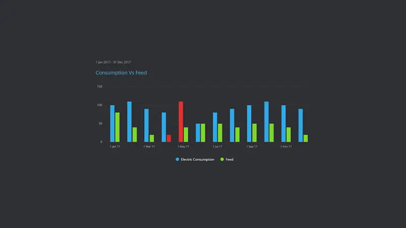
For example, a bar graph showing the amount of electricity used as opposed to the amount fed back into the grid may also color the bars in accordance with set acceptable operating parameters (Red, Amber, Green) –showing the user both the value, and if these values go beyond acceptable norms.
What's the difference between Charts and Graphs?
You'd be right to think that the two terms overlap as even most mathematicians can't agree universally - and there are no defined rules for these words.
However, for the sake of consistency throughout our communications we try to stick to the following:
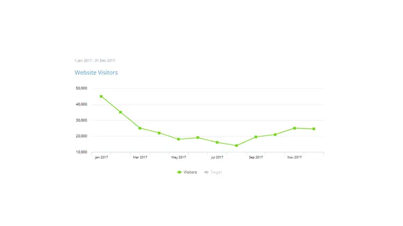
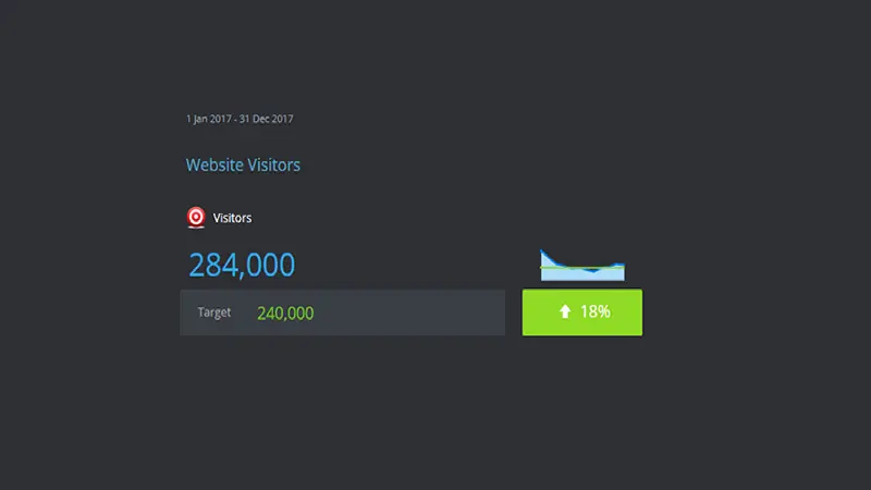
Graph - When a line is drawn to create a linear flow of continuous data, like a trend line showing the number of visitors to a website per hour.
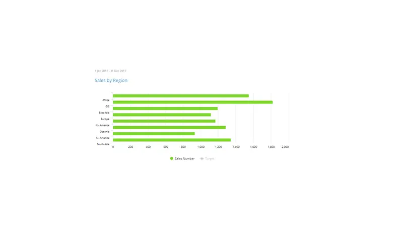
Chart - When illustrative elements such as shapes and symbols (eg.bars) are used to represent data values, for example a chart showing import and export figures for a specific country or year.
Knowing when and what chart to use.
With so many charts available and so many business scenarios to cover, knowing when to use one chart over another can be a little daunting. It's always good to know how different charts perform in different situations, and understand their strengths and weaknesses before designing your dashboard layout, so here's a few pointers:
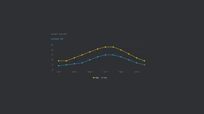
When to use Line Charts
Line charts (as mentioned previously) are a good way to visualize continuous data. A good example of a line chart would be the temperature over a 12-month period for a city. Line charts are predominantly used to track data over time periods however other y-axis such as an age range may be used.
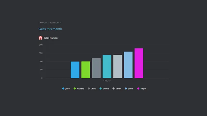
When to use Bar Charts
Bar charts are used primarily to see values across groups or categories, they enable users to quickly make comparisons between related items. A good example would be a bar chart displaying a comparison in the type of calls a support team may receive in a day.
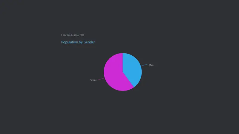
When to use Pie Charts
Pie charts are a good way to compare parts of a whole when it's purely a visual representation. This makes Pie charts good for comparisons, such as a countries population by gender. However, as users generally have difficulty with determining visual values in pie graphs, its best to resort to bar charts when more than a few items are to be compared.
When to use Sparklines
Sparklines are supporting line graphs that are designed to add basic trend detail to a current value. They are a good choice for adding limited context to the primary purpose of the chart. For example, a current website visitor total maybe displayed for the day along side a spark-line to provide the user an indication of the overall trend.
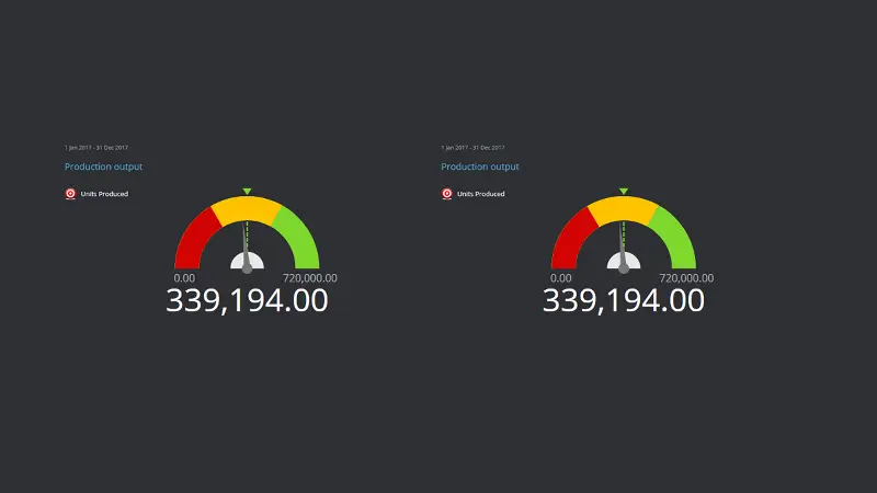
When to use Gauges
Dashboard Gauges are dual purpose charts that often show the value alongside a visual representation using a pre-determined scale. They can be a good way to visualize progress towards a goal for a specific period such as a fund raising or sales target. They can also be used to monitor a current value against thresholds. For example, a gauge may be setup with Red, Amber and Green thresholds for a production lines current productivity levels.
Best practice for Dashboard Charts and Graphs
The purpose of a Data Dashboard is to communicate as quickly as possible critical information without taking time or significant brainpower to interpret. But, it's easy to get distracted by fancy widgets, color schemes and bogged down in trying to accomplish to many things, so here's a quick set of best practice recommendations when building your dashboards:
Choose the right data, metrics or KPIs.
It seems common sense, but users often choose metrics for their dashboard charts that someone thought would be interesting, without considering the audience or the objective. Before selecting your data measurements it's worth setting parameters such as who, why and when will the audience use this dashboard.
Flow your data logically
A dashboard should lead the user through a natural progression. When designing your dashboard think of your graphs as chapters in a book, group your data logically and connect each graph and chart from left to right as part of story.
Keep colors and styles simple
There is always the temptation to let loose your inner creative genius when customizing charts and graphs. Resist the urge to open the psychedelic color palette and stick to themed colors across the charts. Additionally 3D charts, although aesthetically pleasing can be misleading as distorting the axis makes it far harder to accurately assess the relationship between items.
Don't overload
Don't try to squeeze in as many charts and graphs just because you can. Likewise try and keep the focus of the charts to a specific theme. If it's a sales dashboard, then focus on sales. Using only the minimum charts needed will help your dashboards be adopted and utilized by their intended audience.
Show supporting data only when needed
It's all too common for those starting out in dashboard design to try and make them duel purpose. Essentially showing the top-level visuals like a trend graph and then adding all the detail such as lists or tables, the idea being that users can quickly interrogate the data. Well, that's what drill downs or analytics is for. There are occasions when this may be feasible, such as if you are only displaying a single graph but then you may be using the dashboard as a detailed report and not a quick performance visualization tool.
Limit PIE Charts, Gauges and Tables
The use of PIE Charts, Gauges and Tables can have a detrimental influence on your overall dashboard, they are rarely a good solution for their intended use. For example, users have perceptual problems using pie charts as they are unable to visualize the comparative size or order of the segments. Gauges on the other hand take up valuable dashboard real estate that could be better served with other more informative charts. Tables as mentioned are only report level objects that need vast real estate to display content. Consider using these chart types sparingly.

by Stuart Kinsey
Stuart Kinsey writes on Key Performance Indicators, Dashboards, Marketing, and Business Strategy. He is a co-founder of SimpleKPI and has worked in creative and analytical services for over 25 years. He believes embracing KPIs and visualizing performance is essential for any organization to thrive and grow.