
The reality is that it's almost impossible to run a business without monitoring performance. To this end most companies already possess some kind of tracking or monitoring tool. Be it a dashboard, spreadsheet, bespoke application or online software. They are used to keep track of various business functions such as the volume of sales or the number of online visitors. They're indispensable as the 'go to place' for confirmation of performance and for gathering information to help make management decisions. Increasingly, they are distributed throughout an organization for employees to monitor various business activities and tasks.
But what exactly are KPI Dashboards?
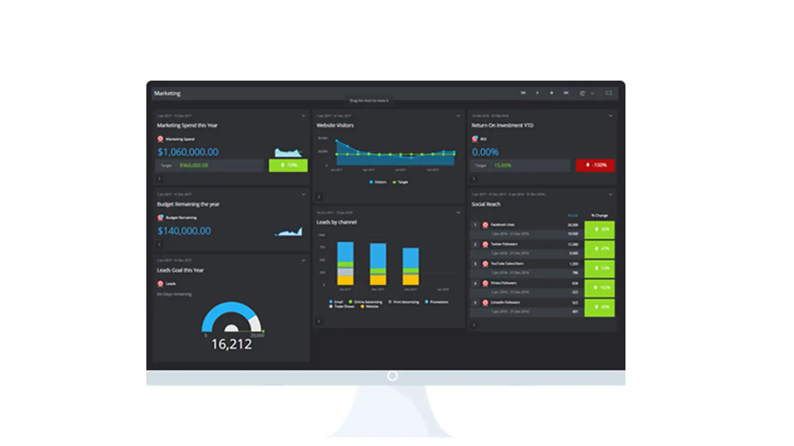
KPI Dashboards (also known as data dashboards or business dashboards) track the performance of Key Indicators, data and Metrics. They typically contain graphs and charts that distill large volumes of data into easy to understand visual representations.
Wasted Potential
Most dashboards are normally the product of a prolonged process of constantly evolving business needs. A KPI added here for the sales department, and maybe an extra metric added there for marketing - and all other kinds of KPIs thrown in for good measure. Consequently, they seldom manage to maximize their potential – or at least straight away.
But there is help at hand. We've put together 7 golden rules to help you avoid the most common pitfalls when building dashboards. Use these to either start building a dashboard for the first time. Or take advantage of these if you're looking to breathe life back into your performance tracking endeavors.
The 7 Golden Rules of KPI Dashboards:
1. Choose your KPIs wisely
Many KPI dashboards simply fail to live up to their potential because they focus on the wrong or even outdated KPIs. Where once these KPIs were aligned to specific business goals or metrics that once provided valuable management information, they now lay dormant, at best taking up valuable screen real estate, at worst providing clutter and misleading information.
It's also common for those new to dashboards to get carried away and measure everything. Because you can't manage what you're not measuring, right? This is just not the case, measuring too much or measuring vanity metrics such as the number of Facebook likes just adds to the confusion.
Dashboards should be simple. Be selective when creating your KPIs, choose KPIs that are aligned to a business objective or goal. It's always better to start with a few and then selectively grow. Ensuring that any KPIs are actionable therefore, can influence performance. Its also worth investigating the S.M.A.R.T and S.M.A.R.T.E.R methodology for selecting and tracking your Key Performance Indicators.
2. Define and Inspire your audience
Every dashboard should have a definitive audience. This may be a specific individual who needs the data on an operational dashboard to help perform daily tasks. Or a manager who needs the detail to make informed decisions, and possibly senior executives who need a strategic dashboard for insight into performance and progress towards business goals. Whomever the audience, it's always worth remembering that dashboards can also play a big part in motivation and inspiration as well as just to track an employee's performance.
In defining the audience its essential to answer the following questions:
- Who is this dashboard for?
- What information do they need?
- What is the best way to display this information?
Getting buy in from the intended audience at this stage of the planning is also a great way to ensure that the dashboard is adopted into their working practice.
3. Create as many Dashboards as you need
Try not to restrict yourself, it's rare that any business can operate on a single dashboard. Nothing will hurt the most well-intentioned dashboard than an overloaded mystifying mess, where everyone is scrolling through an expanse of charts and graphs to find the information they need.
It's also a good idea to segment your dashboard by type. For example, a marketing Dashboard may contain elements of Social media, SEO and advertising when a dashboard specifically designed for tracking SEO performance may be much more efficient.
4. Share, Share, Share
You've spent time creating a perfect dashboard, it looks great, its full of wonderful insights and offers vital information for the business to get the job done. But it's locked away – fully secured behind a myriad of passwords, on a single person's laptop only to be seen by the same individual. Consequently, the information is only ever translated and presented second hand, there is no opportunity for others to challenge the data, or to offer feedback on the dashboard, there is but a single (and potentially damaging) point of interpretation of the data.
Let your KPI Dashboards run free. Obviously, they can still be secure to all but the outside world, but sharing business information with employees far outweighs the risk of that information being used negatively. So, share away, nothing is going to get the entire team, department or company focused on a single goal than if they see the progress towards that goal.
5. Create a natural flow for your data.
Most dashboards are an interconnected flow of data from many sources that are combined to provide the viewer with a logical view of performance. Much like a book is made up of resource background material and placed into logical chapters for readers to follow.
Consider creating a map detailing the flow of information so a user can read and associated graphs and charts in a logical order. For example, if you are creating a SaaS Dashboard then the first chart may show the number of visitors to the website, followed by the conversion rate of those visitors to trials and then the number that successfully subscribed. Not only does putting this in order make sense it will help to highlight areas of the users engagement that need improving.
6. Keep the crayons locked away
Dashboards are incredibly flexible tools. They are by nature a blank canvas waiting to be adored with a multitude of graphs, charts, reports and wonderful widgets. But herein lies the issue. Most of us like to believe our artistic talents are just in a state of hibernation, waiting to be unleashed to finally be recognized as the creative geniuses we are – however true of fantastical this is – dashboard design isn't the place to prove this.
When it comes to dashboard design form truly does follow function, simplicity in both layout and color scheme is the key to producing an effective dashboard that clearly translates the data into visuals that can be instantly understood.
Go for simple (or pre-set) color pallets, use colors consistently throughout the dashboard for each chart series. Try to limit chat complexity by defining a single message and don't crowd too many charts, graphs or widgets into a single dashboard. Offer clear graph descriptions and if necessary an explanation of how the data has been collected. This goes a long way to helping others trust and use the data accordingly.
Chart and graph selection is also a fundamental part of the design process, its worth polishing up on how and when to use bar, column, pie and line charts.
7. Schedule and plan for dashboard refinements
The most overlooked part of dashboard design is how the ongoing maintenance and refinement is going to work. Sadly, most dashboards are created and then forgotten. Subsequently, as the charts become irrelevant as the business moves on they slowly lose their ability to be an effective performance monitoring tool.
Dashboards like any other business tool need regular attention to determine the relevance of the graphs and charts to the business objectives. Typically, these reviews should be conducted any time there is a significant change to the business, for example, a new product line, an acquisition or even a change in direction. In addition, dashboards should also be reviewed at regular intervals such as quarterly or bi-annually.
Feedback from all stakeholders in critical in this process, ensuring that each still has the relevant information that pertains to their needs, along with any re-focusing or optimizing of existing charts.
Creating dashboards can be a rewarding process. Finally seeing in easy to understand visuals the progress of initiatives and projects provides a great deal of satisfaction. But its easy to get bogged down in the numbers, carried away with the charts and trying to measure just about everything. But these 7 golden rules will help you get great KPI Dashboards first time.

by Stuart Kinsey
Stuart Kinsey writes on Key Performance Indicators, Dashboards, Marketing, and Business Strategy. He is a co-founder of SimpleKPI and has worked in creative and analytical services for over 25 years. He believes embracing KPIs and visualizing performance is essential for any organization to thrive and grow.