
In making KPIs simple and accessible for businesses of every size and shape, I’ve seen how a bit of guidance can fast-track those benefits.
So let’s talk about the most common setup I encounter in SimpleKPI, which is the Sales KPI Dashboard. And it’s really no surprise, as sales is a core part of every business and one of the quickest areas to see gains from tracking KPIs.
I get that taking data and turning that into dashboards might seem daunting, but trust me, they're straightforward to set up and maintain, with tons of perks we'll cover along the way.
In just 4 simple steps, we’ll take you from no data at all to a fully functional sales KPI Dashboard that you can use right away, and the whole process takes less than 10 minutes.
If you've seen the video already, you're ready to jump in and get creating. If not, no problem, give it a quick view below.

I'll go through it all step by step, keeping things nice and simple, while sharing real-world examples, tips, and best practices.
If you haven't signed up for SimpleKPI yet, grab a free 14-day trial so you can follow along and build as we go!
In this guide:
- Setting Up Groups in SimpleKPI
- Choosing Your KPIs
- Adding Your Users
- Adding Your Sales Data
- Building Your Dashboard
- Recap
- Going beyond your Sales KPI Dashboard
Step 1 Setting Up Groups in SimpleKPI
First up is setting up groups within your account.
Groups are optional, so if you have a single sales team selling the same goods or services, you can skip this.
But if your sales team is split by location, product, or function (like "Commercial" vs. "Residential"), this is non-negotiable.
How to Add Your Groups
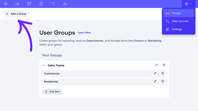
Setting up your groups is really simple: Head to the Groups tab, add a new group (such as "Locations"), and then include items like "New York" and "LA"—and you're done.
Why is it so important?
When we get to the dashboard, this will become evident. It allows you to create charts that compare performance side-by-side, answering critical questions like, "Is our East Coast team keeping pace with the West Coast?"
Tip: Start with logical higher-level divisions of your business, like locations or departments. You can refine these later to include more detailed groups (such as teams or products), and it won't affect your data.
Learn More
For a detailed walkthrough, our support site has a complete guide on how to set up and manage groups.
Step 2 Choosing Your KPIs
Next up are those all-important sales metrics and KPIs. The good news is that these are pretty standard across multiple industries. They can be divided into separate, simple groups: for metrics, think things like deals closed, calls made, and appointments booked. For KPIs, consider items such as call conversion rate and average sales closing time.
A dashboard is only as good as the metrics you put into it, and it's certainly true that a handful of the right KPIs is infinitely more beneficial than lots of clutter.
I always suggest starting with the basics—those raw activities that make up your sales process:
- Number of Deals Closed
- Number of Appointments Made
- Number of Sales Calls
Here's a spreadsheet detailing those basic KPIs I used in the example video.
However, the secret to really improving sales performance through dashboards is to use calculated KPIs. For example, the ratio of deals closed to calls made can show the efficiency of a sales process or salesperson far better than the number of sales made alone. (Deals Closed / Calls Made) × 100 gives you an Calls Conversion Rate.
How to Add Your KPIs
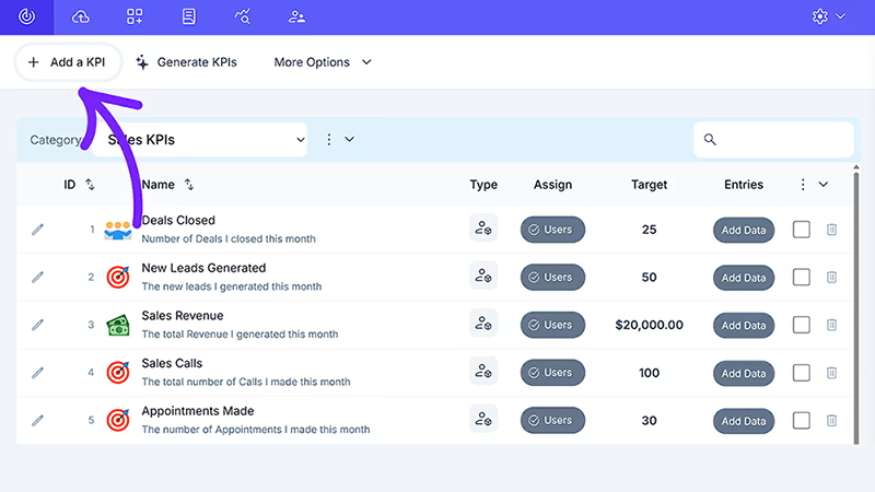
In your account, head over to the KPI tab and click the "Add a KPI" button. Then, simply add a KPI and choose a frequency for when you want it tracked.
Tip: When choosing a tracking frequency, daily and monthly are often your best bets. Daily offers maximum flexibility for reporting within SimpleKPI, while monthly provides a clean, stable trendline for long-term analysis.
Learn More
For a more in-depth guide to adding your KPIs, check out the KPI guide. We also have a list of essential KPIs for sales, complete with 22 examples.
Or, you might take advantage of our AI-powered KPI Generator to get some ideas for the sales KPIs you're looking for.
Step 3 Adding Your Users
Now, let's get your team into your SimpleKPI account.
When sales reps can view their own performance data in real-time, they take ownership of their results, it’s something that we see time and time again as one of the quick wins in sales performance uptick.
This can also be leveraged via gamification features like leaderboards, points for hitting KPIs such as Deals Closed or Sales Revenue.
Which gives you the opportunity to turn tracking into an exciting competition, boosting motivation, engagement, and productivity right from the start.
How to Add Your Users
Head over to the Users tab and add your first user by clicking the "Add a User" button.
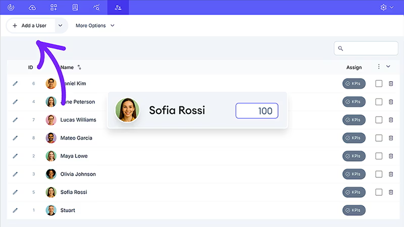
When you create a user in your account, you'll assign them to the Groups from Step 1 (only if needed) and have the ability to set individual targets.
Then, it's a simple case of clicking the "KPI" button and assigning your KPIs and individual targets.
Use this as an opportunity to engage with team members about their goals. Collaborative target-setting is a massive motivator.
Learn More
Here’s a quick guide on adding and managing users.
And a breakdown of assigning KPIs and Targets to your users.
Step 4 Adding Your Data
You have the structure, the metrics, and the people. Now it's time for the data. While you have a few options in SimpleKPI, this is where a clear divide emerges between average and top-tier teams.
| Data Entry Method | The Good | The Not-So-Good |
|---|---|---|
| Manual Entry | Great for getting started and learning the ropes in SimpleKPI. | Can be time-consuming if there's lots of data. |
| Spreadsheet Upload | Excellent for importing historical data in bulk. | Requires your data to be formatted correctly first. |
| Connect a Data Source | Fully automated and always up-to-date. Set it and forget it. | Requires a few minutes of initial setup. |
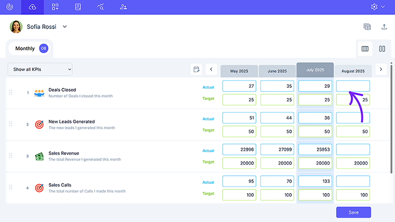
How to Add your Data
You have three straightforward ways to add your sales data in SimpleKPI. For a quick start, manual entry lets you type figures directly into the fields, just head to the Data tab and input your numbers.
Already tracking results elsewhere? Use the spreadsheet upload option by clicking “Upload Spreadsheet” in the same tab, great for bringing in historical or bulk data.
Want things running on autopilot? Go to the Data Connections tab and plug into your tools using prebuilt connectors or API options.
Tip: Top teams automate.
It's not just about saving time; it's about trust. Automated data is accurate and real-time, meaning the dashboard you're looking at in SimpleKPI is a true reflection of your business right now.
Learn More
- Use our Data Example Sheet to see the correct format for uploads.
- Learn about all the ways you can import your data here.
Step 5 Building Your Dashboard
This is the stage where your dashboard takes shape and it's super easy. Here, you’re not simply adding charts—you’re thoughtfully arranging them to communicate a clear and compelling story about your sales performance.
A well-arranged dashboard really does make a difference.
When I can actually see what’s happening, thanks to clear, simple charts, I’m able to spot trends fast, compare team efforts easily, and understand what’s driving results.
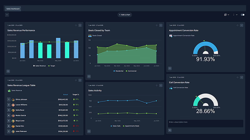
And it's pretty simple to organize the type of charts you need, here is a quick reference guide:
- The Big Picture: A Trend Graph for Sales Revenue shows your overall performance against your target.
- The Comparison: An Area Graph for Deals by Team visually compares your Groups to see who is leading the charge.
- The Efficiency Check: A Gauge Chart for Conversion Rate gives you that instant, "at-a-glance" view of your team's effectiveness.
- The Motivator: A KPI Report set up as a League Table sparks friendly competition and highlights your top performers.
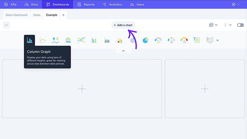
How to add charts to your dashboard
To start building your dashboard, click the Dashboards tab, then hit the Add a Chart button. This opens up a selection menu where you can pick the chart style that best fits the story you want your data to tell.
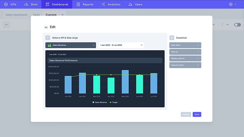
Once you’ve chosen your chart type, the Chart Builder makes it easy to do the rest. Simply select the KPI you want to showcase, pick a date range, and then personalize the chart with filters, options, and colors that fit your needs.
After you save the chart, you can drag and drop it into the perfect spot on your dashboard—so all your key metrics are front and center when you log in.
And once you have all your charts added, it should look clean, simple, and uncluttered like this (theme color is optional):
Tip: The most powerful SimpleKPI dashboards combine activity metrics with efficiency metrics. This allows you to see if your efforts are actually translating into results.
And limit the number of charts and graphs to only a handful of the most important indicators. Clutter creates confusion.
Resources:
- See the finished product in action on the live example dashboard.
- For a deeper look, check out our comprehensive guide to KPI dashboards.
- If you’d like more inspiration, you can browse over 40 real-life dashboard examples.
Recap: Building a Sales KPI Dashboard in SimpleKPI
Setting up a sales KPI dashboard in SimpleKPI doesn’t need to be complicated or time-consuming. In just a few straightforward steps, you can move from a blank canvas to a powerful dashboard that brings your data together, highlights your team’s results, and empowers smarter, faster decisions.
Here’s a quick summary of each step and what it helps you accomplish:
| Step | Description | What You Achieve |
|---|---|---|
| Step 1: Setting Up Groups | Organize your account by teams, locations, or products for more meaningful comparisons. | Gives you side-by-side views of different areas for clearer insights. |
| Step 2: Choosing Your KPIs | Select sales metrics and KPIs that truly matter to your business goals. | Focuses attention on the key drivers of performance and improvement. |
| Step 3: Adding Your Users | Add your sales team to SimpleKPI, assign them to groups, and set targets. | Builds engagement, boosts responsibility, and supports healthy competition. |
| Step 4: Adding Your Data | Bring in your sales data using manual entry, spreadsheet upload, or automated data connections. | Ensures your dashboards are accurate and always up-to-date for real-time tracking. |
| Step 5: Building Your Dashboard | Add and arrange charts to tell the story of your sales results visually. | Lets you instantly spot trends, compare teams, and keep everyone focused on progress. |
If you’d like to keep a copy of this setup for future reference or to share with your team, you can download the complete PDF guide here
Going Beyond Your Sales KPI Dashboard
Once you’ve built your sales KPI dashboard, there are even more ways to get value from it. Sharing your dashboard with your team encourages focus and collaboration, and you can give access to individuals or entire groups—perfect for daily check-ins, review meetings, or comparing progress across teams.
You also have the option to make your dashboard public or generate a shareable link, which is ideal for sharing results with leadership, board members, or even clients who need regular updates.
When to Use Dashboard Sharing and Public Links
- Internal Collaboration: Help teams work together using live dashboards during meetings or standups, so everyone’s seeing the latest results at a glance.
- Cross-Department Reporting: Share dashboards between sales, marketing, or management for better decision making with consistent, up-to-date insights.
- Public or Stakeholder Updates: Use the public link when you want to keep leadership or clients informed—useful for transparency and building trust outside your team.
Benefits of Collaborative Dashboards
- Alignment: Everyone sees the same goals and progress, making it easier to stay on track and prioritize the right activities.
- Accountability: With transparent KPIs, it’s clear who’s making progress and where improvements are needed.
- Engagement: Live dashboards encourage more productive conversations and immediate feedback, driving performance even further.
Tip: For the best results, pin your sales dashboard link somewhere your team checks every day—like a chat channel or your company’s intranet. This keeps everyone in the loop and motivated to hit their targets.
One last thought: Setting up your first sales dashboard in SimpleKPI is a fast, no-risk way to transform how your team works together. If you haven’t already, grab your free 14-day trial and see just how easy it is to build and share results that really drive performance.
A Sales KPI (Key Performance Indicator) is a measurable value that shows how effectively a sales team or individual is achieving their goals. Common examples include Sales Revenue, Deals Closed, Call Conversion Rate, and Appointment Booking Rate.
A sales metric is any quantifiable measure used to track performance (such as number of calls made or meetings booked), while a KPI is a targeted, strategic metric aligned closely with business objectives. All KPIs are metrics, but not all metrics are KPIs.
Most users can go from a blank account to a fully functional Sales KPI Dashboard in under 10 minutes using our step-by-step guide. With the right KPIs and data in place, setting up charts and assigning users is fast, simple, and scalable.
Yes! You can import historical data using the spreadsheet upload feature in the Data tab. Just ensure your data matches the correct format—there’s even a downloadable example sheet to help you get started.
SimpleKPI supports a wide range of visualizations including trend graphs, gauge charts, area graphs, and leaderboard-style KPI reports. These charts make it easy to monitor results, compare teams, and present your performance effectively.
No, but it’s recommended. SimpleKPI can be used with manual entry or spreadsheet uploads, but connecting your CRM or data source automates updates so you always have real-time, accurate metrics without extra work.

by Stuart Kinsey
Stuart Kinsey writes on Key Performance Indicators, Dashboards, Marketing, and Business Strategy. He is a co-founder of SimpleKPI and has worked in creative and analytical services for over 25 years. He believes embracing KPIs and visualizing performance is essential for any organization to thrive and grow.