What is a Coffee Shop Dashboard?
A coffee shop dashboard is a visual display that brings a shop's key numbers, such as orders, revenue, expenses and staff performance, together on one screen. It turns the data the till and the rota already produce into charts and gauges, so an owner can see how the shop is trading without wading through exports. Coffee is a thin-margin, high-footfall business. A dashboard keeps both halves of that equation in view at once.
Overview
Coffee shops have multiplied over the last decade and the trade is fiercely competitive. The numbers that decide survival are rarely hidden. They sit in the POS, the supplier invoices, the rota and the loyalty scheme, in four different places. A dashboard pulls them into one view.
This example covers the three things every shop has to manage:
- Money in. Revenue, orders and order value, plus revenue per available seat hour, which shows how hard the floor space works.
- Money out. Coffee and food stock, salaries and infrastructure, each tracked as its own line so a drifting cost shows up before month end.
- People. Staff retention on one side, customer loyalty and feedback on the other. Both decide whether the first two hold up.
If dashboards in general are new territory, this complete guide to KPI dashboards covers the fundamentals.
Who benefits from this dashboard?
- Owners: the whole business in one place, without collating till rolls, invoices and a notebook of complaints. Most data now arrives automatically from POS and feedback systems.
- Shift managers: orders, strike rates and staffing on one screen turn the quiet Tuesday afternoon into a scheduling decision rather than a shrug.
- Bookkeepers and accountants: three expense lines and net profit, tracked monthly, mean fewer surprises at year end.
- Multi-site operators: repeat the same KPI set per shop and "which branch is struggling" becomes a five-second question.
Dashboard Example Overview
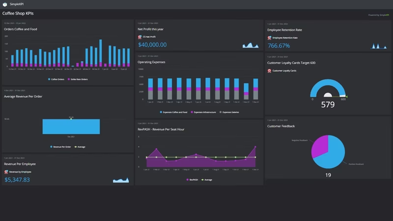
The dashboard pictured here tracks nineteen KPIs for a single shop, grouped around four questions:
- How much are we taking? Revenue, Total Orders and Revenue Per Order give the headline picture, while RevPASHRevenue reads takings against Seat Number and Hours Open to show whether the space earns its rent.
- What does it cost to trade? Expenses Coffee and Food, Expenses Salaries and Expenses Infrastructure are the three big cost lines. Total Shop Expenses adds them up, and Net ProfitNet shows what is left.
- Do customers buy more than a coffee, and come back? Strike Rate Orders and Food Strike Rate % measure whether the pastry case earns its keep. Customer Loyalty Cards tracks repeat trade, and Negative Feedback counts the complaints worth hearing early.
- Is the team holding together? Employees, Revenue by Employee, Employees Leaving and Employee Retention Rate connect staffing to output, and flag churn before it becomes a hiring scramble.
None of this needs new systems. Every number comes from the till, the rota, the loyalty scheme or the accounts, data the shop already produces every day it opens.
Watch Food Strike Rate % next to Revenue Per Order. If more orders include food but average spend doesn't move, the food is selling on discount rather than on top.
Creating a Coffee Shop Dashboard in SimpleKPI
-
Step 1 Decide what the shop needs to know
Start with the questions that nag at you: is the margin holding, is food attaching to drink orders, is the team stable. Pick a KPI for each. This guide to coffee shop KPIs works through the choices in more detail.
-
Step 2 Add your coffee shop KPIs
Create each KPI in SimpleKPI with a target and a frequency. Daily suits orders and revenue; the expense lines usually run monthly. Tags keep money, cost and people KPIs organized, and plans include unlimited KPIs, so nothing gets cut to fit.
-
Step 3 Connect your data
Most POS systems export daily takings and order counts, and expenses arrive with the bookkeeping. Feed both in through spreadsheet imports, integrations or the API, and the dashboard updates as each lands.
-
Step 4 Build views for different audiences
An owner's view with profit and the expense lines. A counter-side view with orders, strike rates and loyalty sign-ups, the numbers the team can actually influence on shift. Same data, different framing.
-
Step 5 Share, review, adjust
Check the dashboard weekly and let scheduled KPI reports carry the monthly picture to your accountant or business partner. Kip, the built-in AI, can suggest targets and indicative benchmarks (AI estimates, not peer data) once a few months of history build up. Retire any KPI nobody acts on.
List of Coffee Shop KPIs
The table covers every KPI on the example dashboard. Targets are general guidance; your own baseline beats any generic range.
| KPI Name | Typical Target | Description |
|---|---|---|
| Revenue | On target or above | Total takings for the period. The headline number the rest of the board explains. |
| Total Orders | Set against last year | Orders through the till. Read beside revenue to see whether growth is more customers or bigger baskets. |
| Revenue Per Order | Trending up | Average spend per order. Rises with attachment and menu mix rather than footfall; the cheapest lever in the shop. |
| RevPASHRevenue | Trending up | Revenue per available seat hour: takings divided by seats times hours open. Shows how hard the floor space works. |
| Strike Rate Orders | Rising with total orders | Orders that include food as well as drink. The raw count behind the strike rate percentage. |
| Food Strike Rate % | 30-50% | The share of orders that include food. Low and flat usually points at the counter display, not the menu. |
| Customer Loyalty Cards | Growing steadily | Active loyalty cards in circulation. A direct read on repeat trade, which is the trade worth protecting. |
| Negative Feedback | Trending down | Complaints and poor reviews logged in the period. Patterns matter more than any single bad day. |
| Hours Open | Consistent week to week | Trading hours in the period. A capacity input for RevPASH, and worth revisiting each season. |
| Seat Number | Set by your floor plan | Seats available. Changes rarely, but revenue per seat hour means nothing without it. |
| Employees | Matched to the trading pattern | Headcount on the rota. Too many quiet-shift hours show up here first. |
| Revenue by Employee | Trending up | Revenue divided by headcount. A rough but honest productivity measure across the year. |
| Employees Leaving | Trending down | Staff who left in the period. Churn is expensive behind a counter; count every leaver. |
| Employee Retention Rate | 70% or higher | The share of staff who stayed. Stability shows up in service speed and regulars greeted by name. |
| Expenses Coffee and Food | 25-35% of revenue | Beans, milk and food stock. The margin lives or dies in this line. |
| Expenses Salaries | Under 35% of revenue | The wage bill, including cover. Usually the biggest single cost in the shop. |
| Expenses Infrastructure | Set from your baseline | Rent, utilities, equipment and maintenance. Mostly fixed, which is exactly why drift here deserves attention. |
| Total Shop Expenses | Within planned budget | All three expense lines combined. The number to read next to revenue before celebrating a busy month. |
| Net ProfitNet | 5-15% of revenue | Net profit: revenue minus total expenses. The only number on the board that pays anyone. |
Why Coffee Shop Dashboards Matter
Coffee shops fail quietly. Revenue looks fine, the queue looks healthy, and meanwhile the milk price has crept up, two baristas are close to handing in notice, and the food case has stopped attaching. Each lives in a different system, so none announces itself. Put them side by side and the quiet problems stop being quiet.
Few things hurt a coffee shop faster than poor service, and service is mostly a staffing story. When retention, leavers and negative feedback share a screen, the link between a wobbling team and rising complaints is visible weeks before it reaches the reviews.
The trend charts earn their keep over a full year. They show which seasons justify temporary staff, whether longer Saturday hours actually pay, and what the loyalty scheme does for winter trade. Owners ran on instinct because the alternative was collating paper. That trade-off is gone. One screen, nineteen numbers, and the shop is legible before the morning rush.
Build this dashboard yourself with SimpleKPI's KPI dashboards, and pay one flat price for unlimited users and KPIs.