What is an Architect Dashboard?
An architect dashboard is a visual display that brings an architecture firm's key performance indicators, such as project completion rate, employee utilization, profit margin and client satisfaction, together on one screen. It shows how projects, people and money are performing against target, so a principal can see where the firm stands without pulling numbers from three systems. Project managers use it to keep individual jobs on schedule. Owners use it to check the firm is actually making money on the work it wins.
Overview
Architecture firms run on project work, and project data has a habit of scattering: hours in the timesheet system, budgets in a spreadsheet, fees in the accounting package, client feedback in someone's inbox. A dashboard puts those numbers side by side, and the relationships start to show. Utilization that climbs while overruns rise is not a busy firm. It's an underquoting one.
Most architect dashboards fall into three broad types:
- Project delivery boards track completion rates, approval times and budget overruns across the current workload.
- Financial boards watch revenue per project, utilization and margin, which is where a firm's viability actually lives.
- Client and pipeline boards follow satisfaction scores, repeat business and lead conversion, the numbers that decide what next year looks like.
The example on this page combines all three, which suits a principal who wants the whole practice on one screen.
Who benefits from this dashboard?
- Firm owners and principals: operational and financial performance in one view, which is the ground strategic decisions should rest on.
- Project managers: timelines, budgets and client satisfaction per project, with overruns visible while there is still time to act.
- Design teams: accuracy and collaboration scores show where revision cycles come from, so the fix lands on the process rather than the people.
- Practice managers: utilization and approval-time figures reveal where billable hours leak, which is usually the difference between a good month and a poor one.
Dashboard Example Overview
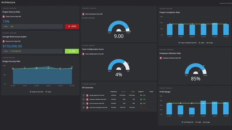
The dashboard pictured here tracks twelve KPIs for an architecture firm, grouped around four questions:
- Are projects on track? Project Completion Rate, Project Overrun Rate and Design Approval Time cover delivery. Together they show whether work ships on time, on budget, and without stalling in client review.
- Is the work profitable? Revenue Per Project, Profit Margin and Employee Utilization Rate connect the hours the team works to the money the firm keeps.
- Will clients come back? Client Satisfaction Score and Repeat Client Rate measure the relationship, while Lead Conversion Rate and New Client Acquisition Rate cover the pipeline that replaces projects as they finish.
- Is the studio working well? Design Accuracy and Team Collaboration Score track the health of the design process itself, revisions included.
Several of these, the satisfaction and collaboration scores in particular, come from surveys rather than systems. That's normal, and it works, provided you collect them the same way every time. This guide to measuring qualitative KPIs covers how to make soft measures behave like hard ones.
Watch Employee Utilization Rate next to Project Overrun Rate. High utilization with rising overruns usually means the fees were set too low, not that the team is slow.
Creating an Architect Dashboard in SimpleKPI
-
Step 1 Map your project lifecycle
Write down the stages a project actually passes through, from first inquiry to final handover, and pick the measure that matters at each one. Keep the list short. This comprehensive guide to KPI dashboards explains how to choose without drowning in candidates.
-
Step 2 Add your architecture KPIs
Create each KPI in SimpleKPI with a target and a frequency. Tags keep things organized by studio, project type or client. Plans include unlimited KPIs, so the twelve here can grow without a pricing conversation.
-
Step 3 Connect your data
Feed numbers in through spreadsheet imports, integrations or the API. Timesheet and project data tends to arrive weekly, financials monthly, and the dashboard updates as each lands.
-
Step 4 Build views for different audiences
A delivery board for project managers, a financial summary for the principals, a studio view for the design team. Same data, different framing, and nobody wades through numbers that aren't theirs.
-
Step 5 Share, review, adjust
Bring the dashboard to project reviews, and let scheduled KPI reports carry the numbers to partners who won't log in. Kip, the built-in AI, can suggest targets and flag indicative benchmarks (AI estimates, not peer data) as your history builds. Retire any KPI nobody acts on.
List of Architect KPIs
The table below covers every KPI on the example dashboard. Targets are general guidance; your own baseline beats any generic range.
| KPI Name | Typical Target | Description |
|---|---|---|
| Project Completion Rate | 85-95% on time | The percentage of projects completed against their scheduled deadlines. The headline delivery figure. |
| Client Satisfaction Score | 4.5/5 or above | Average feedback score from clients on completed projects. Collect it consistently or the trend means nothing. |
| Design Accuracy | Trending up | The percentage of designs requiring no revisions after the final client review. A direct read on how well briefs are understood. |
| Employee Utilization Rate | 60-75% | Billable hours as a share of total hours worked. The core economics of any professional services firm. |
| Revenue Per Project | Set from your baseline | Average revenue generated per completed project. Read it next to project size before drawing conclusions. |
| Design Approval Time | Trending down | Average days to receive client approval on designs. Long approvals stall everything downstream. |
| Repeat Client Rate | Stable or growing | The percentage of clients who return with more work. The cheapest work a firm will ever win. |
| Profit Margin | 10-20% | Profit as a share of total project revenue. The number the rest of the board exists to explain. |
| Lead Conversion Rate | 20-30% | The percentage of leads converted into clients after the initial consultation. A read on both fit and pitch. |
| Project Overrun Rate | Trending down | The percentage of projects exceeding their initial budget projections. Pair it with utilization to find the cause. |
| New Client Acquisition Rate | Set against capacity | The number of new clients won over the period. Growth only helps when the studio can absorb it. |
| Team Collaboration Score | Trending up | Average collaboration rating from employee surveys. Low scores tend to resurface later as revisions and overruns. |
Why Architect Dashboards Matter
Architecture has a long feedback loop. A fee set badly in March surfaces as a margin problem in November, and by then the money is spent. A dashboard shortens the loop: utilization, overruns and approval times are visible weekly, while there is still time to change how a project is run.
It also settles arguments. When completion rates, revision counts and satisfaction scores sit on one screen, the conversation moves from whose recollection is right to what the numbers show. Design is subjective; whether the client approved on time is not.
Mostly, though, it keeps the business honest about the work. Firms are good at knowing which projects felt successful. The dashboard shows which ones actually were, and twelve numbers on one screen is a small price for that.
Build this dashboard yourself with SimpleKPI's KPI dashboards, and pay one flat price for unlimited users and KPIs.