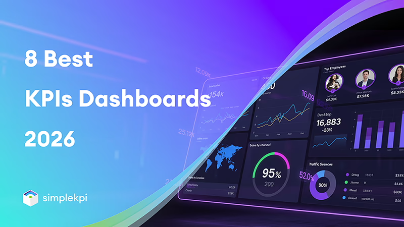
If your spreadsheets are starting to feel like they’re held together with duct tape, or you’re simply juggling more KPIs than you can handle, you’re in the right place.
I’ve pulled together 8 genuinely useful KPI dashboard tools so you can quickly spot what fits how you work without digging through endless “all-in-one” BI platforms. This rundown stays focused on one thing: how well each option helps you design, visualize, and use KPI dashboards.
Some of these tools are built specifically for KPIs, with tracking and analytics baked in, while others are lighter, visual-first layers that slot neatly on top of the data you already have.
Each comes with its own strengths and compromises, so the aim here is to help you match the tool to your workflow.
In this guide:
- SimpleKPI
- Klipfolio
- Geckoboard
- Plecto
- Databox
- Tableau
- Sisense
- Scoro
- 2026 KPI dashboard comparison table
SimpleKPI
SimpleKPI does exactly what it says on the tin.
It wraps up everything you need—integrations, manual entry, and analytics—into one simple dedicated KPI software package that actually makes sense.
Instead of juggling five different tools just to track one department, you get a clean workspace with over 40 chart types to visualize what’s really happening.
But what I really appreciate here is the learning curve—or rather, the lack of one. You don’t need a degree in data science to figure this out. It’s designed to be intuitive, so you can get set up and start tracking in minutes, slashing the time it usually takes to get a team on board.
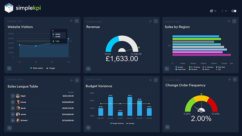
It takes those complex, messy spreadsheets and turns them into real-time visuals without the usual headache. Whether your data is sitting in Google Sheets, HubSpot, or you need to enter it manually, SimpleKPI pulls it all together.
Key details
- Launched: 2012
- Number of clients: 2,000+ organizations across industries
- Notable clients: G4S, NHS, Merck
- Pricing (approx.): Starter from $19/mo (up to 2 users), Growth $59/mo (up to 10 users), Unlimited $119/mo with unlimited users and dashboards
- Best for: Small to medium organizations or large departments wanting simple, flat-priced KPI dashboards without BI complexity
- Free trial: 14 days.
- Credit card required: Not for the trial.
Pros
- Clean, intuitive interface with drag-and-drop dashboard building.
- 40+ KPI-focused chart types and drill-down capabilities.
- Flexible data entry: APIs, spreadsheets, Google Sheets, Zapier, HubSpot CRM, and manual entry.
- No per-user fees on higher tiers, ideal for wider rollout.
Cons
- No heavy-duty data modeling compared with expensive enterprise BI tools.
- Native forecasting is lighter than in larger analytics platforms.
Tip: If you’re moving from spreadsheets, start by importing a single department (like sales) into SimpleKPI and recreating your most-used report as a dashboard. Once the team is comfortable and you’ve validated the numbers, you can gradually add more KPIs and departments without overwhelming users.
Explore SimpleKPI or jump straight to the pricing page.
Klipfolio
Klipfolio is what you grab when you need to pull data from everywhere at once.
It hooks into over 130 different services—spreadsheets, CRMs, analytics tools—and feeds them straight into live dashboards.
I really like how it handles that mix of data sources. Instead of checking five different logins, you just drag and drop what you need into one view that works on your desktop or your phone.
It’s great for keeping teams in sync, too.
You can set up automatic refreshes and share links so everyone is looking at the same numbers, without you having to constantly chase down updates.
Key details
- Launched: 2001
- Number of clients: 10,000+ teams
- Notable clients: Unilever, Shopify, Zendesk
- Pricing (approx.): From $120/mo (annual billing) for team plans; enterprise pricing is custom
- Best for: Marketing, revenue, and agency teams needing deep integrations and branded dashboards
Pros
- 100+ integrations and strong support for multi-source KPIs.
- Flexible visual builder for custom layouts and calculations.
- Mobile and TV-ready dashboards.
- Scheduled PDF exports and shareable links.
Cons
- Costs can climb as you add more workspaces and features.
- Built-in AI is lighter than in newer enterprise-focused tools.
Free trial: Typically 14 days.
Credit card required: Often not required for trials.
Tip: If you manage multiple clients, set up a standard “starter” dashboard template in Klipfolio and clone it for each account. That way you maintain a consistent structure while swapping in client-specific data sources and branding.
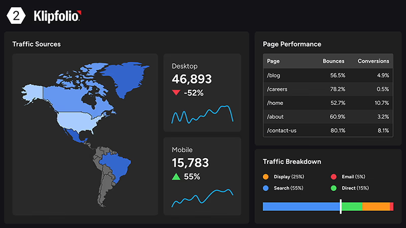
Geckoboard
It’s built specifically for those office TV displays and team huddles, hooking into over 90 tools to pull in your sales, support, or finance numbers.
I love how it keeps things incredibly simple. You aren’t getting bogged down in complex analysis here; it’s designed for those at-a-glance checks during a standup meeting.
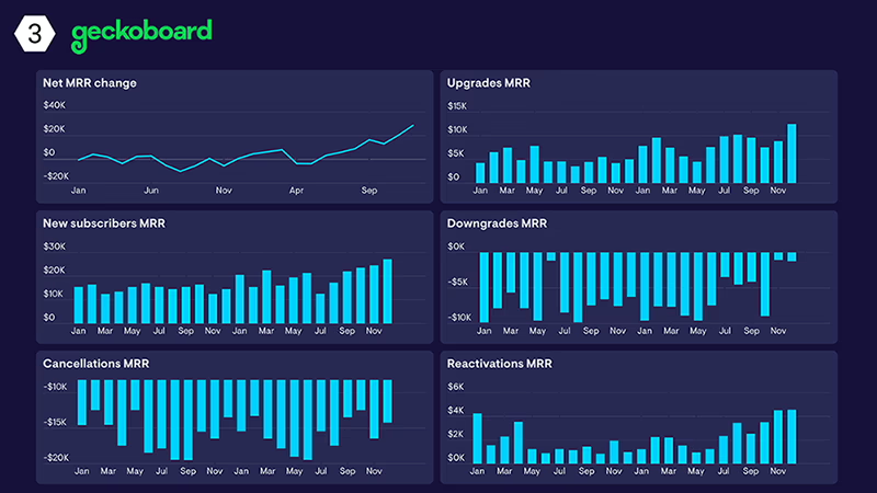
If you need a dashboard that looks great on a big screen or embedded in your intranet—without needing a manual to read it—this is a solid choice.
Key details
- Launched: 2010
- Number of clients: 5,000+
- Notable clients: Buffer, Zapier, Intercom
- Pricing (approx.): From $49/mo for the essential plan; higher tiers for more dashboards and data sources
- Best for: Remote and distributed teams needing TV-optimised live KPI dashboards
Pros
- TV-first layouts, ideal for office or remote displays.
- Quick setup with pre-built widgets.
- Slack and email alerts for thresholds.
- Easy embedding into intranets or internal pages.
Cons
- Fewer advanced chart types and analytics options.
- Less suitable as a full self-service BI layer.
Free trial: 14 days.
Credit card required: Typically not needed for the trial.
Tip: Keep TV dashboards ruthlessly simple: group metrics into “health” (service, revenue) and “actions” (tickets waiting, calls in queue) so teams know instantly whether they’re on track and what to focus on next.
Plecto
Plecto takes a slightly different angle by making your KPIs actually feel like a game.
It adds things like leaderboards, badges, and contests right into the dashboard, which is fantastic if you're trying to fire up a sales or support team. It still connects to all the usual suspects—over 100 integrations—but the real draw here is motivation.
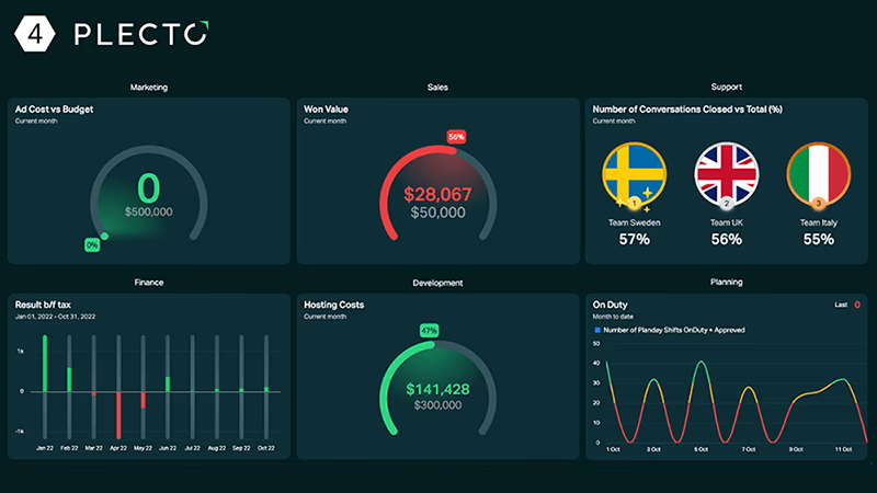
I love that it doesn't just display the numbers; it uses them to drive friendly competition. You can throw it up on a TV in the office, watch the updates hit in real-time, and turn what used to be a boring metrics review into something your team actually wants to look at.
Key details
- Launched: 2016
- Number of clients: 3,000+
- Notable clients: HubSpot partners and sales agencies
- Pricing (approx.): From $190/mo medium teams
- Best for: Sales and support teams who want gamified KPI dashboards
Pros
- Built-in gamification: leaderboards, achievements, contests.
- Strong CRM and support-tool integrations.
- TV and mobile views designed for motivation.
- Flexible scorecards for reps and teams.
Cons
- Pricing scales as you add admins and users.
- Less focused on deep analytical exploration.
Free trial: 14 days.
Credit card required: Typically not required.
Tip: Tie rewards to behaviours you want to encourage (calls made, deals created, CSAT scores), not just outcomes like revenue. That way Plecto’s leaderboards reinforce the right daily habits, not just end-of-month results.
Databox
Databox is the go to tool if you’re tired of jumping between different apps just to see how things are going.
It pulls everything—over 100 different data sources—into one clean screen, so you stop wasting time logging in and out of tools. I’m particularly fond of their mobile-first approach; it means you can actually check your numbers on your phone without squinting at a shrunken desktop chart.
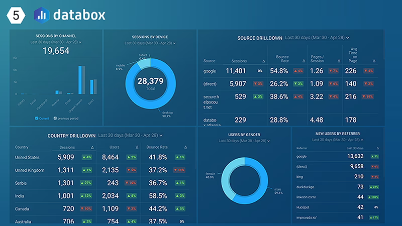
It’s also got some smart AI features that help with setting goals, which is a nice touch if you’re trying to figure out realistic targets.
If you’re an agency managing data for a bunch of different clients, this is a really strong contender because it lets you keep all those custom views in one place.
Key details
- Launched: 2015
- Number of clients: 20,000+
- Notable clients: Used by agencies working with brands such as Adidas and Tesla partners
- Pricing (approx.): Pro from $159/mo (annual billing) additional costs for more data sources
- Best for: Agencies and growing teams consolidating KPIs across many tools
Pros
- 100+ integrations with strong marketing and sales coverage.
- Mobile-first experience with scorecards and alerts.
- Easy links and client-ready sharing options.
- Free starter plan to test the workflow.
Cons
- Advanced features (more dashboards, higher refresh rates) are paywalled.
- Less flexible for very custom data models than full BI tools.
Free trial: 14 days on paid tiers.
Credit card required: Not required for the free tier.
Tip: Use Databox scorecards to push a small set of “north star” KPIs to decision-makers via email or mobile. That way leaders see the trend every day, even if they never log into the full dashboard.
Scoro
Scoro combines project management, CRM, billing, and KPI dashboards, making it a good fit for agencies and professional services where work and metrics live in the same system.
Custom widgets and dashboards let you track profitability, utilization, pipeline, and tasks in real time against projects and clients.
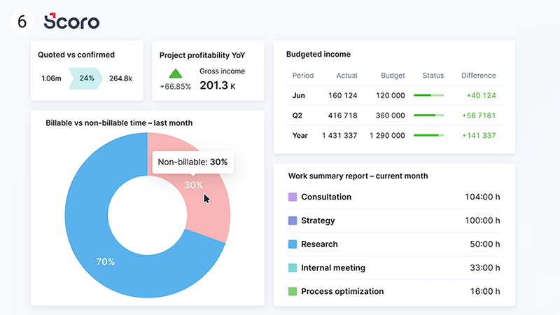
Instead of being just a reporting layer, Scoro acts as an operational hub with analytics built in.
Key details
- Launched: 2011
- Number of clients: 2,000+ agencies and consultancies
- Notable clients: Creative and professional services firms
- Pricing (approx.): Essential from $26/user/mo; higher tiers add features and capacity
- Best for: Service businesses linking KPIs to projects, time, and billing
Pros
- Integrated PM, CRM, billing, and dashboards in one system.
- Real-time profitability and utilization views.
- Multi-client and multi-project support.
- Time tracking feeds directly into KPI widgets.
Cons
- Broader platform than a pure dashboard tool; more configuration involved.
- Per-user pricing can add up for large teams.
Free trial: 14 days.
Credit card required: Typically not required.
Tip: Use Scoro to align your delivery and finance teams around the same numbers by surfacing margin, utilization, and overdue work on a shared dashboard. That way projects, time, and billing all pull in the same direction.
Tableau
Tableau is the heavy hitter when you need to turn raw data into a serious story.
It’s not just about tracking a number; it’s about digging into the "why" behind it with some incredibly sophisticated visualizations. With drag-and-drop tools and AI insights, you can build interactive charts that let you forecast trends and explore data in a way most other tools can’t touch.
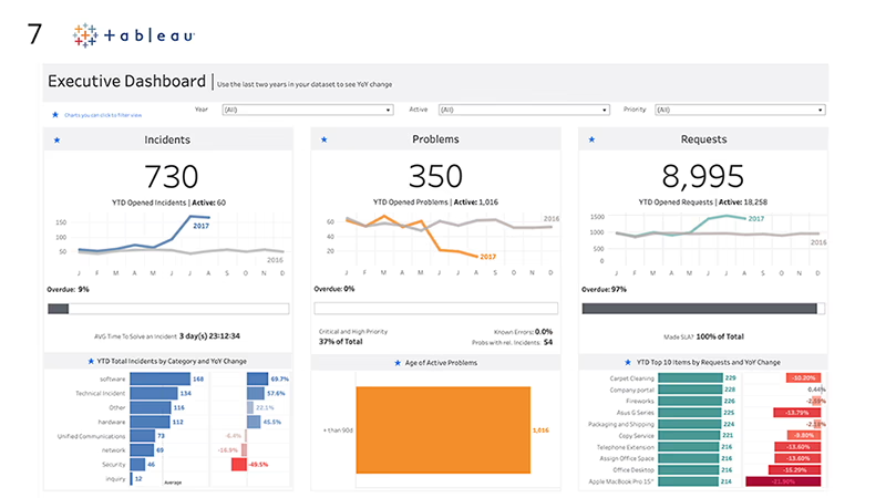
I find it’s perfect for those moments when you need to present a narrative to leadership, not just a spreadsheet. It makes the data accessible and engaging, turning a dry update into a conversation about where the business is actually heading.
Key details
- Launched: 2003
- Number of clients: 100,000+
- Notable clients: Verizon, Charles Schwab, and many large enterprises
- Pricing (approx.): Creator $75/user/mo; Explorer and Viewer at lower price points depending on deployment
- Best for: Data-mature teams building interactive, analytical KPI dashboards
Pros
- Very rich, interactive visualizations and dashboarding.
- AI-powered insights, forecasting, and natural-language querying.
- Governed data models, security, and collaboration for enterprise use.
- Supports both high-level KPIs and deep drill-downs in one place.
Cons
- Steeper learning curve than simpler KPI-only tools.
- Per-user pricing can be significant at scale.
Free trial: 14 days.
Credit card required: Not required.
Tip: Use Tableau for governed “source of truth” KPI dashboards that sit on top of your data warehouse, then embed lighter-weight views into other tools (like your CRM or intranet) so business users don’t need to learn Tableau to benefit from it.
Sisense
Sisense is what you look for when your data needs have outgrown the simple stuff.
It’s a powerhouse for complex scenarios, letting you mash up data from over 100 sources and model it exactly how you need. But where it really stands out is how it lets you embed those analytics right into your own apps or portals.
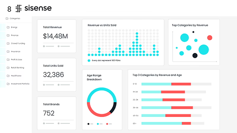
I think this is a fantastic option if you need a white-labeled solution that looks like it’s yours. It’s not just about a dashboard on a screen; it’s about weaving those AI-powered insights and interactive charts directly into the workflows your team—or your customers—are already using.
Key details
- Launched: 2004
- Number of clients: 2,000+ enterprises
- Notable clients: PepsiCo, Lufthansa
- Pricing: Custom, quote-based enterprise pricing
- Best for: Enterprises embedding white-label KPI dashboards into apps
Pros
- Strong embedded analytics and white-labelling support.
- AI-driven insights and advanced data modeling.
- Handles complex, high-volume data environments.
- Flexible deployment and security options.
Cons
- Enterprise-level pricing and implementation overhead.
- Overkill for teams that only need simple KPI dashboards.
Free trial: Typically via guided demo or POC.
Credit card required: Not applicable for standard demos.
Tip: When embedding Sisense into your own product, start with a small set of high-value, in-context KPIs (for example, usage or ROI metrics) instead of mirroring your full internal analytics stack. This keeps the experience focused and easier to maintain.
Scoro
Scoro combines project management, CRM, billing, and KPI dashboards, making it a good fit for agencies and professional services where work and metrics live in the same system.
Custom widgets and dashboards let you track profitability, utilization, pipeline, and tasks in real time against projects and clients.
Instead of being just a reporting layer, Scoro acts as an operational hub with analytics built in.
Key details
- Launched: 2011
- Number of clients: 2,000+ agencies and consultancies
- Notable clients: Creative and professional services firms
- Pricing (approx.): Essential from $26/user/mo; higher tiers add features and capacity
- Best for: Service businesses linking KPIs to projects, time, and billing
Pros
- Integrated PM, CRM, billing, and dashboards in one system.
- Real-time profitability and utilization views.
- Multi-client and multi-project support.
- Time tracking feeds directly into KPI widgets.
Cons
- Broader platform than a pure dashboard tool; more configuration involved.
- Per-user pricing can add up for large teams.
Free trial: 14 days.
Credit card required: Typically not required.
Tip: Use Scoro to align your delivery and finance teams around the same numbers by surfacing margin, utilization, and overdue work on a shared dashboard. That way projects, time, and billing all pull in the same direction.
2026 KPI Dashboard Software Comparison
Here’s a quick at-a-glance comparison of the eight KPI dashboard tools covered in this guide.
| Tool | Integrations | AI / Smart features | Exporting & sharing | Collaboration | Chart range / focus | Starting price (approx.) |
|---|---|---|---|---|---|---|
| SimpleKPI | 100+, spreadsheets, Zapier | Light (no heavy AI) | PDF, Word, Excel, embeds | Unlimited users on higher tiers | 40+ KPI charts, drill-downs | $19/mo Starter; $59/mo Growth; $119/mo Unlimited |
| Klipfolio | 100–130+ | Limited AI | Scheduled PDFs, links | Multi-user, multi-client | Highly customizable dashboards | From ~$90/mo (Base); Team from ~$350/mo |
| Geckoboard | 80–90+ | No strong AI layer | TV links, embeds, PDFs | Team sharing and TV wallboards | TV-optimized KPI widgets | From ~$44–60/mo (Essential, annual) |
| Plecto | 100+ | Limited AI | PDFs, images, TV | Gamified leaderboards | Sales/support gamification | From ~$230/mo (10 tracked licences) |
| Databox | 100+ | AI-assisted goals & alerts | Links, PDFs, scorecards | Client and team sharing | Mobile-first scorecards | From ~$159–199/mo (Professional) |
| Tableau | 100+ | Strong AI & forecasting | PDF, PowerPoint, server | Enterprise collaboration | Interactive analytics | $75/user/mo (Creator) |
| Sisense | 100+ | AI-powered embedded analytics | Embeds, PDFs, portals | Product & data teams | Advanced, embeddable KPIs | Custom enterprise pricing |
| Scoro | Built-in + connectors | Limited AI | Reports & exports | Project & client oriented | Project and profitability KPIs | $26/user/mo (Essential) |
How to choose the right KPI dashboard tool
When choosing KPI dashboard software, map three things clearly: your data sources, decision‑makers, and level of analytics ambition. Spreadsheet‑heavy SMEs that want flat pricing and fast setup will lean toward SimpleKPI or Geckoboard, while agencies juggling dozens of accounts often prefer Klipfolio or Databox.
If you expect to embed dashboards into your own SaaS app or need advanced modeling, Sisense or Tableau will be a better match, despite higher complexity and cost.
For service businesses where projects, hours, and profitability sit at the center of performance, Scoro’s integrated approach can reduce tool sprawl and reporting friction.
A KPI dashboard is a visual workspace that tracks a focused set of key performance indicators in one place, helping you monitor performance at a glance. It pulls data from your existing tools and turns it into charts, scorecards, and reports so you can see how your business is performing in real time.
A KPI dashboard focuses on a small number of high-impact metrics that support fast decision-making, such as revenue, conversion, or customer satisfaction. A broader business dashboard usually includes many more metrics and is designed for deeper analysis, exploration, and reporting across the whole organisation.
Start by listing the tools you need to connect, who will use the dashboards, and how much flexibility you need. Then compare platforms on integrations, pricing model (flat-rate vs per-user), ease of use, and sharing options, and use free trials to see which one fits your workflow best in practice.
Yes. Many KPI dashboard platforms offer entry-level plans or even free tiers that work well for small teams. As your business grows, you can add more dashboards, users, and data sources without having to rebuild your reporting from scratch.
If your main goal is to track a core set of metrics and keep the team aligned day to day, a focused KPI dashboard tool is usually enough. If you also need complex data modelling, self-service analysis, and advanced forecasting across many datasets, a full BI platform may be a better long-term fit.
You can start with manual entry or spreadsheet uploads, but connecting your CRM, marketing platforms, and other data sources is strongly recommended. Automated connections keep your dashboards accurate and up to date, so you spend less time chasing numbers and more time acting on them.
For most teams, a simple KPI dashboard can be created in under an hour once you know which metrics you want to track. More advanced setups with multiple data sources, user permissions, and custom calculations can take longer, but many tools provide templates to speed things up.
A great KPI dashboard is focused, fast, and easy to read: it highlights a handful of clear metrics, refreshes automatically, and works just as well on a laptop, mobile, or TV screen. Features like alerts, simple drill-downs, and light AI assistance also help you spot trends and issues before they become bigger problems.

by Stuart Kinsey
Stuart Kinsey writes on Key Performance Indicators, Dashboards, Marketing, and Business Strategy. He is a co-founder of SimpleKPI and has worked in creative and analytical services for over 25 years. He believes embracing KPIs and visualizing performance is essential for any organization to thrive and grow.