What are Multiple KPI Series Graphs
A multiple KPIs series is a graph that is designed to show two or more KPIs over a period of time for evaluating the connection in values over time. Typically, these trend lines compare KPIs that share a relationship, or whose values directly impact the performance of another KPI. KPI Series graphs can also be used to compare KPIs across the same category or breakdown.
More than a simple comparison chart
While a single series displayed on a graph can provide a visual representation of the historic trend of a value, a Multiple KPI Series can show those trends in relation or context with other KPIs that may be influential to the performance of a KPI. Using this type of graph is not limited to having the same values to compare, as it is the trends that are the primary indicators of effect.
For example, a revenue trend line can provide a quick reference to the current revenue level, while also detailing the financial performance in relation to previous months - showing where the increases and decreases have been at the same time as showing the overall trend and direction - is it steadily heading up or gradually trickling down. Although this is a great way to visualize a KPI, it's still only seeing performance in isolation, this type of series gives no other reference or insight as to why the trend line is fluctuating.
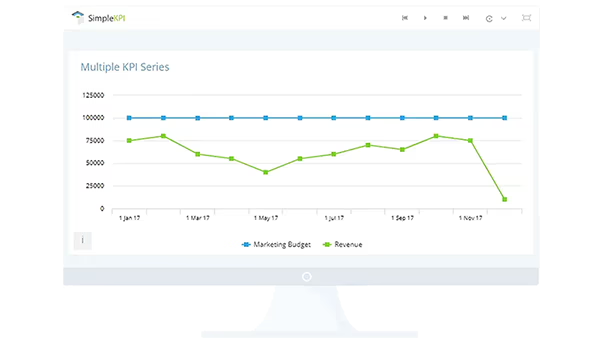
Now let's say you add a marketing spend KPI to the chart, then the chart transforms to focus on the relationship between marketing spend and the impact that has on the revenue figures both current and historical.
Multiple KPI series are not limited to this direct one-to-one relationship, they can also be used to display breakdowns of a single KPI into its contributing factors. For example, 'Marketing Leads' can have an overall figure and a breakdown made up of where those leads came from such as Online, Promotions, Advertising, Exhibitions, and so on. When a KPIs series is used in this context it allows for the direct comparison of breakdowns over time to see both trend and volume.