
The very notion that someone rolling their lucky dice unlocks some kind of higher power to insights unobtainable via actual data is unhinged.
Decision-making attracts a host of these fancy ideas, methodologies, and even, dare I say, downright dangerous ones.
There is no ‘art of the role’
And unsurprisingly, this is supported by real data – wow. Companies that utilize data visualization tools, such as KPI Dashboards, experience up to a 20% improvement in decision-making speed.
Yet, it’s incredible to me that this basic understanding of the vast benefits that data visualization brings is still treated as a simple have-to.
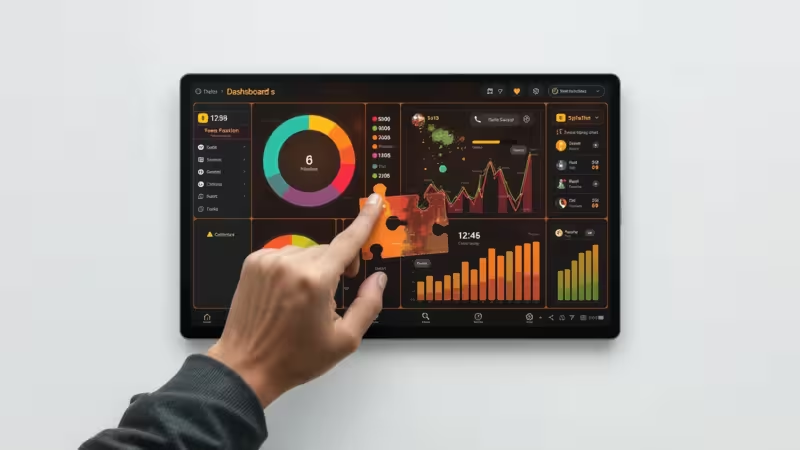
When data is brought to life on a KPI dashboard, it’s a powerful performance and decision-making tool—but only when it’s crafted with each company’s unique needs, goals, and quirks in mind.
It’s not rocket science to create a basic dashboard, but the real art of making them perform optimally is taking the time to plan and customize in a way that fits your goals like a glove.
Imagine these dashboards don’t just display data but actually tell a story—stories that make your data more engaging, actionable, and memorable.
The best part? You don’t have to be a master craftsman or digital artist. With some pointers on the right charts, colors and a streamlined KPI selection, each department can have a dashboard that’s clear, impactful, and perfectly aligned with the company’s bigger goals.
Why Customized, Storytelling Dashboards Matter

Because it transforms an uninspiring wall of random numbers and a ‘uhh’ into an ‘aha!’
Making tracking your performance and goals less like a chore, and more like a trusted base on which decisions are made and real progress can be seen.
This customization means your company, its departments, teams, locations, and even your dog see what matters. It creates an unambiguous view, less prone to erroneous interpretations and those ever-present falsehoods.
Even though all your dashboards are rallying behind one big company goal, you can’t just squish everything into one mega-dashboard and call it a day. Each area of your business will need its own.
Let’s examine some examples of the various areas and their differences.
Here’s what customized, storytelling dashboards do for your teams:
- Clear Focus: Each department sees only the KPIs that matter most. Streamlined dashboards reduce noise and highlight impactful metrics.
- Powerful Storytelling: Well-chosen metrics create a narrative teams can follow. Storytelling in dashboards turns numbers into insights.
- Company-Wide Alignment: When each department’s story aligns with company goals, dashboards unify insights from all teams.
When tailored dashboards connect back to the company’s bigger picture, they do more than inform—they empower each team to make decisions that drive both departmental and organizational success.
Customization Tips for Each Department
1. Sales: A Clear Path to Revenue
KPIs: Lead Conversion Rate, Sales Cycle Length, Revenue per Sale, CLV. Keep it simple—no more than 5 KPIs. Use red for urgent metrics like low conversion and green for goals met.
Dashboard Tips: Keep it simple—no more than 5 KPIs. Use color strategically; red for urgent metrics like low conversion, green for goals met. Add a sales funnel view to show the journey from lead to close. This creates a clear, motivational story for the sales team.
2. Marketing: Engaging Visuals, Focused Metrics
KPIs: CAC, ROMI, Engagement Rate, Website Conversion. Use unique colors for each marketing channel and keep the dashboard visual and concise.
Dashboard Tips: Highlight each marketing channel (email, social, PPC) with unique colors to make it easier to track performance by campaign. Stick to key metrics; overloading with numbers dilutes the story. Add trend lines for engagement to show impact over time. Keep it visual, concise, and action-oriented.
3. Finance: Precise and Predictive
KPIs: Gross Profit Margin, Operating Expenses, Cash Flow, Budget Variance. Use blue and gray for balance, highlighting changes with accents for strategic decisions.
Dashboard Tips: Use neutral colors like blue and gray for balance, and highlight significant changes with accents like red or green. Keep past performance in view to show the trend story and avoid crowding with too many metrics. The finance dashboard should tell the story of stability and foresight, guiding strategic decisions.
4. HR: Tracking Engagement and Retention
KPIs: Retention Rate, Time to Hire, Engagement Score, Training Completion. Show trends in retention with positive colors that reinforce culture.
Dashboard Tips: Show year-over-year trends in retention or engagement with visuals. Stick to positive colors (greens and blues) that reinforce culture and employee satisfaction. By keeping KPIs focused, HR can tell a clear story on team health and engagement, encouraging leadership to support people-centric strategies.
5. Customer Support: The Customer Experience Journey
KPIs: First Response Time, CSAT, Resolution Time, Ticket Volume. Use calming colors like light blue for response times, highlighting problem areas in yellow or red.
Dashboard Tips: Keep it customer-centric. Use calming colors like light blues to show average response times, and highlight problem areas with yellow or red. Keep KPIs limited to avoid crowding, and include metrics that reflect customer satisfaction—this brings the customer story front and center for the team.
Bringing It All Together: A Cohesive Company Story
Individual dashboards help each team on department focus, but a centralized executive dashboard ties everything into a single narrative. This top-level view shows how each department contributes to company goals. With key metrics from each team, the executive dashboard tells the full story—keeping leadership aligned with the entire business.
- Choose Colors with Purpose: Stick to a consistent color scheme across dashboards —red for risks, green for growth, blue for stability. Consistent colors make it easy to interpret insights across departments.
- Limit the KPIs: Focus on 3-5 key metrics per department to avoid clutter. A lean KPI selection sharpens each department's story.
- Design with Story in Mind: Arrange metrics to show a clear narrative flow. Metrics should logically connect, guiding viewers through a story that answers: where are we now, and where are we heading?
- Focus on Trends, Not Just Snapshots: Showing trends over time reveals patterns and provides context. Trends offer insights into progress or warning signs that snapshots alone can’t capture.
Final Thoughts
Customizing your KPI dashboards isn’t just about making things look pretty.
It’s about ditching the “one-size-fits-nobody” approach and building dashboards that actually work for real humans—quirks, goals, and all.
When every team gets a dashboard that speaks their language, suddenly tracking performance feels less like a Monday morning chore, you spot what matters, you act faster, and you spend way less time wrestling with spreadsheets and myths.
The art of dashboard customization is about clarity, not complexity. Give your data a story to tell, and you’ll turn those daily numbers into real, actionable wins.

by Stuart Kinsey
Stuart Kinsey writes on Key Performance Indicators, Dashboards, Marketing, and Business Strategy. He is a co-founder of SimpleKPI and has worked in creative and analytical services for over 25 years. He believes embracing KPIs and visualizing performance is essential for any organization to thrive and grow.