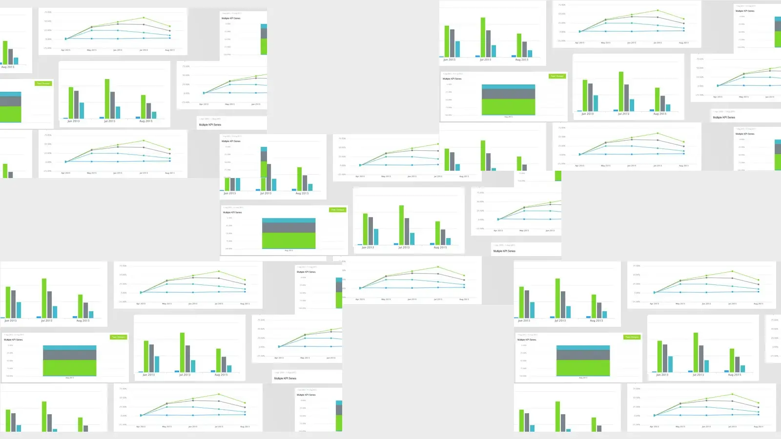
You told us that you wanted more dashboard views so we’ve been busy adding more than 6 additional views to the KPI dashboards. Amongst the new charts types there is a new stacked bar chart - great for showing how multiple KPIs contribute to an overall percentage, and the multi series chart, perfect for showing all kinds of KPIs on the same graph.
We've also been streamlining our databases and loading times so you should see a marked speed increase on those dashboards with lots and lots of data and graph types.
These charts have been carefully selected by dashboard experts to offer a wider breadth of charts and graphs that was previously lacking in the system, these charts offer a significant upgrade for KPI visualisation.
For a closer look at the new latest new features, jump into your account. As always we would love to hear what you think.
More performance insights, Templates and KPIs can be found by visiting KPI Central.

by Stuart Kinsey
Stuart Kinsey writes on Key Performance Indicators, Dashboards, Marketing, and Business Strategy. He is a co-founder of SimpleKPI and has worked in creative and analytical services for over 25 years. He believes embracing KPIs and visualizing performance is essential for any organization to strive and grow.