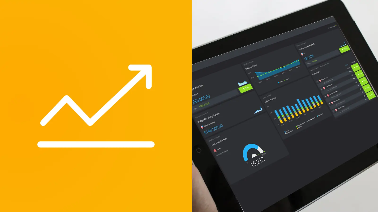
Since we released the ability to customise the interface you told us that you wanted more control over graph and chart colours, so from today you can customise the colours of the graphs on your dashboards.
Choose to customize nearly every aspect of the graph from axis to heading colours, columns to targets.
Additional Calendar Selections
Date controls have been updated to support more default time periods and ISO week numbers are now supported. You can now choose for a host of pre-defined frequencies for your KPI Reports, Analytics and Dashboard graphs; such as weekly, year to date as well as customization periods such as present number of months or previous.
Some other notable changes and fixes:
- Some script updates to improve the efficiency and speed of rendering your graphs and charts
- Upgraded API
- Calculated KPI default targets now displaying for all days
- Some small images and interface tweaks
- Some bug fixes due to recent browser updates
Learn more about the calendar control and how custom periods can enhance your KPI reporting.

by Paulo De Sousa
Paulo writes on the technical side of KPI Tracking. He is a co-founder of SimpleKPI and has worked in the development and SaaS field for over 20 years. He is passionate about helping businesses make data-driven decisions through the use of data, reports, and analytics. With his deep understanding of business intelligence tools, he's adept at providing solutions that can help businesses reach their goals.