KPI dashboards are a powerful and resourceful addition to any business, their very nature encourages better decision making, less time spent analysing data and providing a platform to improve performance and productivity.
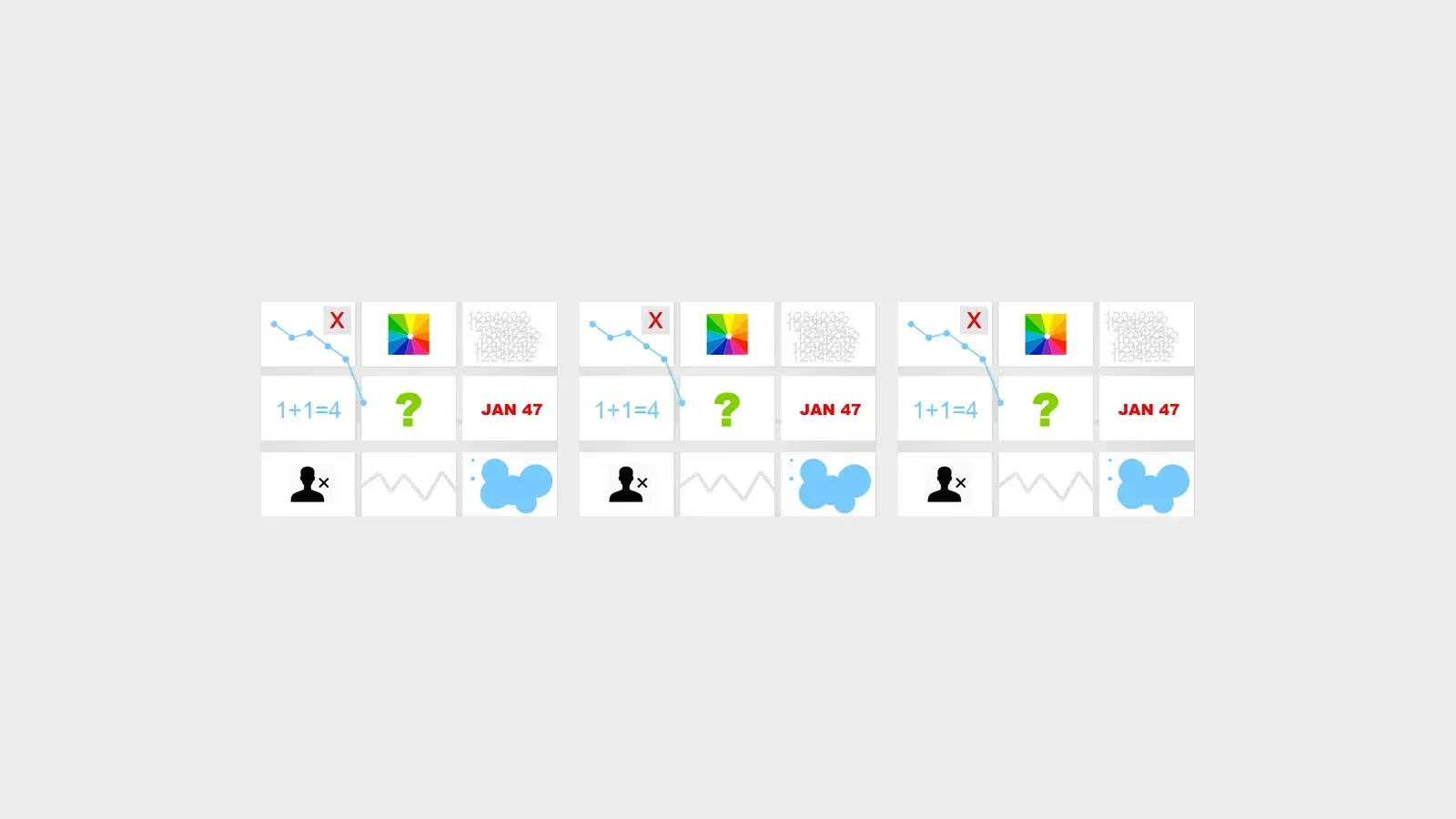
When utilising KPI Dashboards as part of a performance improvement process, it’s worth remembering that while KPI Dashboards are an undeniably powerful tool for gaining insight and laying the foundations for better business decisions - the very flexibility that makes them such an appropriate tool also invites an array of glitches that reduce their effectiveness. Some of the most common mistakes made when setting up your KPI Dashboards are easily preventable - so here is a rundown of the top 9 things to avoid when setting up the dashboard.
Metrics overload
One of the most common issues facing many organisations is the large amount of data now generated on a daily basis. For example collection points such as Social media and online sales create an overwhelming array of metrics. In this data driven environment it is clearly a temptation to just monitor everything as it all in some way affects the business. While this may be true for a small fraction of businesses with a small number of KPIs - the problems arise when metric overload occurs.
Metric overload is typified by copious amounts of non-essential and unconnected data surfacing on the dashboard. A simple test to decide which metrics to display on your dashboard is to ask; do I look at it more than once a month? Does this show me an outcome of lots of different metrics? Is this really essential?
The wrong KPIs
The root to having the wrong KPIs usually (but not exclusively) lie with the understanding of what is important to the individual does not necessarily equate to the importance or performance of the organisation. Managers and production staff for example focus their performance on small detailed metrics resulting in the most important KPIs being overlooked. It is perfectly acceptable to collect the metric data, as analysis can help pinpoint the root cause of any performance peaks and troughs, but focusing on the overall KPI is far more efficient.
Selfish KPIs - focusing KPIs on your concerns.
Are all of your KPIs focused on only things that matter to you - KPIs that fail to listen and gauge the needs of your customers? Most companies fail to intrinsically link their primary KPI performance with the customer service experience.
Data not storyboarded or linked logically
Most businesses rely on the efficient flow of internal processes to be successful – and the same is true with dashboards. Seeing data grouped in a logical way on a KPI Dashboard helps viewers understand the relationship between KPIs and how this affects performance for the whole company. Disjointed dashboards with charts and graphs bearing no connection to each other are inefficient and cumbersome. Imagine that your dashboards tell the story of your business - like a storyboard with each chart or graph telling something about how the business operates and performs.
Wrong graph types
When displaying KPI data, the way it is presented can be as important as the data itself. Selecting line graphs when a pie chart would display a better distribution of the data is a common problem with dashboard visualisations. Most dashboards allow you to choose from a generous amount of visual aids, however selecting the most efficient can be the difference when it comes to a successful dashboard.
Muddled Frequencies
To be honest monitoring some KPIs over smaller (and sometime longer) time frequencies can completely negate the benefits of your dashboard. KPIs should be relevant and balanced against the time periods they are covering. For example you wouldn’t want to display unique visitors to your website on an hourly basis when there are unpredictable fluctuations, whereas over a whole month patterns and comparisons can be made and a clearer understanding can be observed.
It’s always tempting when first creating your new KPI dashboard to excitedly assess each chart and graph with enthusiastic regularity. However when setting up your KPIs and dashboards it’s a worthwhile exercise to consider the optimal frequency that the data should be displayed.
The Wrong or No Audience
Dashboards often get presented to the wrong audience or are kept hidden from the people who would most benefit from them. When creating dashboards part of the process should involve input and feedback from the various groups that contribute, manage from and oversee the data.
Colour Overload
Providing a clear, intuitive and user friendly KPI Dashboard is key in presenting your data in a logical and usable way. One of the best ways to scupper a dashboard is to get overly creative. Customising your dashboard with your corporate colours is always encouraged, however unleashing a never ending colour pallet across each and every graph, chart, table and list is a sure fire way to obliterate what’s really important – and that’s the data . Avoid this by keeping it simple, stick to complimentary pallet colours or graph defaults if needed.
Not enough detail to make a difference or poor data
Sometimes less is more but when is less way to less. As with too many metrics and data overload, either poor or a minimal amount of data is just as damaging to your dashboard. It’s frustrating to users to find that there is missing data but compound this with poor or unreliable data feeds into your dashboard and your KPI Dashboard is destined to nosedive pretty quickly.
Workout what you want the dashboard to show and work backwards with the data to build a list of key metrics needed, then evaluate the reliability of the data – being ruthless in this process pays off as hitting the sweet spot of data and reliability truly sets apart a simple KPI dashboard from a critical business performance improvement tool.
Nothing is set in stone.
As companies and businesses evolve and grow so should dashboards, but all too often KPI Dashboards get left behind, and as a consequence start providing misleading, inaccurate and irrelevant visuals – ultimately leading to the wrong business decisions being made. Regularly reviewing dashboards and pruning charts, graphs and KPIs that are no longer relevant will keep your KPI Dashboards industrious.

by Stuart Kinsey
Stuart Kinsey writes on Key Performance Indicators, Dashboards, Marketing, and Business Strategy. He is a co-founder of SimpleKPI and has worked in creative and analytical services for over 25 years. He believes embracing KPIs and visualizing performance is essential for any organization to strive and grow.