Ah, there it is
There’s always a little inner pleasure in uncovering something you never knew was there.
Even long‑term SimpleKPI users can miss the little features and nimble workflows that make everything click.
Here are five of my favorite hidden nuggets. Small, quietly powerful touches that make the whole experience of tracking your KPIs even better.

1 Data Users
The key to tracking products, locations, and more
Most folks assume “Data Users” are just for… well, users.
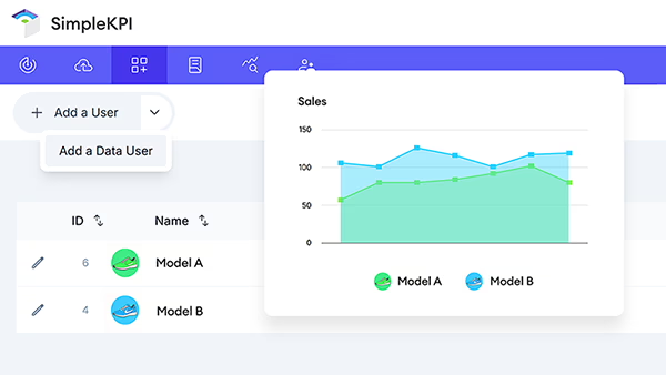
Here’s the twist: they’re perfect for tracking KPIs against almost anything, be it products, locations, teams, or any time it’s better to attach KPIs to a thing rather than a person.
It’s a clean way to avoid creating duplicates like “Door 1 Sales,” “Door 2 Sales” when a single Sales KPI will do.
By leveraging Data Users, performance tracking becomes cleaner, comparable, and dashboard‑ready.
Why it’s awesome
Create product‑level views, compare performance side‑by‑side, and filter dashboards by product without rebuilding your KPI stack. It’s modular, scalable, and tidy.
How to set up Data Users
- Go to the Users tab and choose “Add a Data User” from the dropdown.
- Enter the product, location, or item name and save.
- In the Data User row, click the KPI button.
- Assign the relevant KPIs.
Once KPIs are assigned, add data just like you do for standard users: go to the Data tab and use the user selector to pick the Data User.
Tip: Assign by folder: When setting up, assign a KPI folder to a Data User instead of picking KPIs one‑by‑one. Making it faster and future‑proof when you need to add KPIs later.
Learn more about how Data Users can streamline your workflow and setup in the support guide.
2 KPI Notes
Capture context right where it happens
Spotted a spike and can’t recall why it happened?
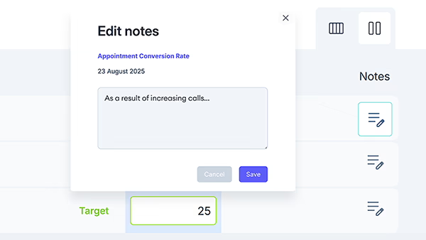
Notes in Single Entry View let context travel with your data. Add quick annotations on the exact day or entry—campaign launches, outages, pricing changes, or staffing shifts. So future you (and your team) can interpret trends at a glance.
Why it’s awesome
Turns raw numbers into narrative. No more digging through Slack or email to remember what happened that week. Notes add instant context, reducing the time it takes to explain peaks and troughs.
Perfect for: sales anomalies, traffic spikes, churn blips, operational incidents, seasonality markers.
Notes are visible on Reports and on Dashboards when hovering over a data point.
How to add a KPI note
- Go to the Data tab and switch to Single Entry View.
- Click the Note icon next to the entry field.
- Enter a short note about the entry and click Save.
Tip: Lead with a short “why,” then details—e.g., “Campaign launch — Google Ads v2.” It keeps tooltips scannable on dashboards and reports while preserving full context.
Discover how to access and view notes on your reports and dashboards.
3 Embedding Dashboard Charts
Share live insights anywhere
Embedding keeps charts living and breathing wherever they’re needed. Be it on an intranet, investor updates, team wikis, or project hubs. You get the same clean look and automatic updates, without asking people to log in.
Why it’s awesome
Use SimpleKPI as the hub, then share out anywhere—embed a chart, export a report, or drop a quick snippet in seconds.
Perfect for: stakeholder updates, public performance pages, partner portals, team huddles, and weekly exec briefs.
How to embed a chart
- Go to the Dashboard tab and locate the chart to embed.
- Open the chart’s menu (top right) and choose Share.
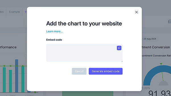
- Click Generate embed code, then copy and paste it where you need it.
Once copied, paste the embed code into your website, intranet, knowledge base, community space, or portal.
Tip: Wrap the iframe in a responsive container (e.g., using aspect-ratio or a 16:9 padding box) so embeds look great on mobile and large screens alike.
Learn how to embed any SimpleKPI chart externally.
4 Full Screen Mode with Auto‑Cycle
Share live insights anywhere
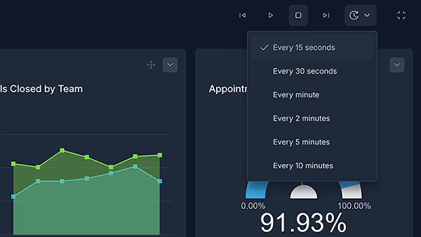
Turn any screen into a simple, rolling view of what matters. Full Screen Mode clears away the clutter, and auto‑cycle rotates through selected dashboards on a timer. It’s great for wallboards, standups, or the ops room. Keeping the numbers visible so everyone stays in sync without touching a mouse.
Why it’s awesome
When metrics stay in view, teams naturally stay aligned and accountable (no reminders required.)
How to use Full Screen + Auto‑Cycle
- Open a dashboard, click the options dropdown, and choose Full Screen.
- Set a timer interval from the interval dropdown.
- Click Play to start the slideshow. Use Next/Previous to switch manually, or Pause to stop rotation.
You can pause the slideshow at any time, or jump ahead using the forward and back controls to land on the dashboard you want.
Tip: Run Full Screen on a dedicated browser profile with “Restore previous session” and auto‑launch at startup. If the display reboots, your dashboards return to presentation mode with the same timing, with no manual setup intervention.
Learn how to set up and use Full Screen presentation mode.
5 Footer Notes on Charts
Add clarity without clutter
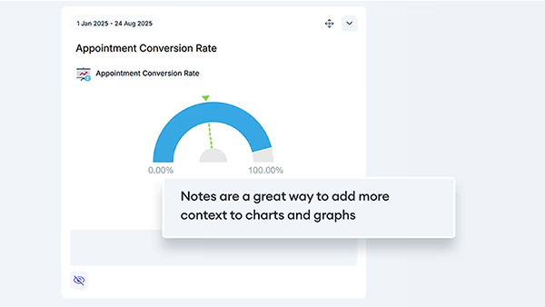
Sometimes a small note makes all the difference. Footer notes let you add definitions, caveats, or data rules right on the chart—without crowding the visuals. Think “excludes refunds,” “targets reset quarterly,” or “data refreshes nightly.”
Why it’s helpful
Prevents misreads and repeat questions, so conversations stay focused on decisions—not definitions.
Perfect for: KPI definitions, formula changes, methodology shifts, data quality notes, inclusions/exclusions.
How to use chart notes
- Open a dashboard and click the eye icon at the bottom left of the chart.
- Enter or edit your chart note in the text field.
You can hide the note any time with the eye icon—your text is saved for later.
Tip: Lead with the key rule, then add detail—e.g., “Excludes refunds — nightly refresh, UTC+0.” Keep it to one or two lines so it stays readable at a glance.
It's the little things
Little things like Data Users, quick KPI notes, easy embeds, full-screen rotation, and tidy footer notes don’t scream for attention, but they quietly change how work feels. Fewer duplicates, fewer “what was that spike?” moments, fewer screenshots and side docs. More flow, more context, and dashboards that stay useful long after the first setup.
If any of these sparked an “oh—that’s handy,” try one today.
Add a note to this week’s outlier, spin up a couple of Data Users, drop a live chart in the wiki, set a screen to auto-cycle for the morning standup, or add a one-line caveat to a chart. Small steps, big clarity—and a smoother rhythm for the whole team.

by Stuart Kinsey
Stuart Kinsey writes on Key Performance Indicators, Dashboards, Marketing, and Business Strategy. He is a co-founder of SimpleKPI and has worked in creative and analytical services for over 25 years. He believes embracing KPIs and visualizing performance is essential for any organization to thrive and grow.
